4 Mise-En-Scène
Mise-En-Scène
Even though we often talk about watching a film, for example, we say “I went to see a film yesterday” or “I watched a really good film in class today,” in reality we really read a film. If we think about film as a grammar, what we are speaking of is a universal language of film, the ways in which a common language is used to enable an audience to ‘read’ a film and understand the specific choices being made by the director in order to communicate story and meaning to audiences. Mise-en-scène is one of the key ways directors provide cues for us to read a film.
The French term mise-en-scène derives from theater and simply translated means ‘placing on the stage’ or ‘putting in the scene’. Essentially, all the elements that have been arranged within the camera frame is mise-en-scène: setting and set design, lighting, décor, props, performance and choreography, make-up, costume, camera placement and angles, color and more. Literally everything within the frame that makes up the frame can be considered mise-en-scène. All film, as such, contain mise-en-scène, which contrives to bring about the look and feel of a film.
Through mise-en-scène the director stages the events of the film. The careful composition of these visual elements constantly communicate meaning to the audience about characters, their inner lives, and the world in which they live. Mise-en-scène directs our understanding of narrative events in both explicit and implicit ways.
Sets, Props, and Costumes
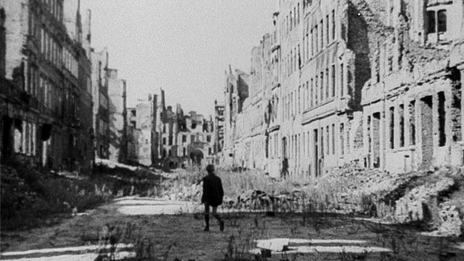
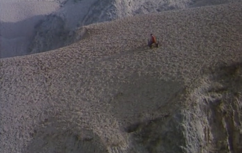
Setting can be its own character. Unlike with theater, you can have a space devoid of people and it will evocatively tell its story. In the films created by the Italian Neorealists at the close of World War II, for example, the postwar landscape was a powerful metaphor that haunted their films filled with depression and struggle. Roberto Rossellini’s Germany, Year Zero (1948) begins with a camera that tracks through the rubble of Berlin, a setting the 12-year old young protagonist, Edmund, will continually walk, work and play in as he symbolically suffers for the bad choices of his elders. In the archetypical Hollywood Western, dialogue is unnecessary against the vast emptiness of its landscape and isolation of characters in a newly discovered world slowly catching up to the rules and regulations of modernity. Fifth Generation filmmaker Chen Kaige shot his film Yellow Earth (1984) entirely on location in an examination of the relationship between the Chinese landscape and the Chinese individual. Similar to Germany, Year Zero, Kaige’s film begins with landscape as his camera pans over majestic yet barren mountain ranges that dwarf the human individual. Landscape dominates the frame and undermines the usual importance given to people and the sky in cinematography, highlighting the value of this yellow earth to the people who live in it. Plot is entirely secondary to the visual presentation of the setting in these moments.
While the use of on-location settings can deepen the sense of realism in a film, setting, of course, can also be staged to engage in important narrative functions. German Expressionist directors often created elaborate stage designs in their films to challenge the way in which we perceive reality in traditional cinema and convey the inner, subjective experience of its characters. The Cabinet of Dr. Caligari (1920), is a story, told in flashback from the point of view of a young man named Francis, about a mysterious Dr. Caligari who commits murders through control of a somnambulist. Director Robert Wiene hired Expressionist painters Walter Reimann and Hermann Warm to construct a set composed of geometrical patterns, strange angles, and jagged edges in a reflection of the twisted mindscape of its narrator. Considered to be one of the earliest horror films, set design in The Cabinet of Dr. Caligari is key not only to the distortion of reality, and audience understanding of the story world, but also to the generation of mood through the creation of a frightening and alien diegetic landscape.
See Chapter 1 for more on Germany Expressionism.
https://youtu.be/04u-5Fn3wR8
Set design refers to the dressing or décor of a set, the way in which a space is staged in order to elicit greater meaning and direct the thought of the audience. A lot of consideration goes into the placement of props within any set in order to subtly suggest subtext and build additional information into a film. In Akira Kurosawa’s High and Low (1963), a chauffer’s son is mistakenly kidnapped instead of the son of a wealthy self-made businessman, Mr. Gondo. The kidnapper still demands payment, but if he pays the ransom, Gondo will go bankrupt and lose everything he has worked hard for. Caught in a moral dilemma, Kurosawa sets his film largely in one room containing Gondo, policemen, the chauffer, and his wife, and creates a sense of claustrophobia through tight composition and the use of long takes that prolong the sense of time within the same room.
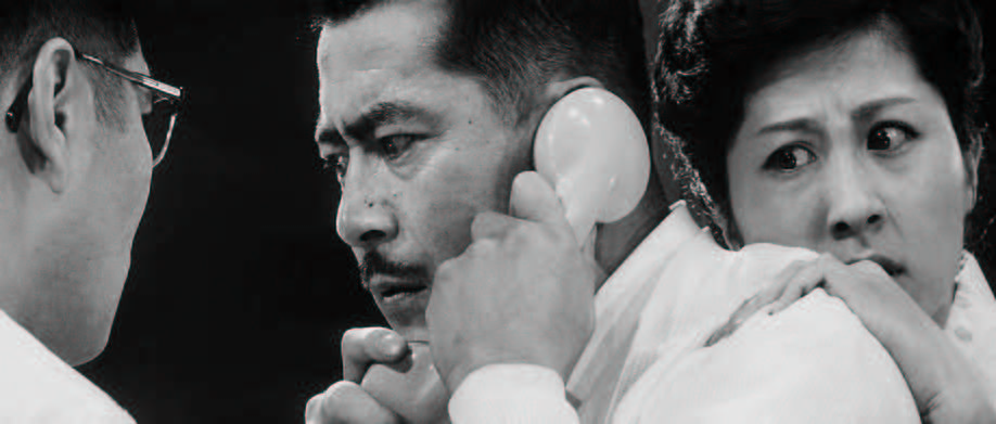
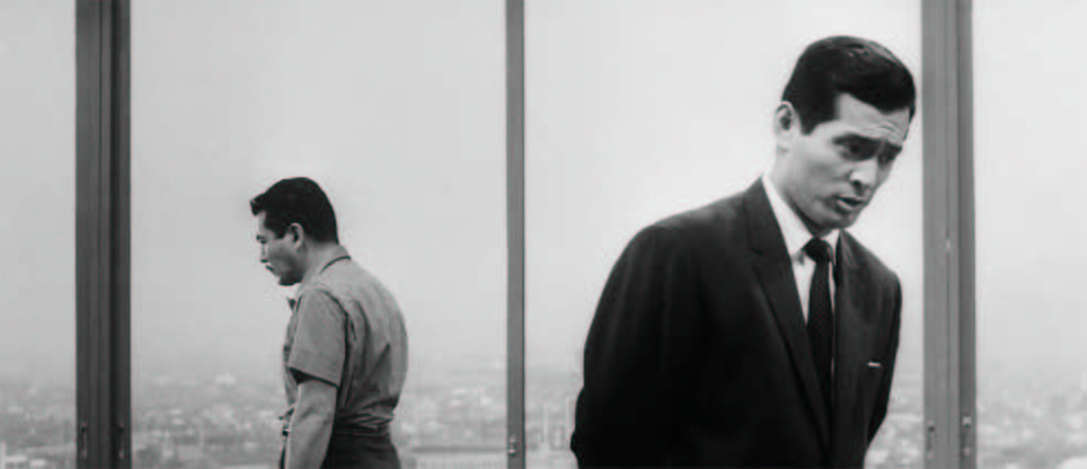
Gondo is repeatedly framed between characters or at the periphery, caught between the desires of others, and his own conscience. Drapes become a very important prop to the visualization of his anxiety and entrapment in High and Low. When Gondo opens the drapes to survey the world below, a sense of space, light and power is created through the fostering of deep space. Forced to close the drapes to prevent the kidnapper from having visual access to the house, and thereby discovering that the police have become involved, the drapes function both to signal an off-screen space where a kidnapper lurks and to create a movement from deep space to shallow space that aids in the feeling of claustrophobia as space and light diminishes. Kurosawa further uses the drapes to emphasize how pressured Gondo feels to do the ‘right’ thing by having the character pace restlessly alongside the prop as first his chauffeur, and later his wife, close him in against the drapes as they plead with him to pay the ransom.
See Chapter 4 for more on deep space.
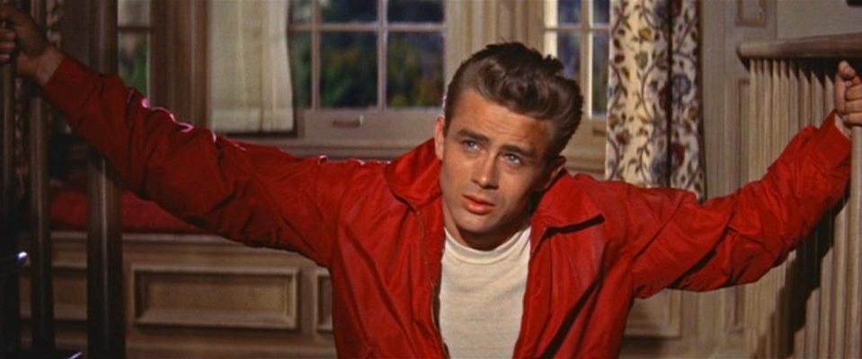
Props possess the ability to provide insight into characters, similar to costumes and makeup which can also affect the tone of a film. Costumes for instance can indicate the historical time period of a film, deepening the realism for audiences, or point to a character’s emotions or development over the course of a story simply through a change of color. Rebel Without a Cause (1955), for example, is a film concerned with teenage delinquency and the failure of the American nuclear postwar family. In this film, the color red is worn by all three main teenage characters at different points throughout the film, and becomes an indicator of rebellion and a crisis of self. At the end of Rebel Without a Cause, Jim (James Dean) replaces his iconic bright red jacket, which he has placed over the corpse of his friend, with his father’s sports-coat in a symbolical movement from teenage angst and sexual confusion to social conformation and adulthood. Red clothing is ultimately phased out as teenage characters mature and are re-contained within the safe harbors of marriage and the family.
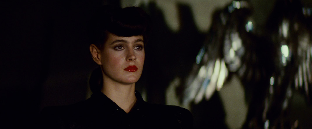
Props, alongside costume and makeup, work to communicate story information to audiences as much as setting and characters. The manipulation of props, costume and makeup can be key to critical shifts in our understanding of the plot, and character decisions. Blade Runner (1982) is a science fiction film set in 2019 where bounty hunters called blade runners are commissioned to ‘retire’ or terminate runaway cyborgs known as replicants. In the midst of tracking down several missing replicants, blade runner Rick Deckard develops feelings for a replicant, Rachel, who has learnt that her entire human childhood was a fabrication. Hiding in Deckard’s apartment, she touches and examines old photographs that adorn Deckard’s piano. While the prop of the photograph can often help to establish a character’s back story in time and space, thereby assisting in lending flesh to a character and moving plot forward, the photograph here does something different.
Earlier in Blade Runner, Rachel presents a photograph of herself as a child in her mother’s arms to Deckard as proof of her humanness, undermining the status of the photograph as incontestable truth when her replicant nature is revealed. Even as Rachel’s interest in the photographs reveal her own yearning to be human, they raise the question of photographs as a prop of our memory. Photographs can be used as evidence, but as a technology they can also be manipulated. Photographic images do not necessarily present ‘real’ memories, but the way in which we choose to remember or present a version of ourselves and others. Removed from any context of location or time period except for their aged appearance, the portraits on Deckard’s piano that should validate his childhood memories, as compared to Rachel’s, instead open the door for a questioning of Deckard’s own background and the legitimacy of his humanity.
Shifts in costume (clothing and its accessories) and makeup can suggest a character’s mood or consciousness, often functioning to more fully articulate a character. As Rachel comes to terms with her new reality as a runaway replicant, her sharp clothing that highlighted her cold aloofness is changed, her hair unpinned and worn down in loose curls, and her red lipstick removed in favor of nude lips. These choices in makeup and costume soften Rachel, heightening her vulnerability and childlike appearance to humanize her and encourage the audience, and Deckard himself, to sympathize with the cyborg. The sudden deliberation
behind Rachel’s decision to change her appearance lends an ambiguity to Rachel’s
actions when Deckard roughly forces a sexual interaction between them: is Rachel truly in
love with Deckard, or is she playing a role in order to survive in a world that either enslaves
or kills her kind? While make-up and costume often strive for realism and thus invisibility,
make-up and costume can alternatively be elaborated or exaggerated to emphasize a state
of being or feeling that is embedded in fantasy or psychological states. The mise-en-scène
elements of setting, costume, makeup and props all work in tangent with character and their
performance to articulate deeper meanings and generate a complexity of emotions in the
audience.
Key Terms
On-location: A real space is used as a set for a scene. As opposed to a “studio” set.
Set design: The dressing or décor of a set and the way that space is staged.
Prop: Short for “property”. Any object used in set design.
Deep space: Many planes of space moving off into the distance, created by set design.
Shallow space: Few planes of space (sometimes only two). Often gives a sense of claustrophobia or a flattened
image.
Performance
Actor performance is an important aspect of mise-en-scène. Controlled by the direction
of the director, the physical performances of characters are crucial to the thematic expression of a film.
While the posture of an actor and the expressions of their face (figure expression) often
function to express character thoughts and emotions, gestures and character action (figure
movement) can also create dynamic patterns and moments of meaning in a film. We can
trace the movement of a character from insecure to confident, for example, by examining
the subtle changes in their posture. A character in this case may begin a film with a bent
posture and pinched expression, and by the end of the film stand tall with bright eyes and
a mischievous smile. Other elements of mise-en-scène and cinematography would continue
to flesh out this character. Imagine, for instance, this same pinched faced, slumped
character in an ill-fitting, wrinkled suit working in the glare of an old computer within the
tight confines of an office overflowing with miscellaneous clutter and crumpled sheets of paper covered in coffee stains. The film might then end with this character in linen slacks on a beach, throwing his briefcase filled with work documents in a wide arc into the ocean to denote his freedom from the conventional grind of capitalism. The control the director exerts on character performance supports the overall argument or larger point of the film.
The delineation of figure expression is typically aided by the shot sizes of the camera, for example, the close-up is the most frequently used shot size to emphasize a character’s emotional state of being. Figure movement on the other hand is often represented through the choreography of characters and things. Choreography, or blocking, is the designing of movement in space and time. An understudied aspect of cinema, choreography is often under-considered in film studies but in dealing with the tension and emotion of movement, choreography remains a core element of the medium.
Most often when we think of choreography, we think about dance. Films can have recurring dance sequences central to the expression of character emotion and dreaming as seen in Hollywood musicals and Bollywood cinema. Here the camera itself becomes a character to be choreographed in turn, and through its movements lengthens or dynamically shortens the articulation of the dance. We might call this camera dancing, as through maintaining continuity between character movement and camera shots, editing enhances the experience of the dance. By choreographing the camera and controlling the editing of the dance performance, the director heightens the movement visible on the screen in a communication of specific messages to the audience. Dance and choreography thus operate as main themes in the film.
Set in North East England, Billy Elliot (2000) is a dance film about an 11-year old boy who wants to dance but is caught between the social expectations of his family who are struggling with the very real economic concerns of the 1984 coal miner’s strike, the desires of his dance teacher, and the social stigma surrounding male ballet dancing. Placed on top of a table by his brother, and surrounded by these dissenting forces, the camera adopts Billy’s point of view and cuts between Billy looking at his family and dance teacher arguing from atop the table to Billy cornered against a brick wall dancing. Cutting between Billy’s tap dancing feet, to fuller shots of him dancing, every door that Billy opens leads to a physical barrier in his way as he attempts to dance his frustration out, but also perhaps dance the dance out to make his family happy. No matter where he turns barriers hem him in, and he finds his path literally blocked at the end of his dance routine by a rusted galvanized fence. The shallow space created aids in the sense of entrapment caused by poverty and culture that sees generations going down in the mines. Billy’s path was already set before his birth.
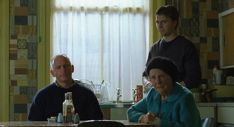
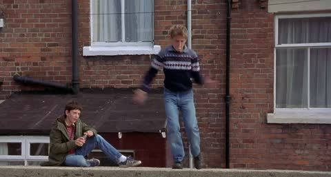
Framing and composition of space is important to the visualization of bodies in motion on the screen. Camera position thus works in tangent with choreography in order to anticipate the flow of bodies across space for maximum emotional impact. Bodies in motion communicate at a deeper psychological and emotional level than dialogue. Billy could have delivered a moving soliloquy where he exposes his feelings of claustrophobia, confusion, and anger to audiences, but such a performance would not have been true for this young character who has difficulty communicating his desires to those around him. Through the movement of camera and dance the audience feels what Billy does, entering into a greater intimacy with the character where dance gives entrance to what cannot be communicated through words. Unlike in the musical, narrative action does not pause for the dance sequence but rather the dance sequence in Billy Elliot is key to character and plot development, holding an important place in audience understanding of the passage of time, and the emotional nuances of the film.
Contrary to the camera dancing of the dance film, some dramatic films contain one or more dance sequences that focus chiefly on the choreography to provide further insight into characters and the shifting moods of the film. While dancing is not central to the film, these films use dance choreography in often revelatory and humorous ways. The question to ask here is what would have been lost (or gained) without the mise-en-scène of character dancing? In the cult classic Napoleon Dynamite (2004) a socially awkward Napoleon bursts into dance on a stage in front of his high school peers in a last ditch attempt to help his friend, Pedro, become class President. Filmed chiefly in wide shot to display Napoleon’s entire moving body, the freestyled dance sequence works as a triumphant climactic moment for Napoleon that the entire film rides upon, one where he momentarily transcends his situation in a dead-end Idaho town. Napoleon surprises his entire year by dancing, and dancing well. Throughout the film Napoleon has been picked on and bullied. At the end of his performance, he returns to the slouched posture he has held throughout the film and runs off-screen to the rapturous applause of his blindsided peers. Through the mise-en-scène of Napoleon’s energetically bizarre movement, his peers finally see that there is something cool in Napoleon’s unique difference, and that he is more than just a social pariah.
Choreography, though, is not only about dance. It can interface with any designed movement in a film, from staged combat like martial arts and medieval battles, to tense car chase scenes, and political rallies. Even a scene set at a frat party involves some level of choreographed movement as drunk and partying bodies move around the main characters. The choreography of large groups can often be overlooked in cinema as a backdrop for the more important interactions of main characters that advance plot. As in the aforementioned frat party, the drunk revelers will only exist as a prop against which important characters are situated and defined. In the right hands, the directing of large groups of people can be moved from a largely unremarkable backdrop to a stylized presentation that emphasizes the argument of the film or deepens dramatic tension.
French director Jacques Tati’s 1967 comedy Playtime, a film loosely structured around a bumbling character (Mr. Hulot) who confusedly navigates a modern Paris, depends on an understanding of choreography as mise-en-scène. The choreography of large groups of people as they interface with modern architecture and space is crucial to the presentation of visual and aural gags in a critique of contemporary French society. The film begins in an airport where moving figures are framed against one another in an articulation of modern space. In a world composed of rigid lines, glass, cold minimalisms and high-rise architecture,
people walk in straight lines and do not deviate from the paths laid out before them.
By the end of the film, the uniformity of the modern individual has collapsed beneath the
chaos of life and humanity in a culminating scene where the poorly constructed architecture of a new restaurant falls around the heads of its inebriated costumers. Everything and
everyone within the film is carefully choreographed in terms of their interactions with each
other, especially in their eventual disarray. In its delineation of space, choreography in Playtime reveals modern architecture as the true main character of its filmic text.
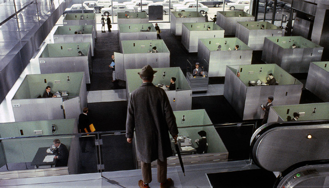
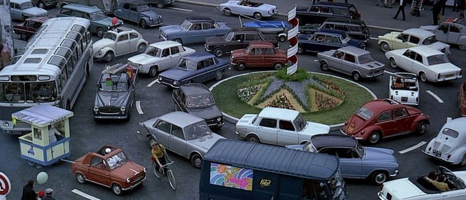
Tati’s careful coordinated scenes powerfully allow the audience access to his overarching
argument without a typical emphasis on dialogue and psychological drama. Tati’s use of wide shots keeps the audience at a distance that allows full views of modern life, one filled with isolated individuals, alienating technological advancements and superficial performances of wealth. Playtime contains little to no dialogue in its dependence on choreography to deliver its implicit meaning to audiences. Choreography possesses the ability to bear the chief weight of meaning in a story, creatively building a specific audio-visual expression that both entertains and drives the viewer to a deeper penetration of the narrative world.
Key Terms
Figure expression: The posture of an actor and the expressions of their face.
Figure movement: An actor’s gestures and character action.
Choreography / Blocking: The design of movement in space and time.
Lighting
The design of lighting in cinema remains one of the most important elements of a shot as the story world of a film cannot be seen without the use of light. The very medium of film stock depends on the presence of light to bring images into visibility. In early cinema, natural lighting was crucial for the clarity of images leading to the creation of studios deliberately built to maximize sunlight (the Black Maria), and prompting the exodus of filmmakers to the West Coast to capitalize on the brighter year-round weather. By the late 1910s and 1920s, most lighting had become artificial, and the function of lighting had moved from simply lending light to a scene to using lighting to add emotional nuance and depth to characters and space. The cinematographer or lighting director would control the amount of light that enters any scene, and, through the manipulation of light and shadows, how we understand the cinematic world.
See Chapter 1 for more on the Black Maria
The three-point system forms the basis of most film lighting, and is the primary way in which figures in cinema are lit. This system is composed of three lights: the key light, the fill light and the back light. The key light provides the main source of illumination, while the softer fill light ‘fills’ out the shadows cast by the key light on faces and the background. In early cinema, the sun, as the strongest source of light, was a natural key light with any surrounding reflective surfaces acting as fill and back lights. Today, you can still see directors on exterior shoots using the natural light of the sun to define characters and collapsible reflectors as fillers to bounce light back unto surfaces.
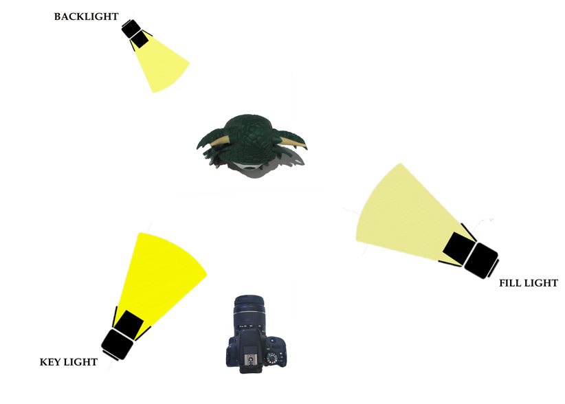
A back light completes the triad of lights by subtly defining character outlines and separating the actor from the background to achieve a three-dimensional look. Early filmmakers would often deliberately place the back light behind their white female stars with the intent of creating a ‘halo effect’ around their hair to emphasize their ‘blondeness’ and virtue. By the 1930s hair lighting would become a feature in Classical Hollywood cinema across hair of different colors but not typically across race or gender. In other words, while brunettes and red heads were privy to halo lighting, women of color and men were not typically treated to the same hair lighting effects for virtue. In cinema today while hair lighting occurs regardless of race, it is not as frequently visible a technique in color cinema as it was on the earlier black and white screen. Lighting as an element of mise-en-scène is rigidly controlled by the lighting director to imply meaning. Through varying different levels of key, fill and back lighting the specific world of a film comes into being.
Lighting is important for psychological effect. Through its presence it can reveal something about a character, and thereby deepen the meaning in a story. Conversely the absence of light and presence of shadows can also tell us more about the inner state of characters and the tone of a film than words or actions alone can always disclose. Depending on how it is wielded by the director of lighting, lighting can produce a diversity of contrasting meanings. For instance, it can aid in enhancing realism in a scene, but it can alternatively be used to create subjective spaces that expose the mental workings of characters. It can make a character appear angelic and in the next moment reveal the hard exterior of someone who leads a dangerous double life.
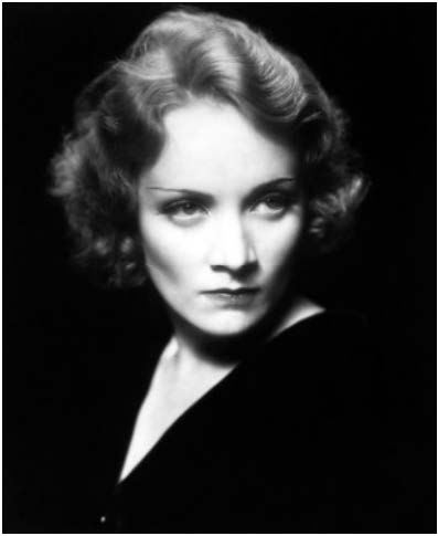
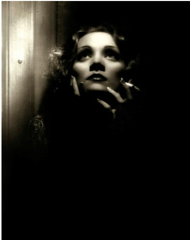
Consider these film images of Classical Hollywood cinema icons Greta Garbo and Marlene Dietrich. How does lighting suggest the story of her character, and how the director wants us to feel about her persona?
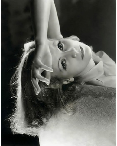
In the first image, the director of lighting illuminates Greta Garbo with soft lighting. Soft lighting, typically some type of diffused lighting, is often used for beauty shots or to soften the appearance of the actor. Soft light hides wrinkles and other undesirable marks on the In the first image, the director of lighting illuminates Greta Garbo with soft lighting. Soft lighting, typically some type of diffused lighting, is often used for beauty shots or to soften the appearance of the actor. Soft light hides wrinkles and other undesirable marks on the body in order to create a fetishized image of beauty, innocence or vulnerability. With soft lighting shadows are softer and undefined producing fewer points of contrast in the image. Overcast skies where light is diffused across the entire sky, rather than emanating from the single source of the sun, or some type of gel, paper or silk placed between the subject and light source all aid in softening light and creating more angelic and beautiful images. Notice the hair light on Garbo that emphasizes her blondness and provides her with ‘glow’. According to Richard Dyer, glow remains key to idealized representations of white women, especially in black & white cinema.
In the second image of Marlene Dietrich, we see that the key light, as the strongest source of illumination, is also a hard light. Hard lighting can be defined as lighting that casts sharp and defined shadows, in other words, as lighting that shows the contours and (im)perfections of the body. It is not a lighting that hides, but rather a lighting that forces things into visibility. A spotlight, the unfiltered light of a harsh sun or single uncovered bulb in a small dark room can all be sources of hard lighting. In this image, the hard lighting is directed to Dietrich’s front and side creating a dramatic chiaroscuro effect that highlights her fairness against the blackness of clothing and background. The hard lighting produces defined shadows that reveal Dietrich’s trademark cheekbones and dangerous exoticism in a creation of her film persona.
The third image is from the Josef von Sternberg film Shanghai Express (1932) in which Marlene Dietrich, shaken from a fight with another character, smokes a cigarette in agitation. A shot designed for the audience to simply gaze upon Dietrich’s beauty and inner turmoil, Sternberg lights Dietrich from above and to the front, like a flower searching out the light. Lighting, here, focuses our attention on the allure of Dietrich’s face, but also serves to lend texture to the image by highlighting the edges of her hair, the brocade design on her shoulder, and the pattern of the wall. Notice the peculiar shape of the shadow beneath Dietrich’s nose. Dietrich was often lit with what came to be known as ‘Butterfly Lighting’ or Paramount Lighting. The key light placed directly above a character’s head created a small, butterfly-shaped shadow right under the nose that would come to be the standard of Hollywood glamour lighting in black & white cinema. The beauty of the image transcends the action of the narrative, and the deliberate use of light fosters the audience’s immersion in the screen.
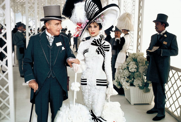
Lighting can be high key or low key, emanate from different sources and directions, and, influence the look and feel of a scene through its color. When lighting is high key, a scene is brightly lit with few (if any) shadows. Think here of your typical musical film, like My Fair Lady (1964) or The Umbrellas of Cherbourg (1964) and the way in which it is lit to eliminate shadows from characters’ faces, and illuminate the bright colors of clothing and space despite dark themes of poverty and failed relationships. Not all musicals are created equal, though, as there are characters and plot concerns that still need to be emphasized giving rise to more contemporary musicals like Sweeney Todd: The Demon Barber of Fleet Street (2007) and Les Misérables (2012), which use low key lighting to dramatic effect.
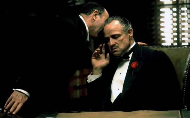
In contrast to high key lighting, low key lighting is characterized by its darker, shadowy look. As its name suggests, low key lighting calls for a softer key light. Contrarily, high-contrast lighting, also known as chiaroscuro lighting, is considered a type of low key lighting even though it calls for a combination of high key light and shadow. High-contrast lighting therefore visualizes the ‘high contrast’ between light and shadow in a scene. Low key lighting is most often used in the genres of horror, thrillers, and film noir to stylistically depict dark social conditions and experiences. For example, in the crime film, The Godfather (1972), Francis Ford Coppola uses low key lighting as a means to create character. The film begins in a dimly lit office with the Godfather, Don Vito Corleone, meeting a father desperate for vengeance against two boys who have destroyed his daughter’s life. Corleone is shot with overhead lighting and little fill light, creating a strong contrast between light and dark areas (high-contrast lighting) that deepens the shadows in the room while illuminating characters for psychological effect. The particular use of low key lighting here has the double effect of shading or hooding Corleone’s eyes. Eyes are the proverbial windows to the soul, and dark secrets lie within Corleone’s soul only to be suggested by our inability to see into his eyes. We are within the dark world of the gangster, the underbelly of society, and the low key lighting aids in the expression of our entry into an enigmatic world. And yet, the precise use of lighting in this scene further complicates this dark insight into the Godfather by directing our eyes to the cat he caresses in his hands, and the rose pinned to his tuxedo lapel. This is not a simpleminded, aggressive thug. Corleone is dressed for his daughter’s wedding, and the use of mise-en-scène introduces us to a man whose hands wield more than violence, and who loves his family deeply.
Diving Deeper…
Watch this 2-minute video about the hit HBO series Insecure
in which the Director of Photography, Ava Berkofsky, discusses
her techniques for the lighting of dark skin tones with the aim to
deepen story and celebrate diversity.
There is a significant difference between low key lighting, which fosters shadows, and
unlit characters that reveal poor lighting expertise. In Hollywood cinema typically non-white
actors are the ones who have historically been ‘unlit’ due to the racism embedded in the
medium. As late as the 1990s Kodak ‘Shirley cards’, depicting photographed white women,
were used as universal ideal skin tone markers to help professional film developers calibrate
color in the processing of their photographs. While great for white skin, darker skin tones
looked terrible under such a racially exclusive technique.
While such a technique would eventually change, lighting for blackness would continue
to lack nuance with filmmakers often throwing lots of light onto darker hued characters
regardless of the psychology of the scene and character, or continuing to light for whiteness
and thereby locking dark skinned characters into obscurity. Only recently has there begun
to be a different approach to lighting darker skin tones to highlight not only the beautiful
diversity of skin tones across ethnicities but also to light clearly for character mood and film
genre.
Questions for Consideration: Lighting for Gender and Race
- Is there such a thing as gendered lighting? in other words, are women typically lit differently from men? What parts of the body does lighting highlight in men and women? Look at film stills of men and women in films currently playing in theaters around you. What do you notice?
- What about lighting for skin color? How can we talk about the use of light between white men and women within heterosexual relationships? Can you find examples of films where women are framed as a light that men yearn towards?
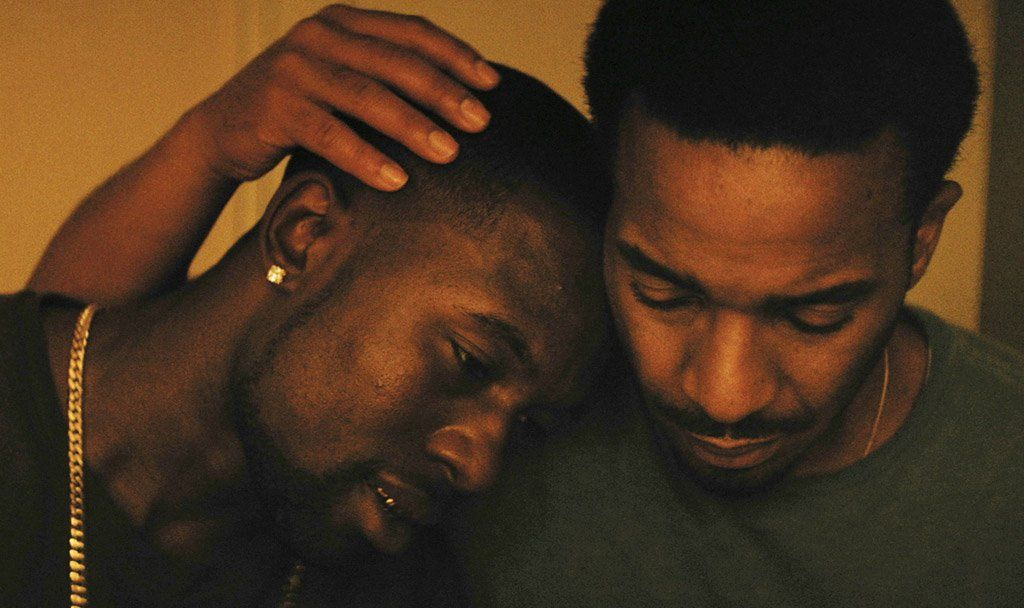
- Black people have been historically unlit and darkly invisible in cinema, especially when framed against their white counterparts. Examine contemporary lighting for non-white characters in television shows such as Insecure (2016 – present) and films like Moonlight (2016) against older Hollywood examples.
Key Terms
Three-point lighting system: A convention of lighting that includes a key light, fill light, and back light. Part of the Classical Hollywood system that created “glamour” shots.
Key light: The main source of illumination.
Fill light: A soft light that fills out the shadows cast by a key light.
Back light: Defines the actor outline, separating them from the background. Can create a “halo effect” in blond hair.
Soft lighting: Diffused light that hides imperfections.
Hard lighting: Lighting that casts sharp and defined shadow. Often shows imperfections.
High-key lighting: Brightly lights a scene with few (if any) shadows.
Low-key lighting: Creates a dark, shadowy look with a softer key light.
High-contrast lighting / Chiaroscuro: A type of low-key lighting that emphasizes the difference between shadowy spaces and light spaces. Often used for metaphorical effect.
Color
To complicate the idea of lighting for color, it is important to understand that light comes
in a range of temperatures and colors that affect the look and feel of a film. Measured on
the Kelvin (k) scale of temperature, the lower the K, the redder or warmer the light, and the
higher the K, the bluer or cooler the color of light becomes on the screen. Light thus moves
from a spectrum of reds, to yellows to white and blues the hotter the temperature becomes
on the Kelvin scale. The director of photography can use light to heighten audience
emotion through their instinctive reaction to certain colors, and thus lend new visual layers
to a film.
Red, for instance, is a color that instantly triggers in an audience cultural understandings
of anger, violence, passion, madness and love, aligned as it is with the universal color
of blood. A shockingly dominant color, Stanley Kubrick paints the screen red with light in the climax of 2001: A Space Odyssey (1968) where supercomputer, Hal, sings his swansong ‘Daisy Bell’. The self-aware A.I. has killed everyone save astronaut Dave Bowman on
the ship. Even though the color red emanates from Hal’s motherboard and ever seeing eye, it is Bowman who is painted red by the lighting as he deactivates Hal positioning him
as a murderer as he effectively kills Hal. We are made to sympathize with Hal’s fear as his mind slowly slips away in a scene quiet but for Hal’s pleas, Bowman’s brief but earnest
replies and the atmospheric sounds of breathing and space. The intensity of the moment is amplified through the colored light, where strangely, despite the emotional tenor of essentially watching a sentient computer die, the color red feels cold, rational, alien.
Lighting for color can create a veritable cinema of the senses for the spectator. The notion of mise-en-scène is invested in the director’s control of what lies within the cinematic frame, and lighting is essential to the composition of a scene. Hero (Zhang Yimou, 2002) is a story about the assassination attempt on the King of Qin told from the point of view of a nameless assassin. In Hero color is used as a narrative device to make clear the four different stories being told by the Nameless to the Emperor— the first in monochrome, the second in red, and, as we come closer to perceiving the truth, the third and fourth stories adopt the colors of blue and white respectively. Zhang uses his lighting to emphasize the specific color of the story being narrated, and to subtly communicate the emotional valences of the scene. In the third story, for example, remembered in blue, Moon, the pupil of master swordsman and assassin Sword is framed against the stark blue sky. Moon has lost her mentor, Sword, to the politics and violence of empire building. The three point lighting illuminating Moon’s face holds a blue tinge. The sorrow and sense of loss expressed by her countenance is enhanced by the delicate lighting, the character’s stillness, and the mournful music that plays over the image. Blue, though, can also be read in terms of serenity, peace, truth, and challenges the way in which we are meant to understand this moment.
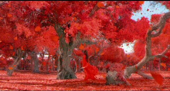
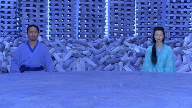
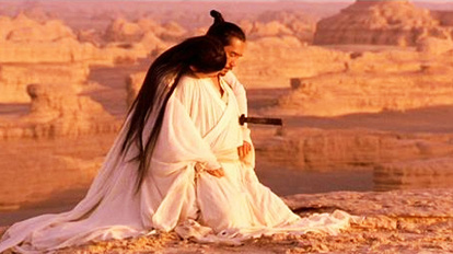
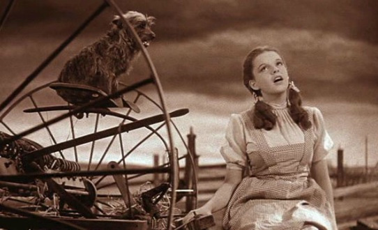
Color in Zhang’s film highlights the perspective, tone, emotion, themes and very malleable aspect of story, while lighting allows us access to the implicit feelings of different characters. While color is not traditionally thought as an element of mise-en-scène, it is often beautifully utilized by directors to develop story and meaning within their films. Wes Anderson , for example, is known for the bright color palette that demarks his film sets and characters’ costumes. Anderson’s color thematic allows the spectator entrance into quirky fictional worlds where color is an extension of characters. Color can also be aligned with gender expectations, in that we associate certain colors with women as compared to men, political and religious affiliations, and other cultural representations. Directors have also used color to delineate transition and change, as illustrated by Wizard of Oz (1939) in which a young girl from Depression-era Kansas becomes lost in Oz, a land of dreams. The reality of Kansas is depicted in black and white (actually sepia brown), while Dorothy’s dream in which she comes to emotional life through her adventures in Oz is full color through the technical achievement of Technicolor.

It is clear that color can have a deep emotional and visceral impact on the spectator. In the historical drama, Schindler’s List (1993), director Steven Spielberg decided to film his 3-hour epic about Oskar Schindler, an ethnic German who saved thousands of Jewish refugees during the Holocaust, completely in black and white save for one moment when Schindler sees a little girl in a red coat wandering lost and alone within the madness of the Holocaust as people are gathered and gunned down around her. Color here is used for dramatic impact, and to place us within the mind of Schindler, as he and the audience alone seems to see the little girl who slips past the violence. It is in this moment that Schindler commits to fighting the atrocity of the Holocaust. The use of color focuses our attention on the child who humanizes and stands in for the mass of victims whose lives were destroyed during the Holocaust. The bright blood red of the jacket becomes a beacon in the black and white world of Krakow and concentration camps that Schindler will continually catch glimpses of throughout the film, and signal the deep stain that marks the hands of the many who knew about yet ignored the Holocaust until war touched their own shores.
Pleasantville (Ross, 1998)
Color can act as an important part of the narrative, and present alternative dramatic ways of examining history. Pleasantville (1998) tells the story of two siblings who become trapped inside a 1950s sitcom set in a picture-perfect Midwest town. As with most sitcoms of the 1950s the people of this small town exist literally in black and white, and, as emotion, sexuality and life begin to bleed into their lives, people and their surroundings become ‘colored’ causing social fears and violence to erupt. Color slowly spreads throughout the black and white town showing every person and thing touched by the changing times. Color here also becomes an allegory to work through collective memory of race relations in 1950s America. There are no African American main characters, but as the people in the town begin to target the ‘coloreds’ in the town with hate crimes and restrict them from social areas, the use of color within this black and white sitcom world embedded in a culture of repression and social ideology, forces into sight a conversation about race, history and cultural memory in America. Without the storytelling device of color, the narrative of Pleasantville cannot be communicated aesthetically and effectively to the cinema audience.
See Chapter 4 for more on color.
Mise-en-scène is produced through the collaboration of many different professionals all under the auspices of the director who ultimately directs and controls the final look and meaning of a film. World-building in a film thus draws heavily upon the visual imagination of the director, his crew, and their construction of a cinematic edifice rooted in meaning that enhances audience experience of the narrative text.
This chapter is adapted from FILM APPRECIATION by Dr. Yelizaveta Moss and Dr. Candice Wilson.
