6 Editing
Editing
Film editor and sound designer Walter Murch famously complained that when audiences whine about “bad editing” in film, they just mean that the film is too long. But editing is a much more complicated and ingrained film process than just the final viewing length. Editing gives a scene a unique pace and rhythm. It defines the space in which characters move and have conversations. It can even change the expression on an actor’s face and his relationship to the event that he is looking at. A good editor will be able to manipulate footage to give us a sense of characters’ interiority: their motivations, emotional reactions, and modes of thinking.
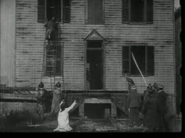
When cinema first emerged as an art form, certain rules of editing that we now take for granted were not yet invented. After all, editing deals in the art of time, and this element of temporality makes cinema unique against all other arts. Cinema editing had to start from scratch. So, for example, if a script described a character reacting to a fire with shock (as in Life of an American Fireman, 1903), early directors would place the camera at a long distance from the actor to frame him and the fire together in the same shot. This way, the audience could see the actor put his hands over his face with shock, then jump and run around wildly, reacting to a blaze just across the frame from him. But within a decade of the film industry, directors learned to use close-ups to develop more emotional connection and intimate moments in film. The same scene, using more nuanced editing, could be much more effectively and quickly communicated to the audience: A shot of flames, rising higher and higher, threatening to explode; a shot of the character’s face, in shock at what he is seeing; a shot of the flames again, rising even higher; a shot of the character’s face, eyes dodging, looking for water, thinking through his next steps.
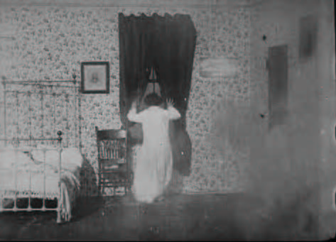
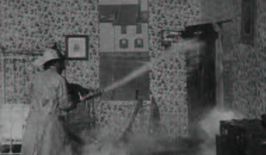
The new scene is, of course, much more effective. It can show emotion on the actor’s face, which can use more subtle movements than a wildly gesturing body in a long shot. It brings the audience closer to the character’s mindset and shows us what he is thinking. This aids in identification, a bond between audience and hero, that often drives our love of movies. The new scene is also faster. In just a few short shots, we are given the impression of the scene instead of a single, drawn out shot that shows us the events in pantomime. The new scene also feels faster because it has more cuts, and so it has a faster pace, moving us from fire to face in a dynamic way that gets our blood pumping with excitement and the feeling of danger.
It is helpful to think of editing not in how long it takes to show the events, but in how the shots are put together to give the feeling of an event. Many early filmmakers used the French term “assemblage” for editing, and this is a more appropriate way to think about the art of editing. By thinking of editing as assembling pieces of footage, we can focus on the stitches that editing makes, bringing together shots or scenes into a larger whole.
In our fire scene example, we were focusing on shot-to-shot editing, which brings together individual shots into a larger sequence. A shot is the smallest unit of film. Simply put, it is a piece of footage without any cuts. A shot can be long (a “long take”), where the camera keeps rolling, following the characters as they walk from room to room for minutes, sometimes even for hours. A shot can be very short, just a small blip, almost unseen and subliminal. But most shots are between these two extremes. The average shot does the job of showing us something, and then it is assembled with other shots through cuts.
A sequence is a larger unit of film that is made of several shots stitched together. If you think of a shot as a word, a sequence, then, is almost like a sentence that is composed of words. A sequence usually shows us a series of actions that relate to each other. Often, the shots of a sequence occur in the same space and in the same time. When the film jumps from one space to another or from one time to another, we see scene-to-scene editing that lets us know that we are jumping. Often we will see a transition between scenes, like a fade, dissolve, wipe, or iris, which tells us we have moved to another space or to another time. For example, in Star Wars: A New Hope (Lucas, 1977), when a scene set in Tatooine ends and a scene set on the Millennium Falcon begins, the two scenes are assembled with a wipe. In A Christmas Story (Clark, 1983), when Ralphie finishes retelling a nostalgic story, the screen turns into an iris (a circle) and the circle closes in until the screen is entirely black.
Key Terms
Shot: A single piece of footage without any cuts. The smallest unit of film.
Sequence: A larger unit of film that is made of several shots stitched together with cuts. Each sequence exists in a single time and space.
Shot-to-shot editing: Editing that stitches together multiple shots into one sequence.
Scene-to-scene editing: Editing that stitches together multiple sequences. Often this type of editing moves between times and/or spaces.
Transitions: A style of scene-to-scene editing that uses an optical effect, like a fade, dissolve, wipe, or iris. These styles are usually meant to be obvious in order to mark a change in time and/or place.
Continuity System
Early moviegoers in the 1890s did not have a strong understanding of editing. Both shot-to-shot editing and scene-to-scene editing felt strange and incomprehensible. This is because early moviegoers were not trained in movies like we are today. When we call film editing a “language” or a “grammar”, this is exactly right: like a language, the grammar of film editing must be learned. Film grammar as we know it is an artificial system, not a natural one, and needs to be taught by lots of movie-watching, sometimes since infancy, in order to feel natural. In fact, studies from 2010 have shown that contemporary cultures which are not exposed to cinema, like communities living without electricity in remote mountain villages in Turkey, find it difficult to understand basic film conventions, such as camera pans, crosscuts, and shot/reverse-shots.(1)
(1) Schwan & Ildirar (2010). Watching film for the first time: How adult viewers interpret perceptual discontinuities in film. Psychological Science, 21, 1-7.
By watching more and more movies, audiences find that film conventions become more and more naturalized, until they are practically invisible. These film conventions, which were developed in the 1910s, have become standardized as the continuity system or Hollywood system. By using these standards, filmmakers can bring attention to the action and emotions of a story rather than bring attention to the editing of shots. In the continuity system, the most effective assemblage of shots is invisible to the average audience member. So, when James Bond kicks in a door, we just focus on how he kicked in the door, not noticing that it took four shots, carefully stitched together by the conventions of invisible editing, for the action to be shown to us. Practically speaking, continuity editing allows a scene to be filmed across several different days or across different settings and still look like it is occurring in a continuous time and space.
There are a few key editing strategies that are part of the continuity or Hollywood system, and they correspond to common actions described by stories. When a film introduces us to a new setting, it does this through an establishing shot with a piece of the landscape and characters interacting within it. An establishing shot is usually utilizes a long shot or an extreme long shot framing that shows us a wide view of the setting. This establishes the setting so that we can orient ourselves once the camera moves in closer to the characters. An establishing shot is a map. And like a map, it needs to be referenced more than once. So even though each scene will usually begin with an establishing shot, it will occasionally return to a wide view of the setting – a reestablishing shot – to remind us of the map and where characters are situated within it. Like a language, the grammar of film editing must be learned.
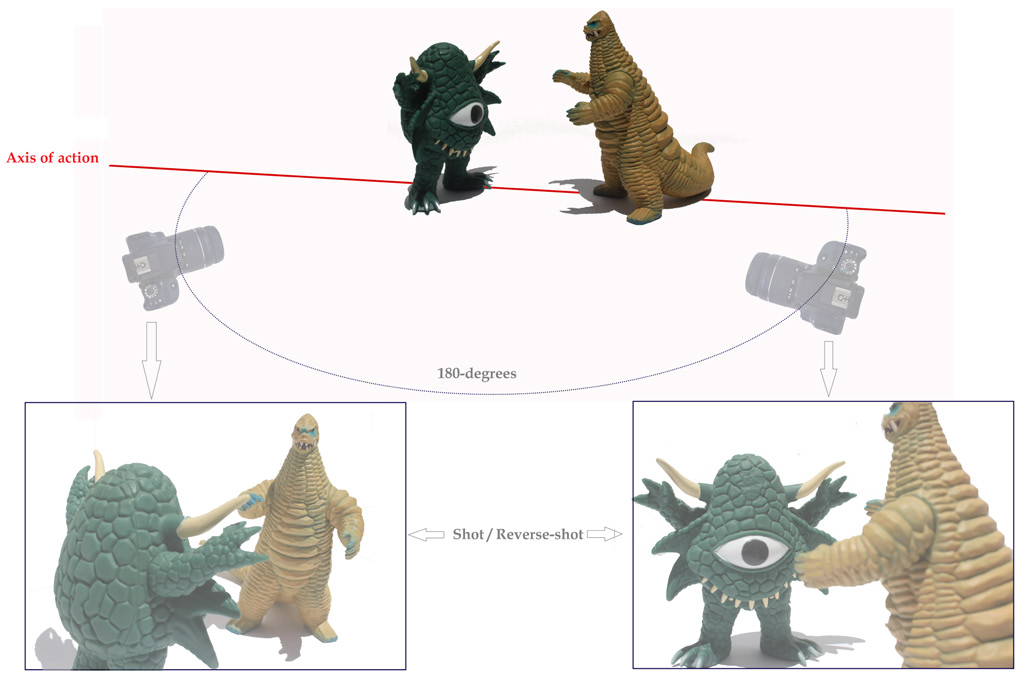
When characters speak, we prefer to see their faces so that we can gauge emotion and thought process in their acting. Since we like tight framings (a close-up or medium shot) for dialogue, it becomes hard to use only two-shots to describe character interactions. The shot/reverse-shot convention allows us to move between two characters as they speak and still see reactions on their faces. Two cameras set at opposing angles will film the two characters individually, and the editor will assemble these two sets of footage to create a back-and-forth rhythm of two characters speaking (see diagram 1). By assembling footage of character A with footage of character B (a shot and its reverse-shot), the editor allows us to see the conversation in more detail than a long shot which would include both characters in frame at the same time. Additionally, the rhythm of editing – bouncing between the shot and its reverse-shot – feels like a visual conversation and becomes more engaging to watch than simply one static shot.
Within the shot/reverse-shot convention, we see that camera angles are usually set up consistently so that one character always speaks from the left and one character always speaks from the right. This is easier for us to process, especially as the conversation becomes faster, more heated, or more emotional. By always filming the conversation from one side of the axis of action (see diagram 1), the directionality of the conversation is maintained. This principle is also called the 180-degree rule: never cross the axis of action within a single scene unless you are willing to confuse your audience. Why would crossing the axis of action (the 180-degree line) confuse the audience? As viewers, we are very willing to ignore small differences from shot to shot as long as the meaning of the scene is maintained. For example, if we are engaged in the emotion of a lovers’ quarrel, like the rain scene in The Notebook (Cassavetes, 2004), we will naturally ignore the fact that one character’s hair is completely wet in one shot and only somewhat damp in the next shot. But too much difference will snap us out of our engagement with the scene and make the “invisible” qualities of continuity editing blatantly obvious. If the camera crosses the axis of action in a lovers’ quarrel, then one character will speak from left to right, towards his lover, in one shot, then in the next shot he will suddenly be speaking from right to left, towards his lover. This might just be enough visual change for the audience to be snapped out of the emotion of the scene and disengage from the film entirely. For most of cinema history, the film industry decided that filming from one side of the axis of action was a rule that could not be broken without risking audience engagement. (See “Discontinuity” section for more on breaking the 180-degree rule)
Another way to keep audience engagement in the scene is to match the energy of the scene action with the energy of the editing. Often, the rhythm of editing will match how much or how little action is happening on screen. For example, action films are cut almost twice as fast (with almost twice as many shots) as dramas simply because the pace of action films tends to be faster than dramas. In this way, editing rhythm supports the content of the film. One way to keep the audience engaged in the scene without noticing the editing rhythm, especially when it is fast as in action films, is to cut between different camera angles on a physical action. Match-on-action cuts use the physical action (a kick, a jump, or even a hug) to “hide” or make invisible the fact that two different cameras are being used to describe the scene. This helps the audience to not notice the change, and thus to remain engaged in the scene’s dynamism. But also, practically speaking, it allows the editing to create action. For example, if you cut on a punch, the punch itself does not have to be filmed – one shot can describe a swing and the next shot can describe an impact from another camera angle. The editing itself, by giving the impression of impact, creates the punch.
So far we have been describing editing on the level of shot-to-shot. Editing on the level of scene-to-scene moves the viewer in time or space by assembling several sequences together. One very common creative mode of scene-to-scene editing assembles many individual moments in time (hours, days, months, or years) into a very short amount of film time. Hollywood montage condenses great expanses of time and space in ways easily and quickly understood by audiences. This type of editing is also called elliptical editing because it acts like an ellipsis (. . .) in literature, skipping over unnecessary material and creating rhythm in the writing. In film, the montage sequence often describes monotonous action which must be repeated over a long period of time or it describes the process of growing up, represented by a series of coming-of-age events.
Rocky (Avildsen, 1976) features perhaps the most famous Hollywood montage sequence in cinema history, describing boxer Rocky Balboa as he trains for a championship: shots of Rocky jogging are intercut with him training in a gym and at a meat packing plant. The impression of the montage sequence is that Rocky has been training for days on end, growing stronger and stronger with each short slice that we are able to see of each day. The meaning that the sequence imparts visually is that Rocky is growing from an unknown meat packer to someone worth watching and betting on. His montage training journey takes him from being a nobody to being a somebody. The sequence culminates in Rocky running up the stairs at the foot of the Philadelphia Museum of Art and throwing his hands up in victory.
Rather than moving us quickly through time, other scene-to-scene edits can move us quickly in space. A crosscut assembles footage from two separate spaces in order for the audience to see two events happening simultaneously. This type of editing is also called parallel editing, because the film treats the two scenes as parallel events which take place side by side in time. Crosscutting can have a variety of effects and meanings. It can create tension by letting the viewer in on a truth that only they can see. It can create a sense of romance by showcasing two distanced lovers bonded in time, if not in place. It can also play tricks on the viewer by setting up expectations. For example, Demme’s Silence of the Lambs (1991) assembles footage from inside a house with footage from outside a house to suggest that the same house is being described within the sequence. The editing pace becomes faster and faster as we get closer and closer to entering the house, making the viewer expect that the interior and the exterior belong to the same building. However, the crosscutting conclusion reveals that the inside footage and outside footage actually belong to separate houses; we have been in two separate spaces all along. Surprisingly, this editing “trick” does not break audience immersion, but rather brings the viewer into a deeper engagement with the film by making the viewer think that they must become better film detectives.
Key Terms
Continuity system / Hollywood system: Standardized film conventions that make it easier for the viewer to understand the film’s time, space, and movements. Includes establishing shots, shot/reverse shots, the 180-degree rule, match-on-actions, and eyeline matches.
Invisible editing: The prime goal of continuity editing is to be invisible to the viewer. This way, the viewer does not focus on the editing, but rather focuses on emotions, story, characters, etc.
Establishing shot: A common way to introduce a new space at the beginning of a scene. Most often an establishing shot is an extreme long shot of a landscape and characters interacting within it.
Shot/Reverse-shot: A common way to edit two characters in conversation. One shot features one character; the other shot (the “reverse-shot”) features a second character. Cuts move us between these two shots as the characters converse.
Axis of action: An imaginary line that can be drawn between two characters in a shot/revere-shot setup. This line is the “180-degrees” of the 180-degree rule.
180-degree rule: Do not cross the axis of action within a single scene. Adhering to the 180-degree rule maintains directionality of characters (one character always sits on the left of the screen; the other character always sits on the right).
Match-on-action: A cut between two camera angles is “hidden” by an action that is shown in both shots. For example, the action of a door opening, when matched in two shots, “hides” the fact that one shot was filmed from inside a room and the next show was filmed from outside.
Montage sequence / Elliptical editing: A sequence that condenses great expanses of time by showing small portions of actions stitched together.
Crosscutting / Parallel editing: A sequence that stitches together shots from two different spaces to show two events occurring at the same time.
The Kuleshov Effect
The manipulative quality of filmmaking has been scientifically studied since the origins of the art form. Most famously, Lev Kuleshov and Vsevolod Pudovkin ran film editing experiments in the 1910s and 1920s to prove that film editing choices have a profound effect on our understanding of film meaning. Their most famous film experiment, credited to Kuleshov, assembled a static shot of actor Ivan Mosjoukine after three different shots: a bowl of soup, a girl laying in a coffin, and a woman laying on a couch.
The shot of Mosjoukine does not change – he held a neutral face in the shot and the shot length remained the same. But depending on which shot was edited in after the Mosjoukine shot, audiences read a different emotion onto his quite neutral face. Later in life, Pudovkin described the original reaction this way:
“[the audience] raved about the acting . . . the heavy pensiveness of his mood over the forgotten soup, were touched and moved by the deep sorrow with which he looked on the dead child, and noted the lust with which he observed the woman. But we knew that in all three cases the face was exactly the same.”(2)
(2) “Naturshchik vmesto aktera”, Sobranie sochinenii, Volume I, Moscow: 1974, p 184.
How strange that the same face can exert such a variety of emotions. Kuleshov concluded that the editing must change the impression of the face on the audience. The Kuleshov effect has come to describe this great power of editing to change the impression of a shot based on what it is assembled with.
Though many Russian directors of the 1920s edited based on the Kuleshov effect, Alfred Hitchcock famously popularized the principle in the 1960s in a series of filmed interviews. He was interested in the psychological impact of cinema, and the Kuleshov effect explained to him why editing holds such great psychological power over an audience. He called the Kuleshov effect “impressionistic” and praised its ability to suggest action and meaning rather than hand meaning over directly.
Most famously, Hitchcock’s Psycho (1960) uses the principle of “impressionistic” editing to suggest the action of a murder in a shower setting. Hitchcock uses 52 cuts in only 45 seconds to describe this event, an extremely fast-paced editing sequence meant to evoke terror and anxiety in its audience. What makes this sequence “impressionistic” is that the knife never literally stabs the victim – we never see the murder itself. We see short close-ups of a victim’s body, quick images of a glistening knife, a shadowy outline of a murderer, and bloody water washing down the drain; but we never see the murder itself. Violence is suggested through a series of visual impressions. Just like in the Kuleshov effect, we read into Psycho’s shower sequence to extract the meaning of a bloody murder, and the victim’s eyes read as even more horrified against the other shots which horrify us. It is not just Janet Leigh’s performance that is so effective at portraying surprise and hopelessness, but our impression of the assembled shots inflect her eyes with more surprise and more hopelessness. It is important to notice how the montage of Rocky differs from the shocking, rapid cuts of Psycho. Hollywood montage should not be confused with the discontinuity editing of Soviet montage, which emerged in the mid-1920s. Rather than communicating information seamlessly across time and space, Soviet montage can be understood in terms of a juxtaposing or collision of shots to create ideological meaning or emotion in the audience.
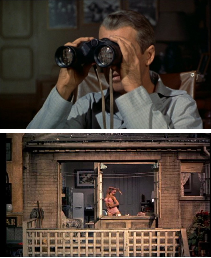
Not all editing that uses impressionistic editing must be as dramatic as a murder sequence. In fact, the Kuleshov effect is at play in nearly all editing, no matter how mundane. The shots that are assembled next to the shot of an actor’s face will necessarily effect our impression of his performance. In his films, Hitchcock routinely used an eyeline match to inflect a rather neutral, thinking face with an emotion created by a separate shot. His Rear Window (1954) showcases Jimmy Stewart, whose emotions and thought-processes are described almost entirely by eyeline matches. He looks out his window onto his neighborhood’s goings-on, and Hitchcock describes this gazing out in two distinct types of shots: Jimmy Stewart’s face and what he is looking at. By assembling a shot of a window view next to a shot of a face, we automatically assume that we are being shown a character and his gaze. According to the Kuleshov effect, Jimmy Stewart’s face does not need to change much in order for us to imbue his face with meaning based on the thing he is looking at. In the film, when an eyeline match tells us that he is looking at a beautiful woman, we believe that his face is imbued with desire, and when he looks at a depressed, lonely person, his face is imbued with sympathy.
Key Terms
The Kuleshov effect: The psychological principle that adjoining shots influence each other’s qualities in the viewer’s eyes.
Eyeline match: A shot of a character looking off-camera cut with a shot of an object. The cut suggests that the object is a point-of-view shot from the character’s perspective.
Discontinuity
Much of the editing we have been describing so far has fallen under the most common umbrella of the continuity system, or Hollywood system. This style of editing is designed to be as invisible as possible so that the audience can feel its effect without necessarily noticing its artistry. But another type of editing is discontinuous and aims to be noticed by the audience in either an obvious or subliminal way. Discontinuity editing does not follow conventional modes of editing from mainstream film, sometimes breaking Hollywood rules altogether, and it draws attention to itself as editing artistry.
In opposition to the long-standing convention of the axis of action and the 180-degree rule, which maintains directionality in conversation scenes, some discontinuous editing will intentionally break the 180-degree rule in order to evoke a sense of unease or disruption in the viewer. Japanese films of the 1930s were some of the first to consistently break this rule. Tense domestic arguments or power imbalances or swordfights would violate the 180-degree rule in order to evoke disorientation in the viewer.
Though in the 1930s, these violations were much more obvious since they were quite rare, now breaking the 180-degree rule has become quite common and has less of an obvious effect on the viewer. As we have become more film-literate and greater consumers of film material, it takes more radical editing choices to completely disorient us within the film’s time and space. But a subliminal feeling of disorientation might linger with some more contemporary 180-degree rule violations. For example, in Kubrick’s The Shining (1980), we watch a father played by Jack Nicholson slowly lose his mind and become homicidal. Some of Jack’s mental breaks are visually represented by 180-degree breaks. In one, he is filmed through a mirror and then this footage is assembled with similar shots of Jack directly in front of the camera – this gives the impression that Jack has shifted angles without moving and evokes an off-putting feeling to the audience. In another scene, Jack is filmed laterally as he is speaking to a door at the left side of the screen. As he picks up an axe to break the door down, the editor cuts to the opposite side of the room, crossing the axis of action, to show Jack swinging the axe towards the door which is now on the right side of the room. This gives the impression that Jack’s actions are erratic and the audience feels a visceral sense of mania.
In a more contemporary example, Nolan’s Dark Knight (2008) concludes with a tense interrogation between Batman and The Joker. As the two characters converse over a table, playing verbal games and outdoing one another’s wits, the camera moves around the table. Each time a character wins the upper hand in the conversation, the camera crosses the axis of action to reveal a power shift by switching the characters’ positions on the screen. Viewers are not necessarily meant to catch this camera trick, as it keeps moving around the action, but we are left with an uneasy feeling that our beloved Batman might not win this round.
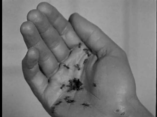
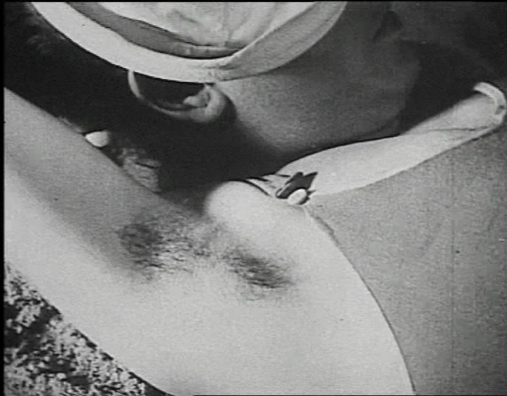
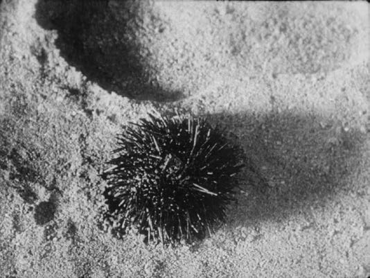
Other discontinuity techniques are also borrowed from film history and imported into contemporary cinema. Silent cinema developed many creative editing tricks in order to tell a story as visually, with as few intertitles, as possible. The graphic match was used in surrealist films like Un Chien Andalou (Buñuel, 1929) in order to compare two visual elements to each other. Like the surrealism movement in art, surrealist film favored collage and non-sequiturs as representations of how our mind pieces together seemingly random experiences into cohesive thoughts and feelings. (See Ch 1: Film History for more on surrealism in film).
By comparing an armpit to a sea urchin, Un Chien Andalou draws our attention to a visual simile: this armpit is prickly and scratchy like a sea urchin. When compared next to ants, both armpit and sea urchin come alive with movement. Each graphic match creates a comparison that inflects shots with each others’ qualities.
Art cinema of the 1960s and 1970s reused these early surrealist film techniques and raised their stakes. Kubrick’s 2001: A Space Odyssey (1968) famously matched a shot of a bone flying through the air four million years ago with a satellite in outer space in 2001. This match shot serves as elliptical editing, skipping over millions of years to compare humanity’s pre-history with human’s future. The editing evokes a sense of great evolution and also, perhaps, a lack of progress, as human’s connection to tools has not changed. Similarly, the match cut in Lawrence of Arabia (Lean, 1962) between a lit match being blown out and the setting sun over a desert evokes a sense of human power over nature. In both cases, graphic matches of the 1960s act as grand metaphors that dominate the themes of the films.
More playful editing violations of the continuity system poke fun at Hollywood conventions. French New Wave films of the 1950s and 1960s adopt American genres like gangsters and mysteries in order to twist them into parody by sapping them of their deep metaphors and grand heroes. Just like French New Wave characters float through life without many goals or aspirations, editing techniques like jump cuts describe these flippant lifestyles. Rather than use cuts to move between characters or between camera angles, a jump cut maintains the same camera position with the same footage, but takes out a small piece of film. The effect is jumpy and erratic, like a film mistake. The cut has not done anything for the progression of film time or film space, and so it is discontinuous, pointing attention to the mere fact of cutting in place without creating change or movement.
Often, discontinuous editing is described as defamiliarization, an art term from Russian Formalism (1910s & 1920s). Discontinuity takes material that is otherwise “normal” and through the form of editing makes it “strange”. The editing points to itself, thus showing itself off, and so it becomes visible whereas most editing conventions ask this art to be invisible. Films like The Graduate (Nichols, 1967) use discontinuity throughout the editing in order to create a sense of disconnection and alienation in the viewer – if you are constantly aware of editing tricks, it becomes difficult to immerse yourself in the story world and to identify with main characters. Other films, like Godard’s Contempt (1963) or even Chazelle’s La La Land (2016), use discontinuous editing in order to say something about filmmaking itself. In these films, which usually take place on a film set or are told through the eyes of a filmmaker, the discontinuity never lets the audience forget that they are watching a film. Fiction never becomes mistaken for reality. In this way, discontinuity is self-reflexive: it uses the art form to comment on the art itself and the form that it can take.
Key Terms
Discontinuity editing: Does not follow conventions of the continuity or Hollywood system. Points attention to itself by disregarding “invisible editing” rules.
Breaking the 180-degree rule: The camera crosses the axis of action in a conversation or fight scene so that each character flips positions in the screen with cuts. Creates a sense of unease or disruption.
Graphic match: Adjoining shots use objects that take up similar shapes in the screen. This creates a comparison between objects. In discontinuity editing, the objects usually have no relation to each other and the non-sequitur is jarring. In continuity editing, the similar shapes help to blend the two shots together and the cut becomes “invisible”.
Jump cut: A cut between two shots where the camera position remains the same. A small piece of film is cut out, so that the object on screen looks “jumpy”.
Editor’s Pick
1. What is a shot breakdown? A shot breakdown unpacks all the shots that make up a film. This slowing down of the film allows for alternative ways to examine the choices of its director from shot to shot. Choose a favorite film sequence and break it down shot by shot, creating your own shot list where you list each shot, shot size, cinematographic aspect (angle, movement, position), and editing cut or transition. What do you notice, or what can your shot breakdown tell you about the cinematic aims of your chosen film?
2. Editing challenges the structure and implicit meaning of a film. Think about how different editing styles can completely transform how the audience understands or perceives the same story. For example, create a simple story or scenario, such as two people meet in a restaurant when suddenly they are approached by a stranger. Draw four separate storyboards to show how you would edit this sequence if you were
- A Classical Hollywood film director
- A montage director
- A French New Wave director
- A contemporary directory of your choice
How does the plot and story change dependent on editing?
This chapter is adapted from FILM APPRECIATION by Dr. Yelizaveta Moss and Dr. Candice Wilson.
