11 Assignment: Full Page and Spread Illustrations
Dr. Jessica Boehman and Johanna Guzman
In this chapter, we will consider your next assignment, the second of three book-related illustrations. We started with the spot illustrations, which forced you to distill a moment into a small illustration, cutting out extraneous information and focusing on simplicity. In this next assignment, you will have the entire page–a splash which extends to the edges of the printed paper, or even a spread if you choose to use the two pages for one illustration. This will allow you to choose a moment of character development, drama, world-building, or action: it’s up to you! This is your chance to add to the world that the author has created and show how your imagination adds to this environment. It’s time to consider your characters (see the future chapter on character design): are they age appropriate, in-line with the character description in the book? Do they show the proper emotion for the scene? Do not hesitate to model pose or emotion for yourself–or get a friend to model for you–in order to get the expressions of face and body accurate. Remember, the illustration must communicate what you mean it to do.
Things to Consider before you Start
*Always be sure to thumbnail your ideas. At least three sketches is a good rule of thumb to push yourself to think differently.
- Whereas your spot illustrations took one small aspect of the story, a full-page should focus attention on a part of the story that is very dramatic, exciting, or that particularly captures your attention.
- Use composition, line, and value to direct the viewer’s attention to the most important part of the story.
- This is a narrative image! Portraits are not appropriate choices for full page illustrations. Be sure to pick a scene that tells a story.
- Be sure to ask yourself: how does my illustration add richness to the written text?
You will keep the same story that you picked for your spot illustrations, but this time you can stretch your legs–and your creativity–with a full page composition that tells the most dramatic, exciting aspect of your story.
assignment
Choose one scene from your story that sparks your imagination. Make three thumbnail sketches of your choice of full page illustration. NOTE: I am not looking for three different points in the story, but three visual solutions to the part of the story that you have chosen to illustrate. You should consider: setting, camera angle, composition, value placement, lighting, etc. to come up with three solutions. Sketches only!
Note for professors: Once the three sketches are complete, consider the worthiness of the the three and help the student to decide how to proceed with the finished illustration. At this point, you may want to ask for a combination of the three ideas, resulting in a further sketch, or even new sketches if they have not yet achieved the proper dynamism. We act as the editors, and this mimics the real-life feedback an illustrator would receive.
The Pitch
The Challenge
Project Specifications
By Johanna Guzman
In this chapter, I’ll talk about the full-page illustration, which is the second part of the three-part Fairy Tale project. I’ll share the process I followed, the tips I picked up along the way, and what I would do differently if I had the chance to revisit it.
I chose to illustrate The Mouse, the Bird, and the Sausage by the Brothers Grimm. I hadn’t heard of the story before, but I own a collection of their tales and decided to flip it open at random and committed to illustrating whatever story it landed on. The story is short, please feel free to read it from this site… but here’s a summary of the story: a mouse, a bird, and a sausage live together in harmony, each with their own household duties. The bird gathers wood, the mouse handles water and fire, and the sausage cooks. One day, the bird is convinced by another bird that he is being taken advantage of and insists they switch tasks. The change leads to disaster – the sausage is eaten by a dog, the mouse dies trying to cook, and the bird accidentally burns down the house and drowns while trying to fetch water. Their once peaceful life ends in tragedy.
I picked the scene where all three characters are about to meet their grim fate because it is dramatic and a key moment in the story. I had to show three gruesome endings, so I decided to spread it across two pages, which was pretty ambitious since we only had two weeks to finish each project. It actually took me four weeks to get it done, but Dr. B gave me extra time because of the extra page. I’ll share how I worked through the process to finish the illustration.
Thumbnail Sketches
I had already started sketching out ideas for the full spread while we were still working on the spot illustrations. Dr. B asks for at least three sketches per illustration, so I got a head start. Since the story I picked is pretty short, I planned out the full spread early on to get a better idea of where the two spot illustrations would go.
These were my first rough sketches. I like to work in thumbnail size because it’s easier to manage. It helps avoid burnout; it’s big enough to get the main ideas down, but not so big that you end up focusing on too many little details too soon. I usually keep them no bigger than a business card.

Other versions:

Dr Boehman’s Critique
The week we worked on the full spread, I had a decent number of thumbnails to choose from. It was basically a mix of individual spot ideas combined on one page. Honestly, it wasn’t that great, and Dr. B agreed. At the start of the class, she asked how we wanted to handle critiques. She said she’d take on the role of a client and would give feedback based on whatever level we were comfortable with. I told her to go all in and treat me like I was dealing with the toughest client she’s ever had. I wanted the real-world experience. The assignments were tough because I asked her to push me, but I think that approach led to a much stronger final illustration. Since the mash-up of spots wasn’t working, she suggested going with a domestic environment scene instead. The idea was to come up with a composition that would fit all three moments and still be visually interesting. Her take was, ‘Here’s a lovely house where these three lovely characters live in, but wait, look closely… something doesn’t look right.’
I made two thumbs, one for an indoor scene and another for an outdoor one. Because the illustration was getting more complex, I ended up needing two pages to fit everything in.

Dr. B really liked the indoor thumbnail because it had some calm, domestic feel to it. She also liked the composition. I had drawn each character’s death framed inside arches without realizing it. Amelia pointed that out later on during the day we presented the final illustration. It turned out to be an intuitive compositional choice that quietly tied their fates together.
The outdoor thumbnail was more graphic, “in-your-face violence,” which Dr B wasn’t thrilled about. I actually preferred that one. Like a lot of my classmates, I had the tendency to lean into the darker, more violent illustration choices. But she was the client, so I went with the indoor scene. (Note from the Professor: This is because we need to keep the audience in mind: this was for a Middle Grade book, where excessive images of violence are discouraged in imagery.)
Here are the pages of sketches made for this fairy tale:

Revisions and Final Composition
From the thumbnails, I used a water-soluble marker to sketch in the rule-of-thirds grid on each page. It is faint, the marker fades over time, but it helped at first with placing the focus areas. Later, I realized the thumbnails didn’t match the aspect ratio of the actual page size we were supposed to use. The final illustration had to be 8×10 inches per page, and I was doing a two-page spread, mine needed to be 8×20 inches (*plus the trim and gutter). I had to redo the sketch to fit that size while still keeping the composition aligned with the rule-of-thirds I had planned. The fastest solution I found was to take a picture of the sketch on my iPad and do line drawings in Procreate.

I work on a computer every day, and my eyes get strained pretty easily. I enjoy making digital illustrations, but these days I prefer working traditionally to cut down screen time. Drawing in Procreate was wearing my eyes down, so I just focused on the perspective guidelines and refining the focal scenes. For the rest of the space, I decided to wing it. I brought the sketch into Photoshop, resized it to match the final paper dimensions (two sheets of 12×9 inches taped together), printed it out, and lightly traced it onto my paper using carbon. After that, I went over the traced lines with a 2H pencil and kept the strokes light. It is important not to press too hard so you can erase it easily and avoid spending extra time cleaning it up later in Photoshop.
Research and Ink Rendering Swatches
At the start of the fairy tale project we had to choose the style we wanted to illustrate our story. I started practicing ink drawing the previous semester and wanted to continue it. This project was a good opportunity to get better at ink techniques under the guidance of a seasoned illustrator. Last semester I was practicing on my own.
I bought and borrowed several how-to and reference books. Here are a few that I own, and a link to the Youtuber who specializes in ink illustration content.

Resources for Ink Drawing:
Gustave Doré Remastered (The Divine Comedy)
Alphonso Dunn – Pen and Ink Drawing Workbook (Volume 2)
Henry Justice Ford – Maidens, Monsters and Heroes: The Fantasy Illustrations of HJ Ford
Chloe Gendron shared a tip that I still use today. Ink, like all other techniques, takes mileage to master. To avoid feeling overwhelmed, focus on studying just a small section of an illustration at a time. I used that advice to look closely at how different artists render elements that are in my drawing such as wood panels, brick, glass, cloth, stone, smoke, highlights, and shadows.
Here are a few of the small areas I studied and turned into simple swatches:

The ink swatches are small boxes where I practice rendering different textures. I keep them pretty simple so I can reuse the techniques on various objects. Whenever I come across an interesting or unfamiliar ink texture, I draw it in my sketchbook and test it out using different Micron pen sizes. These swatches have stayed useful over time, and I keep adding to them whenever I find a new reference or technique I like.

One important thing to keep in mind: if you plan to add a color wash over your ink drawing, you’ll need to use waterproof ink. The Sakura pens I used weren’t waterproof. You can buy archival waterproof pens, or go with a fountain or dip pen and use bottled permanent ink. The bottled ink is the more economical choice in my opinion, but very tricky to handle if you’re just starting out. I tried it first and ended up making a mess on my first spot illustration. Since the ink was permanent, I had to find a way to cover it up. After that incident, I decided to stick with Micron pens and skip the ink wash entirely.
The Drawing Process
Drawing the spread was slow. I had to keep a steady hand for all the straight lines, carefully shade the walls, and make sure the line thickness stayed consistent. That part gave me wrist cramps, so I had to work in short sessions. For areas with highlights, I used a worn-out .005 Micron pen with low ink to get thinner, more delicate lines. For the darker areas, I filled in large sections using a brush ink pen.
I made plenty of mistakes during the linework and covered it up with white ink. The downside to white ink is that it tends to clog Micron pens if you draw on top, so I had to be extra careful to avoid many corrections in the future. I used a bunch of reference photos for the household objects, shaded everything with pencil first, and then drew over it with ink. Once the first layer of ink was completely dry, I removed all the pencil lines using a kneaded eraser.
Add more values and darken the darks
Once the first layer is done, it becomes much easier to figure out your shading and values. Take your time with it. You can start by shading a section with pencil, which makes it easy to change things if something doesn’t look right. Start inking once you’re happy with the shading. Keep repeating this process until the overall values feel balanced.
It’s important to have strong contrast in your focal areas since those are the spots the viewer’s eyes will be drawn to first. In my illustration, the area with the highest contrast is the mouse boiling in the cauldron. I planned it that way to pull focus. Then, as the viewer’s eyes move around the pages, the rest of the story starts to unfold: the sausage about to be eaten and the bird falling into the well are revealed almost like a theater scene with curtains drawn halfway open.
Scanning, Stitching & Cleaning
I drew on two separate pages, so I had to stitch it together in Photoshop. I won’t try to explain the whole thing here. This video does a way better job explaining and walking you through. Honestly, following a video tutorial is easier than reading sequenced instructions.
In my merged pages, the images did not line up neatly. You can clearly see where the pages met, so I used the Stamp Tool to clean up the area. The video covers how to use the stamp tool too. After stitching and cleaning, I adjusted the Brightness and Contrast to make the lines pop more.

The Final Illustration
The final piece turned out pretty great. There are definitely some spots I would tweak like the fireplace (which I kind of overworked) but when I step back and look at the full spread, the small mistakes don’t bother me anymore. I still need more practice with stone textures, but overall, I think it came together nicely, especially given the tight deadline.
If I could go back, I’d suggest my past self to sketch and do all the line work for the furnishings and household things in Procreate first. It would’ve saved so much time and stress. Being able to move things around and test the layout digitally is way easier than sketching directly on the final paper and risk damaging it.
Also, if you can, invest in permanent Micron pens. Using ink washes for shading is way quicker than line work like I did.
If you’re on the fence about taking Illustration, go for it. It’s challenging, but you learn so much and end up making pieces you’re actually proud of.

Media Attributions
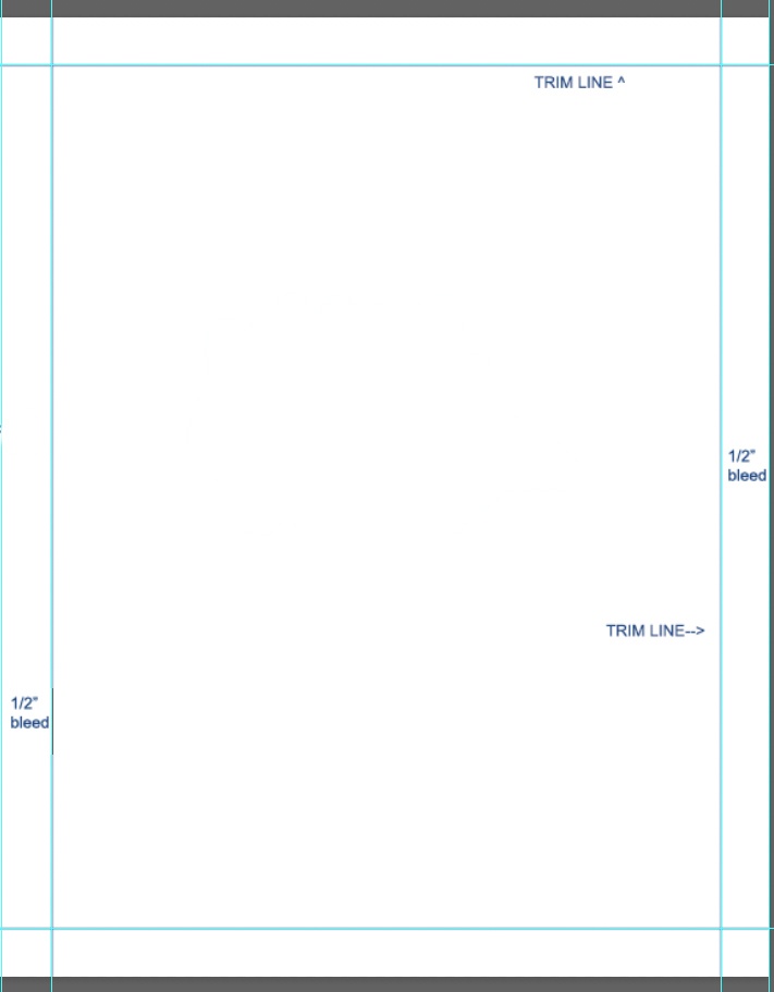
- full page template 7×9 with trim © Jessica Boehman is licensed under a CC BY (Attribution) license
- Johanna Guzman, Thumbnail sketches © Johanna Guzman is licensed under a CC BY-NC-ND (Attribution NonCommercial NoDerivatives) license
- Johanna Guzman, Thumbnail Sketches for The Bird, the Mouse, and the Sausage © Johanna Guzman is licensed under a CC BY-NC-ND (Attribution NonCommercial NoDerivatives) license
- Johanna Guzman, Refined thumbnail sketches © Johanna Guzman is licensed under a CC BY-NC-ND (Attribution NonCommercial NoDerivatives) license
- Pages of possible compositions for “The Bird, The Mouse, and the Sausage” © Johanna Guzman is licensed under a CC BY-NC-ND (Attribution NonCommercial NoDerivatives) license
- Laying out the drawing on Procreate. © Johanna Guzman is licensed under a CC BY-NC-ND (Attribution NonCommercial NoDerivatives) license
- Inking References © Johanna Guzman is licensed under a Public Domain license
- Samples of ink textures from various illustrations. © Johanna Guzman is licensed under a Public Domain license
- A swatch page of ink textures in a sketchbook © Johanna Guzman is licensed under a CC BY-NC-ND (Attribution NonCommercial NoDerivatives) license
- Merging two illustrations on Photoshop © Johanna Guzman is licensed under a CC BY-NC-ND (Attribution NonCommercial NoDerivatives) license
- Final Spread from “The Bird, the Mouse, and the Sausage,” © Johanna Guzman is licensed under a CC BY-NC-ND (Attribution NonCommercial NoDerivatives) license
an illustration that takes up an entire single page
A single illustration that covers two pages of a book. Sometimes called a double page spread.
