Include 10-15 pieces of work that is consistent in style and voice. (Fewer than this will seem as if you are not prepared. More than this is unnecessary, repetitive, or simply overwhelming.)
Your art should look professional.
This is actually a multi-step process:
–Keep your work clean.
Clean up your image before scanning or before having it photographed. There’s no need to see spills, smudges, fingerprints, or dust marks. Erase any smudges and trim any unsightly borders. After scanning or photographing, if it still needs to be cleaned up, do it in Photoshop or another photo editing program. Make sure you scan your work properly at 300dpi for print quality and save a copy under a different name at 72dpi for web purposes. Be sure to adjust for color and contrast (and that your monitor is calibrated). If you have digital details to add, like the covers of the books, do it now. If your portfolio is digital, you’ve got 90% of your work already done. If it’s print, then follow the next step.
—Get good quality prints!
It’s a bad idea to have originals in your printed portfolio, in case of theft or loss. In fact, some places, like illustration conferences, will not allow originals in the portfolio. So make a good quality print of your work that will capture the detail and color appropriately (hence the good scan tip, above). It’s not worth it to skimp costs here. This is how your work will be seen by the world. I prefer giclée prints for their crispness and color quality.
—Choose a professional presentation portfolio.
Shown below is a professional portfolio. It screws open and closed to allow for additional pages, and has clear, archival sleeves with black backing, just in case the picture does not fill up the entire 8.5×11″ space. It’s hardcover, durable, protects my art, and looks like I care. Your portfolio doesn’t have to be expensive, but should be clean and orderly and look like you are presenting yourself professionally. Sizes between 8.5×11″ and 20×26″, that can lie flat for tabletop presentation, are your best bet.
A hardcover portfolio
Your art should reflect your best as an artist:
–Leave out anything that shows your weaknesses.
Your work will be remembered by its weakest point. This sounds brutal, but it is true. Instead, play to your strengths. If you prefer drawing people, animals, in a cartoonish style, or are excellent at watercolors, inks, or some other medium, show that off! So:
–Choose only your best pieces.
10-15 good pieces are better than 30 mediocre images that show no real focus. Try to make sure that your work is coherent and forms a beautiful whole. Only show images that align with the type of art you would like to make in the future. Make sure that every piece is strong and shows off some aspect of what you can do, which leads us to…
–Consider subject matter
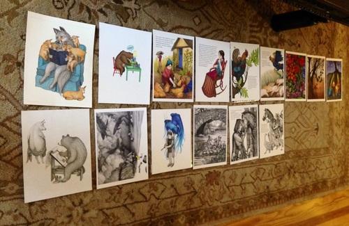
You may consider showing a mix of children, adults, animals, and even creatures. Character studies, with a variety of pose and facial expression, are a great idea. Make sure you show some environments and different lighting or atmospheric situations if appropriate. Make sure your images tell a story–it’s not a bad idea to show two or three scenes from a single story within your portfolio to show your ability to tell a sequential story with the same characters.
Illustrations for the Portfolio–Determining the Order
–Make sure your style is consistent.
Ideally, you will have nailed down a style before looking for work. You should look for a consistency of style. After all, if you cannot have a consistent style for ten works of art, an art director may not believe you can be consistent for your entire book project. Make sure that your voice is visible in your works and all works look like they are made by the same artist.
–Try to avoid work based on photographs (and/or AI)
Not only is it tricky from a copyright point of view to make works of art based on photographs, as they are based on another’s work that may be protected, but it looks like a crutch and does not show off your ability to think like an illustrator. It should be clear that work generated by AI has no place in an illustrator’s portfolio, so leave it out.
–Show published work if it coincides with your future needs
If you have other work already published, this shows marketability. However, if your work is in graphic design or another related but different field, perhaps leave it out. You might have a page at the back that lists credits in a resume form.
—Know your audience and prepare your portfolio accordingly
It’s important to know your audience. Trying to get graphic design work? Don’t show pet portraits. Trying to get illustration work? Leave out professional design work, like logos, and stay away from images that don’t tell a story, like simple portraits.
—Find the best order for your works.
Try to consider the flow of your works: grouping by theme, color, or composition are places to start.
—Get another pair of eyes to look at your work.
Speaking with illustration peers or professors is very helpful for arranging the portfolio. They will be able to see things that you will not.
—Start with and end with pieces that pop.
Why not make your best first and last impressions?
—Show both color and black and white.
Here I really speak from experience. Last time, I had an entire black and white portfolio, and the feedback I got? People were unsure if I could handle color, if I was unwilling, or even afraid to do it. Since they could not see how I used color, they could not visualize it, and just so. Each person uses color so differently that there is no real way to visualize how one artist will execute in color. So show what you can do–in color and black & white.
Make sure you are highlighting the type of work you want to make.
If you have great works of art in an older style, but it’t not what you want to be doing, leave it out. An art director or agent may want you for a style you do not wish to use anymore, so don’t show it to them in the first place. Show off the work you love now.
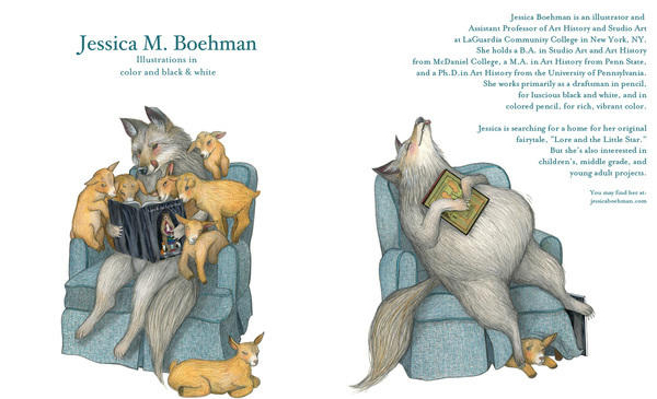
Don’t forget to introduce yourself!
Include a title page at the start and a bio page as well. I believe these images should match up in theme and style to other works in the portfolio. This set is from my old black and white portfolio, which had many fanciful creatures:
Jessica Boehman, Cover and bio page for a black portfolio in a black and white, fairytale style. Pencil. 2013.
Here is another that was based in narrative, a two-part story intended for the purposes of the portfolio only. It’s based on the fairytale of the Wolf and the Seven Kids by the Brothers Grimm.
Jessica Boehman, Cover and bio page with Wolf and the Seven Kids. Colored pencil and pencil. 2015. Used with permission.
If your portfolio is solely digital, make sure that your site is clean, professional, and free from any typographical errors. Bad spelling looks sloppy and sloppiness looks unprofessional. Use spell check in a word processing program if necessary and then cut and paste your copy into the website. Label your artwork with title, medium, and year of creation. Include an about me and a contact me page if you want people to be able to find you. Link to Instagram, Facebook, Twitter, etc. if you have a social media presence.
–Attach a book dummy if you have one.
Dummies, especially for work in the children’s markets, can show your ability to tell an entire story and plan a book over 32 pages.
–Have an artist’s presentation card to leave behind you
This card should have at least two examples of your work, alongside your contact information and website url.
–If your portfolio is solely digital:
Make sure that your site is clean, professional, and free from any typographical errors. Bad spelling looks unprofessional. Use spell check in a word processing program if necessary and then cut and paste your copy into the website. Label your artwork with title, medium, and year of creation. Include an about me, an artist’s statement, and a contact page if you want people to be able to find you. Link to Instagram, Facebook, Twitter, etc. if you have a social media presence. (Read the chapter on making an artist’s website).