16 Assignment: Illustrated Postcards for Self-Promotion
Dr. Jessica Boehman; Amelia Stepnowski; Johanna Guzman; and Isaac Ramos
The Project Specifications
- The card must follow the template specifications exactly –including file type, bleeds, size, and color profile–so that it will print properly. (See links below to download appropriate template)
- You will create two images for this assignment that work together to tell a story: one for the rerectocto and one for the verso of the card. Think of it as a two-part story. After all, you are pitching yourself as an illustrator.
- You should not use existing illustrations for this assignment. You will be making something precisely for this purpose.
- Try to think outside of the “self-portrait” mode and get creative! You can show anything you wish as long as it is appropriate for a wide audience.
- You must plan space within the illustration for your text to fit naturally.
- You must include your name, website, and whichever other contact information you wish to share (a social media handle or an email if your website does not have a “contact the artist” section). Your phone number is not necessary on a business card if you do not prefer to list it.
- Prepare three sets of refined sketches of your front/back concepts (six sketches in total–three different compositions and solutions for the front and back of the card). I will then give feedback and choose best of three concepts.
Using a Template
You can have postcards printed from many sites, and it’s imperative that you choose this first before beginning the design process, as you must follow the particular template used by that company. For example, moo.com offers many downloadable templates.
From here, you may choose which sort of template works for you: whether you are working in the Adobe suite (InDesign, Illustrator, or Photoshop), or another program, like Procreate, you can download the appropriate file. (Download the .JPG for Procreate or other non-Adobe programs). Open the downloaded folder of files and choose which works best for your design: landscape for horizontal images, portrait for vertical images. This template will open a file that is perfectly sized, has the proper resolution, and should open a file in the proper color profile, making this process just a bit easier for the user.
You will see a list of art guidelines, which you should keep as the top layer for your design, which you will hide or delete once you are ready to print. This guideline, which includes instructions (such as preferred file type and color profile) will also give you the safety area, the trim, and the bleed. Be sure to keep all text and important visual information within the safety area, and if you want color to extend to all edges of the card, be sure to have your design extend all the way to the edge of the bleed.
Other Considerations!
Like with any illustration, the drawing you make for this is not the final output. Because postcards (and business cards, which follow the same concept but are smaller) are small in size, you may want to draw your image larger and then reduce it in size for the final card. This will keep your design looking as crisp as possible.
Consider color! Since this is meant to be handed out or mailed, you want your design to be eye-catching. It’s not a bad idea to keep the same color scheme or palette for front and back for a unified look: remember, it’s the changing narrative of the two images that will add the interest even if style and palette remain the same.
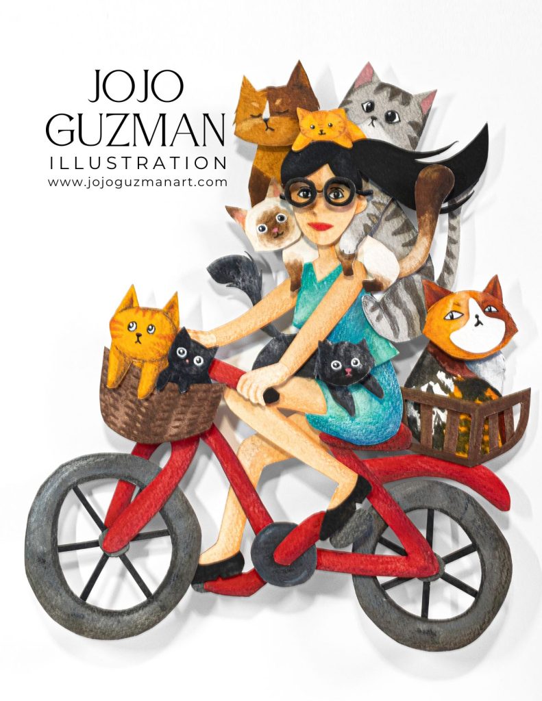
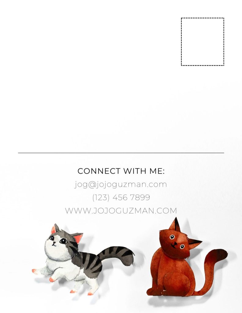
Consider style! The style should be the same on front and back or it will feel disjointed. (See the postcard by JoJo Guzman above. The design is simple, the style is the same front front to back. She picked a small detail from the front to carry over to the back, tying the design together and adding whimsy while still leaving room for text for a note and for an address and stamp.)
Consider Font! Lettering is communication, and if your font or hand-lettering is hard to read, change it. Make sure it is clear and easy-to-read. Generally, you should rasterize all text on your card (or convert it to a smart object) before sending it to the printer: in this way, a rare or imported font will be legible to other computers that might not have that particular font installed. If you fail to do this, your font may be automatically transformed to some other, generic font; this could change your formatting and overall look of the card significantly. Rasterization essentially turns the text into an image, so the computer does not recognize it as something foreign and it will print normally without glitching. You can do this by right-clicking the text layer and choosing “rasterize.” Once you do this, you cannot edit the text without retyping it, so be sure that it is correct before taking this final step.
Consider how you plan to use the card: Are you only going to hand these out in person, or have them alongside an in-person portfolio review at a conference? If so, you can have a full design on both sides. If you plan to mail the card, remember to leave room in the design for the address and any note to be visible (keep the color white or lightly colored) and leave room for a stamp. When printing your card, make sure to leave the back side uncoated so that you can write on it with a normal pen. (You can make the front glossy for best color).
Consider where you place your name. If you plan to mail the card to agents or editors, consider having your name on both sides. I heard an editor once say that if they like the art, but do not yet have room on the roster, they will hang up cards they have received. You want your name to be in their mind, no matter which side of the card they display on their board.
Interview with a student: Amelia Stepnowski’s Postcard design
Read below to hear about this assignment from a student’s point of view
(AS= Amelia Stepnowski, JMB= Dr. Boehman)
AS: This assignment shows off your abilities without necessarily having any guidelines, so you can really be open with what you can do. There’s a lot of flexibility, so you can literally do anything that’s appropriate for all viewing audiences.
JMB: So this assignment was the culmination of a semester where you had quite strict guidelines and restrictions as you worked with real and fictional clients. In the last two assignments of the semester, I opened it up so your imagination could run wild.
AS: Right, and it’s interesting because even in the sketch phases, showing the professor my sketches…because of our expectations of an artist’s postcard, you have free rein, you can do what you want, we kind of expected it to be a self portrait because it’s showing our own artistic freedom, something we want to do. So at first, the sketches were very “me-centered,” they were all self-portraits.

AS: Then, I had to try to think outside of the box. In your free time, you get to do whatever you want, but in a class it’s slightly different. You have these set expectations. So, I thought, “What’s important to me that’s not me?” I thought about stories my stories had told me about living in the country of Poland when they were kids, where people had animals. So I tried to do that, because it’s still in their behavior and therefore still reflected onto us. We are not city folk, even though I was born here, because of the way my parents raised us.
JMB: So what was your process?
AS: We had to do two-illustration story–to have the two sides connected through character or narrative. (Professor note: this was a requirement of the assignment: make this a mini narrative illustration). I started with the first sketch and then thought about the second half once I had my characters fleshed out.

AS: As you see in the final, they have picnic basket, the other dances on a broken wall with a gate. They are in the country, they are going on a picnic.

And then on the back, they are in food comas, relaxing in the shade, enjoying the day. Getting the sun shining through the leaves was hard for me to do, it’s still a little off. But I think it came out pretty well, on their faces.
JMB: That is a hard think to do. There is an illustrator, Briony May Smith, who has made dappled sunlight one of her calling cards. She’s got it down to a science.

JMB: I want you to speak to the anthropomorphic animals, fantasy creatures, that you tend to draw? It seems like you feel very comfortable making animals act as humans, and getting their expressions in ways that are believable and difficult to achieve–because it’s not like you can look at a reference of a dancing, smiling pig.AS: Yeah! Honestly, I think animals are more interesting to draw as people. You mix animal and human attributes, and that creates an interesting challenge, you have to make them feel human without making them look uncanny. So you need to make it in a way that it looks like an animal that could walk and talk but not make it so weird that their legs look really weird, or their faces don’t look animal enough.JMB: I feel like you have a nice balance there, because they still have the structure of the animal, yet they are standing in ways that don’t feel unnatural. That’s one of the real strengths of your style that I noticed over the last year.
What advice would you give to a fellow student approaching this assignment of an artist’s postcard? And would you change anything now if you could go back?
AS: So no, I would not change anything. I got to work in color, and that was super fun. Advice? Just have fun: it’s an open assignment, open your mind, be creative. It could turn into anything and it’s whimsical in that way. You can push yourself out of your comfort zone and discover something new about yourself as an artist. Push yourself and have fun.
Interview with student Isaac Ramos
(IR= Isaac Ramos, JMB= Dr. Boehman)
JMB: Was this assignment useful, and if so, why?
IR: It was actually useful. It was really helpful. I remember the process we went through. You were always taking your time to go one-on-one with students. I remember at the beginning of the course you asked us “What do you want to work on?” and I remember that one of my goals was to work more on the backgrounds, because usually I focus more on the characters as the main subjects, but perhaps without a narrative. So I remember showing you my first sketches, and you definitely didn’t like them. You were like, “These are cool, but this is not what I am looking for. They need more work.”
JMB: If we can think back to those sketches, if I am remembering correctly, they were more closely based on photographs?
IR: Yes, exactly.
JMB: And so I was pushing you to go more into your own style, and I think what you came up with is really amazing. This is really beautiful. In terms of information that you think that illustrators should have, was this useful?
IR: Yes. Although I do not consider myself an illustrator–I want to be an art teacher–but it is helpful because when you go to fairs and there are people who like your work, you want a card. I had an experience where I was showing in a gallery and I didn’t have a card. So I had to tell people my contact information. I didn’t know what to say, haha, besides “Follow me on Instagram!” One of the things you told us, was when we give a card to a person, it’s not only something they can remember easily, but is also like a gift, a small print or piece of your art. So yes, an illustrator or artist should have some sort of presentation card.
JMB: How did you approach the assignment, or what was your process?

IR: After receiving the feedback from you that I needed to keep pushing myself, I got into my head a bit, trying to see exactly what was my voice. I think I did it a little bit directly, because the image that you see here is the street where I grew up. I was thinking about the things I told you I wanted to improve, like I said one of them was backgrounds and the other was narrative. So I had to come up with an image where I could show that I could do narrative illustration, but I can also work on having a background, and combine them together. So I started thinking about things that I did in the past, the things that I imagined as a child. For example, the image of the children riding in the wheelbarrow, is an actual memory of me and my friends when we were younger. And I wanted to add a little magic to it. I wanted it to be magical.
JMB: I think that sounds right. This Doña Toña: was this on your street?
IR: There is a store there, but Toña is my mom, her name is Antonia, so I wanted to add little Easter eggs in there. Also, in the background, there is a thing in Mexico, when there is a concert or a festival, instead of using billboards, they go to the walls and use graffiti instead, and put the information on the wall: on this day there is going to be a party, come and join us. In this case, I put “LaGuardia” there like it is the name of a music group or something like that.
JMB: What medium did you use?
IR: Gouache, watercolor, and colored pencil, with Canva for the text.
JMB: You talked about this a little bit already, but are there other cultural references in here?
IR: It was heavily inspired by my culture, the pop culture or things that are closer to me, like the man who is in the back, sitting on the wall. That is a traditional dance from La Mixteca Poblana, the region I am from, called Tecuanes, and the dancers are called Huehues. It’s passed from generation to generation, and different towns call it different things. My town is Puebla, and we call it by those names there.
JMB: The skeleton is very common in Mexican culture, but what about the flying snake?
IR: I always used to draw these…with butterfly wings or bird wings, I guess it comes from Quetzalcoatl, a serpent deity. But I also see it as sort of an alebrije, a made up character, based on sculptures that are made of different parts of animals that are supposed to be from your dreams.

JMB: If there was another student–or maybe one of your own students who was going to be doing this, since you’re going to be a teacher–what advice would you give them for this assignment?
IR: I think I would tell them just as you told me, to challenge yourself. Do not see this assignment just as showing a random work of art, but one that tells people the type of art and the type of skills you can give them if they hire you. Something you are proud of, that engulfs all of the skills you have.
JMB: Is there anything you would change about this if you were to do it again?
IR: Yes, I think I would work more on some technical parts, like the shadows. I like how it looks, but I could have done better, but there was a deadline. There are always things you can change. Maybe the trees.
JMB: That’s funny, I really like the trees. The setting is very evocative, like I know how it would feel to go to that place.
Key Takeaways
- The student has learned to work in precise templates for printing.
- They have considered which images best represent their unique style
- They have made a mini-narrative of two images that work to tell a two-part story for self promotion
- They have practiced using hand-lettered or digital text and layout
Media Attributions
- “Bike Ride” postcard design, final © Johanna Guzman is licensed under a CC BY-NC-ND (Attribution NonCommercial NoDerivatives) license
- Back of “Bike Ride” Postcard with cats. © Johanna Guzman is licensed under a CC BY-NC-ND (Attribution NonCommercial NoDerivatives) license
- Amelia-self portrait postcard sketches © Amelia Stepnowski is licensed under a CC BY-NC-ND (Attribution NonCommercial NoDerivatives) license
- Amelia sketch 2 postcard © Amelia Stepnowski. is licensed under a CC BY-NC-ND (Attribution NonCommercial NoDerivatives) license
- Amelia–front of postcard © Amelia Stepnowski. is licensed under a CC BY-NC-ND (Attribution NonCommercial NoDerivatives) license
- Back of Postcard, Amelia Stepnowski © Amelia Stepnowski is licensed under a CC BY-NC-ND (Attribution NonCommercial NoDerivatives) license
- Isaac Ramos, recto of artist postcard © Isaac Ramos is licensed under a CC BY-NC-ND (Attribution NonCommercial NoDerivatives) license
- Isaac Ramos, verso of artist card © Isaac Ramos is licensed under a CC BY-NC-ND (Attribution NonCommercial NoDerivatives) license
The front of a piece of a manuscript page or artwork on paper
The back of a piece of a manuscript page or artwork on paper
The area on a printable object where nothing will be trimmed
an area added to the edge of an illustration that gives room for the printer to cut the paper to size; this is often around 1/2" of extra space around all edges of a drawing.
Extending the image past a trim line so that the illustration prints to the edge of a page.
