12 Assignment: The Illustrated Book Cover
Dr. Jessica Boehman; Arnold Tatis-Algarin; and Isaac Ramos
We do judge books by their cover, don’t we? At least, in the world of art, we do. The cover’s job is to get a reader to pick the book up amongst a sea of choices. It could be bold, graphic, colorful, playful, humorous, creepy–and it must not give too much away. A cover illustration must be conceived of differently than a narrative illustration, for it must encapsulate the feeling of an entire book–not just illustrate an important scene. It’s the visual thesis statement. It mixes design with illustration, and must include text.
One of the great, fun challenges of a book cover design is that it can stretch across the spine, through to the back of the book, and even over the interior flaps, if desired. Though the front cover is most important, the back needs to leave space for a summary, promotional blurbs, and ISBN number and barcode. An illustration needs to plan for these things at the start instead of trying to cover an illustration.
Due to the nature of an open-access textbook, I can only embed images here that either are in the public domain or that we have permission to use. I will link to books with iconic design, but please also consider these older examples that still endure.
The Book Cover Throughout History: A Very Brief Look
In centuries past, book covers were precious items of gold and jewels–these bindings for a codex were considered fitting offerings for what were, essentially, extremely expensive, labor-intensive offerings to God.
Consider the 9th-century A.D. jeweled cover for the Lindau Gospels in the collection of the Morgan Library: the staggering expense of the cover lets us know that the contents inside are priceless, a rare, couture work of art:

After the invention and proliferation of the printing press in the 15th century, and the eventual rise of printing with industrialization, book covers became the domain of illustrators, starting in the 19th century (1000 years after the Lindau Gospels above). Much more inexpensively made, but some still utilizing gold leaf, new colored printing techniques, or embossing, covers still were meant to tantalize the viewer, to get one to touch, open, and read the book.
While today, the author’s name and title of the book is given priority, in the 19th and early 20th centuries, this was not always the case. How much better to tempt the viewer with a clever or beautiful illustration on the theme of the book? The title, after all, would be visible on the spine, the part of the book which would be visible when the book was housed on the bookshelf.
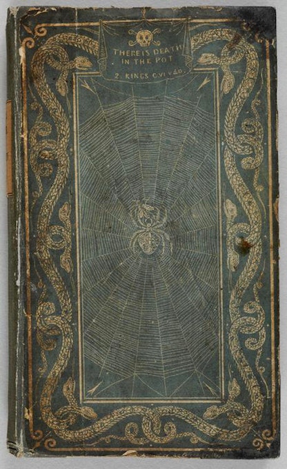
Take, for instance, the cover for A Treatise on Adulteration of Food and Culinary Poisons. The gold leaf cover shows us interlocking snakes and a poisonous spider in the middle of her web, with a skull and crossbones with inscription above: “There is Death in the Pot.” So much more inviting than the rather drab title, no?
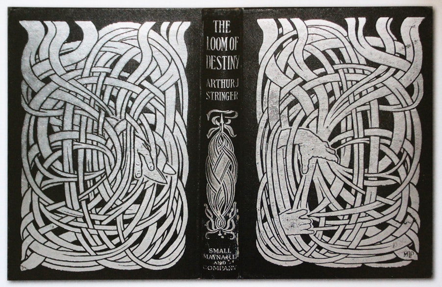
As does this silver-embossed cover, whose elaborate designs are interwoven in spirit–if not in actuality– over the front, back, and spine:
The Pitch
We have done two previous assignments based on a single story: the two spot illustrations and the full page illustration. Now, we will practice thinking conceptually and graphically for the last of the narrative assignments by designing a book cover. It’s time to think about what image will be the perfect thesis statement for your book: the one that sums up the feel of it without giving away the story.
We are preparing as if a press wants to print your book based on your fairytale. You will need a front, spine, and back cover image to fit within a prescribed template.
Take a look here to take inspiration from lots of great examples that are not in the public domain.
Project Specifications
-
be clear
- be in color, unless deliberately chosen to be in black and white
-
be graphic
-
be easy-to-read
-
be eye-catching
-
prioritize the title and author’s name *(title should be largest, author name should be about 50% of the size of the title)*
-
consider the spine design, which should include author’s name, title, and publisher logo
-
consider how the front and back work together
-
leave room for a blurb, the publisher’s logo, and a ISBN code

Utilizing a Template:
If you use a template, you can use it as a measuring guide for working traditionally or import it into whichever digital program you prefer and keep it as a locked layer at the top of your drawing. Most templates will be transparent—this one is not, so you can reduce the opacity on it or sketch on a layer over top of it. As you work in sketch phase, you can make sure nothing of import falls within the gutter or bleed areas. Be sure to extend the color to the edge of the bleed—not just to the trim line—if you want to have color to the edge of your printed, trimmed page. Once you start drawing, you can hide the template layer.
Proceeding with the Assignment:
Client will expect to see three finished concept sketches in color. Be sure to receive approval from client (professor) before proceeding to the final work.
Interview with student Arnold Tatis-Algarin
Read below to hear their thoughts on design and on the process of creating a cover for folktale El Silbón
(JMB= Dr. Boehman; ATA=Arnold Tatis-Algarin)
JMB: Do you think that this particular assignment of working on a middle grade cover was useful?
ATA: It absolutely was, working within those perimeters. It was useful being able to explore more of my strengths as an illustrator and the mediums I was most comfortable with and the way I was able to utilize them. This project in general was my first real experience using ink with a small no. 2 round brush and a dip pen with two general calligraphy nibs. It was something I always wanted to try and never really had something to use it for until now (Professor’s note: the three assignment arc of narrative illustrations for middle grade required black and white for the first two assignments; students were free to use color for the cover). The whole project helped me to explore that medium and make me realize it’s one of my strong suits.
JMB: So what did you like about the ink?
ATA: It’s an unforgiving medium—I mean, whatever you put down is whatever you put down, so I guess that unforgiving nature really helps to build confidence as an illustrator in terms of your line work and your composition.
JMB: Did you feel like you had to really plan out where you made your marks, or did it become more comfortable as you went on?
ATA: A bit of both, actually. At the start (for the spot illustrations), I had to go through three separate drafts as I was getting used it it, because before I drew very spontaneous. With ink, you have to strike a balance between being sure with what you want to do—a plan, a sketch—with the free flowing nature of the medium itself. Once you get comfortable, you can just do what you want, as long as you stay within those perimeters you make for yourself at the beginning.
JMB: This particular assignment, out of all of the assignments in this course, is the closest to design, as opposed to illustration. And I always say that Illustration is the child of Fine Art and Design. So do you feel like that came into play with this particular assignment?
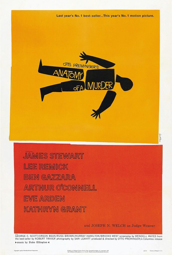
ATA: Yeah, absolutely. To be honest, I haven’t really gotten into graphic design just yet, but I do find it has some sort of influence in terms of how I think about my art. I’ve always been drawn to really graphic illustrators, like Saul Bass. I just find his style of design work to be the best. It’s simple but it’s not—I would say that being simple, to the point, is more difficult than it looks.
(Professor’s Note: Saul Bass was a prolific graphic designer from the 1950s through the 1980s, working mainly in logos and iconic movie posters and their animated opening credits).
JMB: So you’re saying it’s more difficult to be simple than it is to be complicated.
ATA: It’s antithetical to the general opinion of art in general, especially from an outsider’s point of view, to see simplistic shapes and colors as not real art, like they look at Jackson Pollock, and they say, “My fetus can do that.” But, once you immerse yourself in that world and get familiar with the fundamentals, it’s not simple at all. The hardest thing about creating art, especially for a professional, is to keep your ideas simple and readable.
JMB: That’s one of the ways that design in illustration has such a big influence. Because design needs simplicity, but in order to achieve that, it takes tremendous skill. In order for it to function properly in a simple way, you have to be precise, have a lot of attention to detail. You’re looking at every little detail.
ATA: And you have to be really confident in your abilities as an artist, and your style especially. You need to find everything that works with you as an artist in order to translate these grandiose concepts into something small and to the point. That’s what makes Saul Bass’ work function. In the Anatomy of a Murder poster, we look into it, it portrays the concept or general idea of a movie. It works as a thesis statement to the movie. The amount of time and effort you had to go through to get to that point.
JMB: A lot of experience. I mean, it’s possible it didn’t take him that much time at all. It’s hard to tell. For instance, the I Love NY logo was sketched out on a napkin in a taxi. I mean, it was changed from there, but the original concept was quick. And then designer Paula Scher of Pentagram said something to the effect of, “If I don’t get it in my first try, I am not going to get it.” So I think it’s the life experience of looking. This is why I always say you have to look at as much work as possible, and then the experience of making is going to train your eye and hand to do it quickly. But it would have taken him his whole life, at the same time: a lifetime of experience in order to do something quickly. So that’s why if people ever say to you, “How long did that take you?”, the only correct answer is, “My whole life.” Because if you say, “This took me an hour,” it’s devalued. My guess is it didn’t take him an hour. But I bet it didn’t take him as long as you would think. But I could be wrong. I wish we could talk to him.
OK. So, you’re excited about the simplicity of Saul Bass’ design work that you were able to tap into. Is that different from the way that you normally work?
ATA: I guess, up to that point, I would say so, because generally I approach my art in a different way. I usually have a lot of anxiety about starting and finishing pieces. I am a pretty bad perfectionist, and I will usually worry so much about detail and about comparing myself to others in my field in a professional or social setting, but this project in particular really helped me to discover my artistic and illustrator voice and strengths.
JMB: So what do you think your strengths are?
ATA: Playing with negative space in a way that represents my ideas in bold, graphic way.
JMB: I agree. I think that playing with negative space is one of your strengths, and if I recall, pushing you in that direction a bit, trying to get you to tap into it. I haven’t had a lot of students who I have pushed in that particular direction, so it was exciting for me to see that this was a skill, that’s kind of hard to develop, and Arnold looks like he wants to go in that direction, so just push and see if that can happen. So that was fun for me.
How did you approach the assignment from concept to fruition?
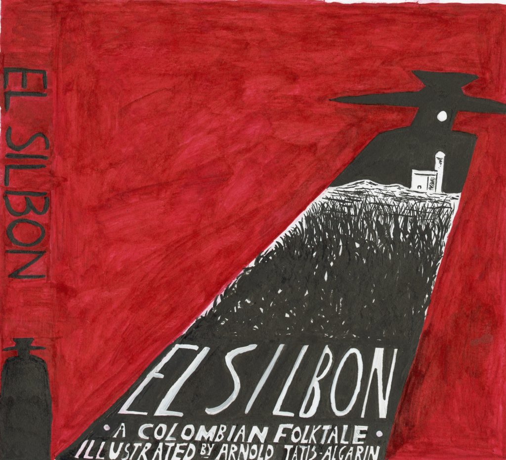
ATA: My story, the legend of El Silbón (“The Whistler”), was chosen for its ties to my Colombian heritage and the potential I saw in its graphic content. Despite several regional differences on how it’s told, the general summary follows a selfish young man who meets a brutal end by his family as penance for the slaying of his father, ultimately being devoured by a pack of starving dogs; after which he is reborn as a tormented spirit forever carrying a sack of his father’s bones, traversing the lands with a distinctive whistle that grows more distant the closer he is. The primary idea I had for my cover design was prominently utilizing the silhouette of the titular El Silbón; within his silhouette would be the moonlit farmland that served as the tale’s primary setting, with the full moon simultaneously acting as a pseudo-eye; the book’s title would be housed at the bottom of the silhouette. Starting with concept sketches: I think you helped a bit with this but I knew from the start I knew I wanted to go in a poster direction.
JMB: So you wanted a book cover that could double as a poster?
ATA: Yes, I seriously did want to channel mid-century graphic design, and the commercial art from that period, Milton Glaser. Keith Glaser. Pop Art. The design philosophies from the 50s, 60s, 70s, the simplicity. Soviet Art. German expressionism. I am not a fan of how graphic design has shifted in the recent years where everything looks like it’s in a corporate mold. I like the stuff with unmatched personality and soul that breathes life into it.
JMB: Did you want to speak to any particular sketches?
ATA: Absolutely. From the start I had an idea of the direction. I wanted the silhouette of El Silbón.

JMB: It’s got a kind of Hitchcock vibe to it.
ATA: Yeah, like Vertigo.
JMB: Which is also Saul Bass. But even at the beginning of the Alfred Hitchcock show, he would have his shadow. And in the original Nosferatu, with the way they used the shadow of him creeping in.

ATA: Yes, absolutely.
JMB: Why are you not a graphic designer, Arnold? (Laughs)
ATA: (Laughs). Hmmm, I’m only 21! I’m thinking about it, ok?
JMB: You need to go in Milton Glaser’s mold, where he trained as an illustrator, but did most of his work in that illustration/design space. That’s probably your sweet spot. If you look at him as some sort of guiding light. His work is heavily illustrative. All of the people he worked with when he first started Pushpin Studios were all illustrators. And that’s how they saw themselves, as illustrators who were doing design stuff.
Looking at the final sketch: You have the landscape embedded in the silhouette. With the moon as the eye.
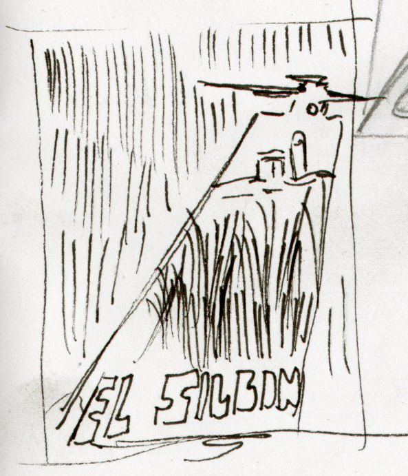
ATA: So yes, that’s my final sketch after you helped me out with the composition. Can we show your sketch?
JMB: This little doodle?
ATA: Yes, with the spine and his silhouette.
JMB: So, this three lines that I drew was really helpful?

ATA: Yes, because I was struggling with the composition. I knew I wanted the town and farm landscape to fit inside his silhouette, but I was really struggling with shape and format. Looking at your sketch, you helped me out with giving me a strong guideline with how to follow through with my design.
JMB: You were nearly there, I just nudged you a little bit.
ATA: I was struggling with not making it too complicated. We keep coming back to it: the hardest art to make is the most simplistic, and I didn’t want my art to get too complicated. I mean, this is a book cover. It’s supposed to sell the book.
JMB: So if it’s not intriguing, you’re not going to pick it up the book.
ATA: Complexity is not my thing.
JMB: So the KISS principle I taught you is helpful?
ATA: Keep it Simple, Stupid!
JMB: We can maybe change it to silly. Or Sweetheart.
ATA: No, to Silly!
JMB: I learned that from Mr. Weir in 9th grade Geometry class in Frederick High School; it was related to solving theorems, but I have found it’s more useful in art than it is for geometry—which I rarely have to use.
ATA: So, with your input, you really helped me to get a complete idea of how I could format this before I got started inking the final. So I don’t make any mistakes or mess anything up. Using ink is something you can’t do right off the bat.
JMB: I think if you only work in ink, you’ll get to that point eventually. So, what advice would you give to a fellow student approaching as assignment like this?
ATA: Draw on your interests in media, arts, your aesthetic in general. From my experience, some students get intimidated with projects like this, and they will overthink it. It has to be the best I can do.
JMB: You mentioned sticking to your aesthetic. Do you think there is a threat of losing your voice on these sorts of projects?
ATA: Yes!
JMB: So one of the things I tried to communicate in this class is that we’re imagining that when working with clients, they have hired you because they like YOUR style. So I don’t advocate changing styles—just finding a way to make your voice work for the project. We’re not trying to get you to draw in someone else’s voice. We’re trying to get you to do the best you can do in your own voice, which is the challenge! But I want that voice of yours to come out.
ATA: Yes, that was the main challenge of the class. That and keeping the same momentum and energy going was hard. I have to give it my all, or else I’ll fail.
JMB: So what did you learn, then, about the concept of professionalism?
ATA: Just don’t overthink it. Just do it! I’m aware that the hardest part of the assignments is starting them. Getting stuck in sketch phase. If it’s not perfect…then I’m not perfect. The advice I would give is stop thinking about all the drafts and just get working. Drafts aren’t supposed to be perfect. It’s just an idea, just a sketch. Put your energy into crafting the final version, and make it as “yourself” as possible. Don’t worry about being the next Saul Bass or Milton Glaser. Just be the best “you.” These projects are a way to improve yourself and get comfortable with yourself as an artist.
JMB: Would you change anything about this if you could go back and do it again?
ATA: In terms of changing anything specific, I wouldn’t say so. But doing it over again, now that I’ve gotten more confident with my style, I would love to approach that project again.
JMB: So you could do a side by side comparison? It’s very satisfying.
ATA: I would love to see what I could do now.
JMB: It’s only been 9 months! You’ve grown that much in that time—that’s great.
ATA: I really have gotten to make myself feel at home using ink and using analog techniques. It’s crazy to think how far I’ve come in finding my voice in that time. I’m pretty excited to see how I’ll do in the future.
JMB: Ideally, you’re going to be constantly changing and improving. If you get to the point where you think you’re the best, you’re dead in the water. Forget it. You’re done. Your interests will change, your style might change, and that’s ok. You might get bored and want to try to conquer something else. It’s a challenge to keep pushing yourself. It keeps it exciting, it keeps you young. Creativity is one of the great revitalizers, in some ways.
Interview with student Isaac Ramos
Read below to hear his thoughts on finding his voice in this assignment, which was inspired by the folktale The Man Who Became a Buzzard, but felt oddly personal…

(JMB= Dr. Boehman, IR= Isaac Ramos)
JMB: I love this book cover. It’s so nice. So this was the third assignment in a larger book project. We started with spot illustrations in black and white, then we did a full page or spread illustration, and then this was to do a front and back cover in color related to the same story that you had just illustrated. This seemed like it was one of your favorite assignments for the semester. How did you find the process of working on these narrative illustrations, and in particular, the book cover?
IR: Yeah, I think that the whole process of working on that was a really good learning experience. From the three things I did, this is the one I was most happy with. Even now, looking back, I think the three assignments don’t make sense to go together in one book as the style and aesthetics changed. But yes, I definitely like it, because it was not just the challenge of doing an illustration that portrayed the essence of the book without giving too much away…I think that was one of the points that you mentioned, right…finding the balance between attracting the eye of a child looking at the book and then also not putting there anything that doesn’t make sense or gives too much away about the story. I don’t remember if this is something that I first came up with—or maybe you had some input on it. (Laughs). I don’t remember.
JMB: True, I don’t remember the exact process. I remember you sketching it out…I wish I had the sketches because I can’t recall. I remember being slightly worried as you were working that this was not going to look like what I had pictured in my head. But as you continued to work on it, it came out really beautifully. I think we may have talked about composition and—I don’t remember if the bird shadow was overlapping his face at the beginning. I think there was. But, I don’t know!! It may have been a collaboration between us.
What medium did you use?
IR: This is gouache, colored pencil, and some watercolor.
JMB: So you used gouache for the figure and the shadows of the birds.
IR: I did a base in watercolor, but it wasn’t as saturated as I was hoping, so I covered it in gouache. And then I added the details in colored pencil.
JMB: Colored pencil takes nicely to the top of watercolor or gouache. So that’s a good combination. So this particular story was about a man who wanted to be a buzzard because he was too lazy as a man. So this particular illustration, in my mind, was really nice because it is really graphic. We see the portrait of the man, the shadows of the birds, and it doesn’t give away too much information. So it’s very conceptual, which I think works very nicely for a book cover. It also looks like he’s floating in the sky, which is nice because he wants to be bird. Instead of making the background green, the blue makes it more magical, which ties it in with the other work that you do.
IR: That collaboration aspect is one of the things I liked about your class. I don’t know if I mentioned that. You really take the time to go and talk to each one of us. It’s not like you are changing our minds, but you are giving us advice and that definitely helped. In the end, it’s my voice, but your input—you were trying to challenge me to come to this final piece. Because like I said, I keep trying to remember where the shadow came from. I think I had it in one of my spot illustrations where I had the shadow of a man.
JMB: That might be right. I remember talking through the shadow.
IR: One of the earlier illustrations had the shadow of a man in the bathroom. So you were like, “You should go back to this concept of shadows.” Because I wanted to put birds around the man to show he was lazy, and looking at the sky. One of the things is that I kind of related to the man. So I thought, what would it be like to be me, just being lazy, on the ground looking up at the sky, appreciating it from down below.
JMB: I am glad you appreciated that feedback time, because that’s my favorite part of the class, too, honestly. So if there was something you could go back and change now, what would it be?
IR: Ooh, ok. For this one, I think that I wouldn’t change anything. But in the whole three-project arc, it would be nice to go back and make them cohesive with the style of this cover.
JMB: Hmm. It seems to me that in the process of making these three sets of illustrations, you found your voice. This painting is closer in style to the other works you did later in class. So you kind of figured it out. It’s a difficult thing when you’re first getting started with illustration: trying to figure out what is your voice. So that would be interesting. What would the interior illustrations look like if you could do them in this style? You could paint them in greyscale, if that’s what you feel comfortable using. This played into your talents of painting and using vibrant colors. I think that’s normal. As you go forward, you have a better sense of your illustrative style, if you ever decide to use that.
IR: Ok, maybe I would change the font. The book is based on an old Mayan story. I wanted to make it more modern day, But that’s not the best font I could have chosen.
JMB: Keep in mind, most of the time you won’t be the one doing the font. You would do the illustration and a graphic designer would do the text. Thanks so much, Isaac!
Key Takeaways
This assignment is a hybrid of illustration and design.
- Students will have learned to work within a template
- They will have practiced hand lettering or digital lettering for legibility and drama
- They will have practiced making an illustration that is simple and eye-catching
Media Attributions
- Cover of the Lindau Gospels © Workshop of Charles the Bald adapted by The Morgan Library is licensed under a Public Domain license
- A Treatise on Adulteration of Food and Culinary Poisons. © Illustrator unknown adapted by The Public Domain Review is licensed under a Public Domain license
- The Loom of Destiny. © Illustrator unknown adapted by The Public Domain Review is licensed under a Public Domain license
- Basic Layout template © Jessica Boehman is licensed under a Public Domain license
- El Silbon Final Cover. © Arnold Tatis Algardin is licensed under a CC BY-NC-ND (Attribution NonCommercial NoDerivatives) license
- Anatomy of a Murder © Saul Bass is licensed under a Public Domain license
- Concept sketches, El Silbon © Arnold Tatis Algarin is licensed under a CC BY-NC-ND (Attribution NonCommercial NoDerivatives) license
- Nosferatu is licensed under a Public Domain license
- El Silbon final sketch © Arnold Tatis Algardin is licensed under a CC BY-NC-ND (Attribution NonCommercial NoDerivatives) license
- Professor’s sketch, El Silbón © Jessica Boehman is licensed under a CC BY-NC-ND (Attribution NonCommercial NoDerivatives) license
- The Man Who Wanted to Be a Buzzard © Isaac Ramos is licensed under a CC BY-NC-ND (Attribution NonCommercial NoDerivatives) license
a medieval bound manuscript book, made by hand
