3 Materials and Media
Dr. Jessica Boehman
Each illustration, assignment, or commission will have different needs in terms of the materials and medium you choose. You may find, however, that there are those that work best with how you think creatively, with your chosen processes, or with your level of patience with art. In this section, we will explore some of the common mediums that artists use; however, this is by no means intended to be an exhaustive list.
Learning Objectives
In this section, we will explore working processes of various media with examples of different effects that each medium can create.
Pencil
Pencil is the most basic, and most fundamental, of media. It’s the one that you carry with you, the one you use to sketch, plan, and play. But it can also be used for finished illustrations, as well. The medium has been around for hundreds of years, and will stick around forever.
Pencils are the go-to medium for planning. Cheap, portable, and erasable, pencils give artists the flexibility that many other mediums do not. Below, we can see John Flaxman’s pencil lines, pentimenti, beneath the finished line drawings. Given the clarity of his lines, these pentimenti allow him to sketch, finding the proper poses before adding the more permanent medium of ink.

In this 19th-century drawing by Adrian Ludwig Richter, you can see that artists have used pencil in the same way for the last many hundreds of years. He’s sketching, playing with composition, value, and pose. He renders in hatching.

Types of Pencils
Artist’s pencils come in a range of hardnesses from Bs (soft leads) to H (hard leads). Each type of lead is given a number–the higher the number, the harder or softer the lead is (for instance, a 6B is significantly softer and darker than a B, and a 6H is significantly harder and greyer than an H.) You will find a use for some or all of the pencils, depending on your style. The Bs are good to achieve rich blacks, but are much softer and therefore much more friable. They will leave more of the texture of the paper behind. The Hs are harder and therefore must be used with care. A light touch will result in a lovely, even, soft grey that blends away the texture of the paper, and can be layered over B pencils to negate the paper’s texture, as well. But press too hard with H pencils and you will dent or even tear the paper. Below, I’ve added two or three layers of each pencil in a square with the same amount of pressure to give a sense of the differences in value and fineness that can be achieved with different pencils.

Rendering
Most common forms of rendering follow one of these three styles: hatching, cross-hatching, and rendering with a continuous line without lifting the hand. As you can see, they have different effects.

Pencils can give a variety of effects depending on style. Some famous books have been illustrated with pencil, such as Chris van Allsburg’s Jumanji. Here are two pictures by this author to show various effects pencils can achieve. This drawing below, “Life Drawing,” showcases both the linear quality of pencil in the bear’s fur, but also the subtle rendering and range of value that can be achieved with pencil.

Below, you can see how pencil can be used to achieve a variety of textures and values. It’s important, especially in pencil drawings, to remember the value scale, as rendering with pencil with grey tones can easily lead to mud if you do not remember to leave room for both black and white.
Pencils can also be used, in some cases, with brush or water (if using the graphite in powdered form) to give a softness that is hard to achieve even with careful rendering. Artist beware, this graphite powder is toxic and must be used sparingly and with a mask in a well-ventilated area, as it is a known carcinogen.

Suggested surfaces for pencil
Pencils work great on any number of supports.
- Sketch paper
- Bristol Board
- Hot Press watercolor paper
- Board or panel
Colored Pencil
Though the industrial processes that allowed us to make colored pencils–a brightly colored, waxy core encapsulated in a wooden casing–is relatively modern, artists have been drawing in color in various ways for thousands of years, using chalks based on natural pigments. However, the pencil we’ve come to know and love since the early twentieth century makes the artist’s job easier and more efficient.

Colored pencils can be used in many ways, on many surfaces, but I have found that they like a thick, smooth paper that will allow them to be used in any way you wish: lightly, allowing the texture of the paper to show through, layered thickly to showcase the pencils’ ability to deliver rich, vibrant color, or used in mixed media with pencil, watercolor, charcoal, or other media.
Tips for Working in Colored Pencils
Colored pencils come in a wide variety of colors which can be used “straight”–like you would use paint directly from the tube.
However, in layering colored pencils in the same way one would layer pencils to achieve a richer rendering, you have the opportunity to mix colors to achieve custom results. Your knowledge of mixing colors in paint will come in handy here–experiment to get the effects you desire. Remember to add your light colors first and then layer with darker tones, as dark tones will show over the top of light colors, but lighter colors have less ability to show vibrantly atop dark colors. Remember that any combo you use of colors will be affected by the base color. (For instance, adding a grey overtop of yellow will change the nature of the grey). The best thing to do is to keep a spare sheet of paper to text color mixtures before experimenting on your final drawing. You will become more confident in which colors work best together with practice and experience.

Take a look at the drawing above by Jan Toorop. Here, he uses the colored pencils in various ways. First, he uses it relatively lightly (see the blue), allowing the paper’s texture to remain. He layers pencil over top (see the skirt), but also allows it to remain as the slightly messy line that the colored pencils naturally produce (see the red arabesques in the border).
Using a base layer: To save time, you may consider adding base layers of solid color or tone. Water soluble graphite works well to consistently deepen the tone of a drawing. Add the graphite in the places you want to be naturally greyer or darker, and then use a brush and clean water to blend. Wait until completely dry before adding your pencils, or the paper will rip. In this self portrait below, the artist Ivan Albright used graphite and charcoal as a base layer before highlighting with colored pencils.

In this old drawing by the author of this book, I experimented with starting with graphite rendering first in the areas of deeper shadow, then adding colored pencil, and finishing with more graphite for small details and shading. You can see the vibrancy I was able to achieve, and the colors I mixed in the various flowers. I used Berol Prismacolor brand colored pencils on Arches brand 140lb hot press watercolor paper. I used a 3H pencil for soft shading overtop of the colored pencils, and a mechanical pencil for small details and fine lines.
You can also draw easily over watercolor with colored pencils; this is a classic combination. This drawing below mixes a watercolor base layer with graphite and colored pencil.

Suggested surfaces for Colored Pencils
- Bristol Board (100lbs) colored pencils like the smoothness of its vellum-like surface: you will be able to achieve a subtle render, but you will have limited ability to layer before the paper reaches its limit and will no longer accept more layers of pencil.
- Drawing paper (no lighter than 80lbs): It’s fun to draw right into your sketchbook, but know that this will work best if you tend to draw lightly with the pencils and do not want to layer the pencils. If you attempt to achieve an effect that covers the paper’s natural tooth by layering or pressing hard with the pencils, the paper will buckle, making your finished illustration nearly impossible to photograph without light catching on the ripples of the paper.
- Cold press watercolor paper (140lbs): The rough tooth of the watercolor is appealing to those who like to show the texture of the paper. This would work best with a light treatment of pencil. If attempting a drawing that will not show the natural texture of the paper, this would not be an ideal choice.
- Hot press watercolor paper (140lbs) (This author’s preferred choice). The heavy weight of the watercolor papers lend themselves well to colored pencil, as they will not buckle, but the smooth surface of the hot press is ideal for those looking to heavily layer colored pencil. The paper will accept many layers, as well as various pencils, inks, or even watercolor, which you may want to use to create a mixed-media illustration.
Here’s how the colored pencils react depending on the surface (I’ll demonstrate here with just cold press and hot press watercolor papers).

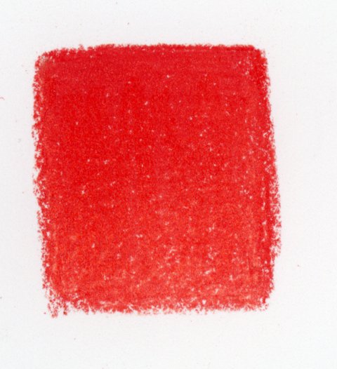
Above, we see how a single color, Scarlet Lake, looks like on the heavy tooth of Cold Press watercolor paper. Lots of texture shows through.
Adding a gradient of four colors (Scarlet Lake, Carmine Red, Pale Vermillion, and Yellowed Orange) on the same surface produces a slightly different effect. Some like the texture this surface produces.

You’ll notice that adding another layer using a colorless blender brightens the colors and removes some of the texture, but cold press paper is too textured for it to be fully removed. This effect is a personal choice.

Using hot press watercolor paper produces slightly different effects.


You see that the texture is slightly reduced. Adding a colorless blender works better on hot press, as it removes more texture and creates more vibrancy in color:
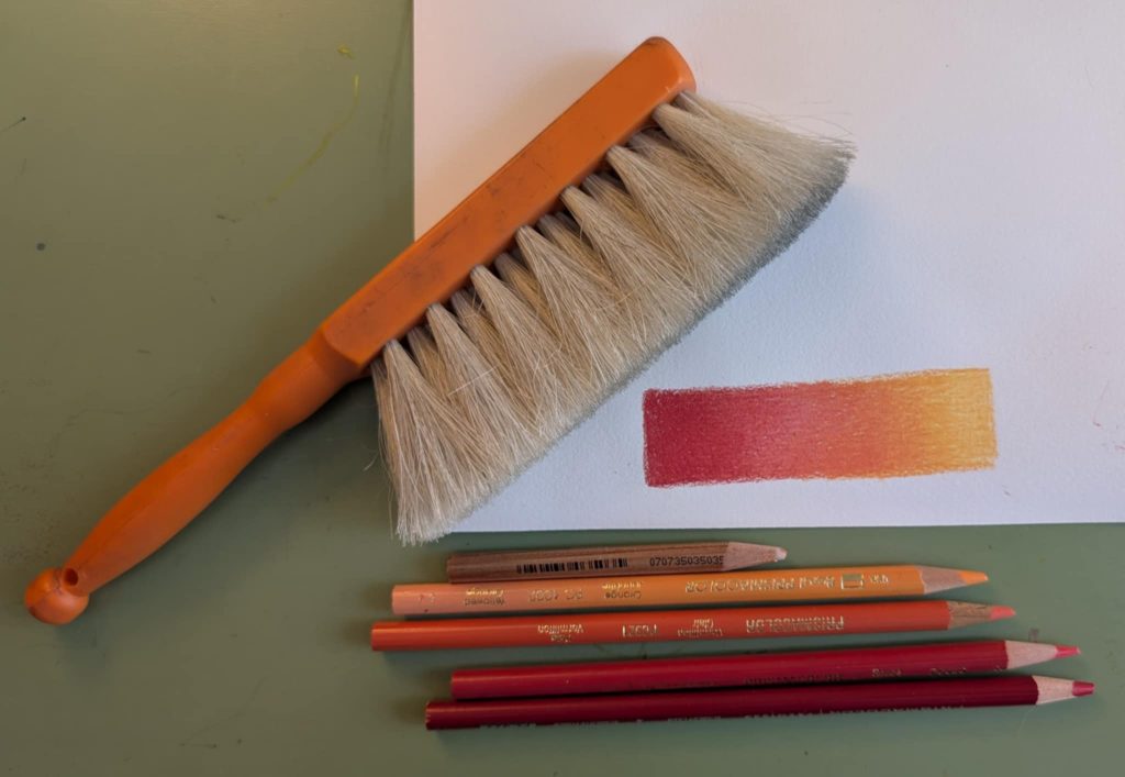
You may find as you layer colored pencils (and use the sort of pressure you would need to remove the paper’s tooth) that your pencils generate a waxy dust, which is potentially damaging to your final drawing. Be sure to keep a clean paper under your drawing hand at all times and have a clean eraser and a horsehair brush on hand. The brush can be used to sweep away any dust without adding any oils from your hand. Use the eraser to pick up any small smudges left behind. In this way, you will keep your paper as clean as possible.
Using a finishing layer on top:
You may want to use another medium on top of colored pencil for crispness. Pencils of various softnesses–from the Bs to the Hs–all work well, depending on the darkness and quality of the line you want to achieve. I find that the Hs work well to add subtle, grey shading, while a 2 or 3B works well for a darker outline. Experiment with what works for you. I would not recommend adding ink on top of colored pencil–especially if you are using a nib, as the waxy crayon will clog the tip and the ink will not stick. If you must use ink, apply it with a small, detail brush.
When you are done:
Like any friable medium, be sure to use a fixative spray when you have completed your illustration.
Ink
Suggested surfaces for ink
Ink likes a smooth surface. Try to avoid anything with too much tooth as it will disrupt your line.
- Paper for Ink: Various companies make paper specifically for ink. It’s very smooth, with almost no tooth, and will not disrupt the line.
- Bristol board: the smoothness of bristol works great, too
- Hot press watercolor paper: the thickness of the paper will absorb more ink that the other papers above, but it works beautifully
- Cold press watercolor paper: use only for ink wash as it will accept the water more easily.
Ink can be used in many ways: with a dip pen with various nibs, a pre-inked pen with a fixed tip, a pre-inked pen with a brush or variable tip, with a brush dipped in pure ink, or as a wash. Nib pens give a flexible line. Brushes are the most expressive. Fixed-size tips, like Micron pens, are good for consistent lines or tiny details. You have to experiment to see what works best for you, but likely it is a combination of the above. You should also consider what types of ink you prefer: india ink? Colored inks? Waterproof or water-soluble? Acrylic ink? Fountain pen inks? Each has different purposes, feels, and uses.
Student JoJo Guzman came up with a cheat sheet of marks for rendering in ink. You might do the same.

A careful application of ink can produce lovely, variegated line, value, texture, and tone. See in this drawing below the various effects achieved with an ink pen.
Ink wash allows for a quick addition of value or tone. Mix straight ink with water, like you would with watercolor, on a small palette, and apply with a brush. You can see this added over sepia ink lines.

Ink works well with other media. If using other wet media, be sure to use a waterproof ink to lay down your lines or tones. It pairs naturally with watercolor:

Here William Blake used ink various ways–with pen and brush, with wash, and added graphite and watercolor, as well. It reveals that ink does not have to be such an extreme, bold choice. The colors below are soft.

Watercolor
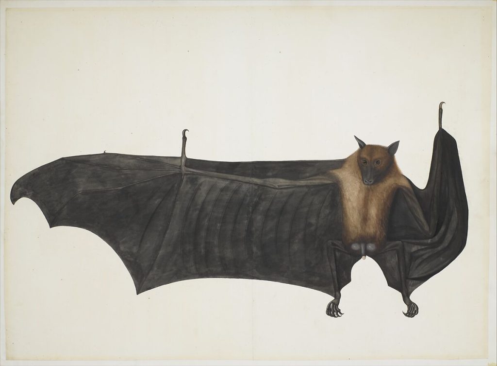
In this image, Indian artist Bhawani Das uses watercolor, richly and thickly applied with minimal water, to achieve deep, rich color, and layers ink and graphite on top on in order to get the crisp detail he requires.
Here we see Turner layer watercolor over graphite in the same way I layered colored pencil over graphite above. He uses the paint as thin washes in areas of light (the sky, the far mountains shown in aerial perspective) aerial perspective, and with minimal water to achieve the vibrancy of the blue of an alpine, glacier-fed lake.

The Metropolitan Museum of Art, New York, Marquand Fund, 1959 (59.120)
Depending on the amount of water used, you can achieve soft washes or rich, vibrant color. You may experiment with watercolor from bricks or from the tube to see what you prefer. But the effect is up to you. Just be sure not to overladen the paper with water, or to overwork the paper, which will result in pilling. Work quickly, work lightly, and allow the paper to dry between layers if you want to minimize the mixing of color.
Here is an old nature study by the author of this book. Here, I used watercolor very saturated for the body of the cicada killer, and a light wash for the wings and shadows to show the transparency.

Digital Art
Digital art has quickly become an industry standard, but is difficult to illustrate here as you can achieve nearly every effect with it. Like any medium, it requires practice. There are various, inexpensive programs out there, but I would suggest paying for a program without ads. These free programs are readily available but are much more limited in their capabilities. I would recommend Adobe Photoshop, Adobe Illustrator, Procreate, or Clip Studio Pro. You may have free access through your school to the Adobe suite, if not, it is a subscription service. Procreate is a one time small fee but well worth it.
Don’t rely on fancy brushes that will give your work away as digital. Try to experiment with how you would normally draw and use the digital tools to allow for ease of editing, layering, and playing with color.
Building your Collection of Supplies on a Budget
Don’t feel like you need to purchase everything at once. Be judicious; most art supplies will last a long time, so you can add to your collection when you can afford it. Buy a good quality brush but take good care of it and it will last nearly forever. While more expensive paints might deliver better color–buy them only if you can afford them. Or start with a few tubes to supplement a less expensive, student-grade pack. Good pencils are relatively cheap. Purchase single sheets of good paper for final drawings instead of whole blocks, and utilize sketchbooks for all other work. You can get a nib pen with various nibs for a good price and a bottle of ink–this is much more economical than pre-inked pens which wear out quickly and cannot be refilled. Purchase a small portfolio for transporting your works.
Items to start with:
- A good set of drawing pencils (I like Faber Castel, Blackwing, or Kimberly)
- A small set of colored pencils (I prefer Berol Prismacolors)
- A horsehair brush
- A can of workable fixative
- Good erasers (I like the barrel erasers best)
- A few good round and flat brushes
- An 80lb sketchbook
- A dip pen with a nib set and a bottle of waterproof ink
Media Attributions
- Illustration for “Seven Chiefs Against Thebes” (recto); Studies of Figures (verso) © John Flaxman adapted by The Metropolitan Museum of Art is licensed under a Public Domain license
- “Two Designs for Illustrations” © Adrian Ludwig Richter adapted by The Metropolitan Museum of Art is licensed under a Public Domain license
- The B and H pencil value scale © Jessica Boehman is licensed under a Public Domain license
- Rendering in hatching, cross-hatching, and continuous line © Jessica Boehman is licensed under a Public Domain license
- Life Drawing © Jessica Boehman is licensed under a CC BY-NC-ND (Attribution NonCommercial NoDerivatives) license
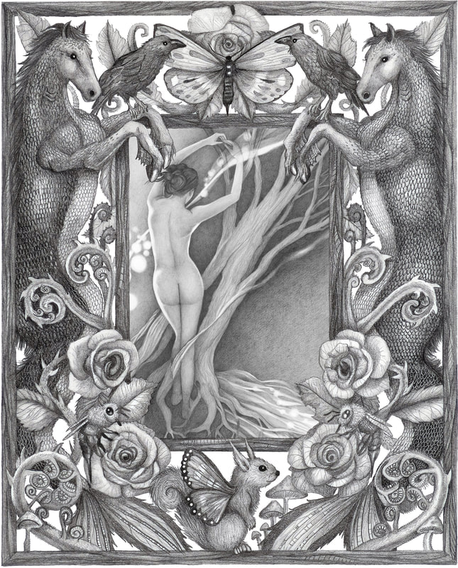
- “Daphne (with border)” © Jessica Boehman is licensed under a CC BY-NC-ND (Attribution NonCommercial NoDerivatives) license
- Drawing for an Illustration in “Voyages du Flandre” © Albert-Charles Tissandier adapted by The Metropolitan Museum of Art is licensed under a Public Domain license
- Colored pencils © Jessica Boehman is licensed under a CC BY (Attribution) license
- “Joan of Arc” © Jan Toorop adapted by The Art Institute of Chicago. is licensed under a Public Domain license
- Self Portrait (No. 14) © Ivan Albright adapted by The Art Institute of Chicago is licensed under a Public Domain license
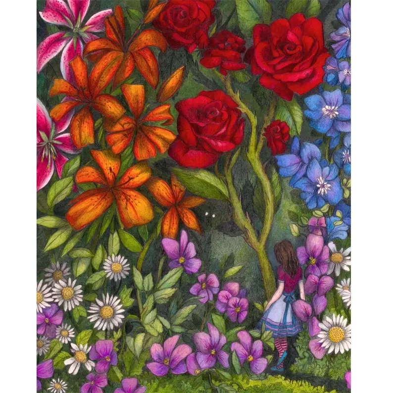
- Alice in July © Jessica Boehman is licensed under a CC BY-NC-ND (Attribution NonCommercial NoDerivatives) license
- Century of Progress Exposition Tower of Water and Light, Chicago, Illinois, Final Design © Ralph Thomas Walker adapted by The Art Institute of Chicago is licensed under a Public Domain license
- Single color on cold press watercolor paper © Jessica Boehman
- Cold Press Gradient © Jessica Boehman is licensed under a Public Domain license
- Cold press gradient with colorless blender © Jessica Boehman is licensed under a Public Domain license
- hot press single color no blender © Jessica Boehman is licensed under a Public Domain license
- Hot press gradient © Jessica Boehman is licensed under a Public Domain license
- Single color on hot press with colorless blender © Jessica Boehman is licensed under a Public Domain license
- A four color gradient on hot press paper, with a horsehair brush © Jessica Boehman
- A swatch page of ink textures in a sketchbook © Johanna Guzman is licensed under a CC BY-NC-ND (Attribution NonCommercial NoDerivatives) license
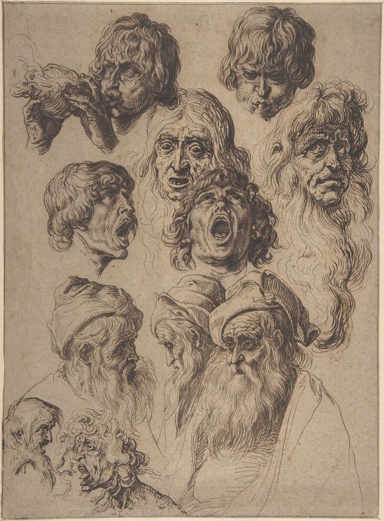
- Study of Eleven Heads © Jacques de Gheyn II adapted by The Metropolitan Museum of Art is licensed under a Public Domain license
- Two Kneeling and Two Standing Figures © Nicola Maria Rossi adapted by The Metropolitan Museum of Art is licensed under a Public Domain license
- Reading the News at the Weavers’ Cottage © Adriaen van Ostade adapted by The Metropolitan Museum of Art is licensed under a Public Domain license
- Angel of the Revelation (Book of Revelation, chapter 10) © William Blake adapted by The Metropolitan Museum of Art is licensed under a Public Domain license
- Great Fruit Bat © Bhawani Das adapted by The Metropolitan Museum of Art is licensed under a Public Domain license
- The Lake of Zug © JMW Turner adapted by The Metropolitan Museum of Art is licensed under a Public Domain license
- Eastern Cicada Killer © Jessica Boehman is licensed under a CC BY-NC-ND (Attribution NonCommercial NoDerivatives) license
The substance or material one uses to make a work of art (ie., paint, pencil, ink, marble)
The visible lines made in a drawing or painting before the final lines of the work are found. From the Italian for "repentance", signifying that the artist has changed their mind.
A mode of drawing that uses short, roughly parallel strokes to create tone.
A medium that crumbles easily and so tends to smear on your support easily, like charcoal, pencil, or chalk pastels.
Rendering with short parallel marks, with a second layer being applied at roughly a ninety degree angle to the first layer of marks.
a spray that helps to set easily-smeared media, like pencil, colored pencil, charcoal, or pastel
a visual technique that shows objects in the distance as bluer, hazier, and less distinct.
