6 Assignment: The Illustrated Poster
Dr. Jessica Boehman; Donivan Bonilla; and Benjamin Alexander Taveras González
Approaching an illustrated poster: what to consider?
Posters have long been the domain of illustrators. They came into prominence in the late 1800s with the rise of simple color printing techniques like screen-printing or chromolithograph. Posters are ephemera, meant to be viewed for a finite period before they are pasted over with newer posters. Acting as advertisements for places, events, bands, movies, or companies, these posters are meant to be seen while the viewer is en route. Because they are read quickly, these posters need to be designed clearly, with an easily-digestible message.
What to consider when making a poster? Is your design eye-catching? Because a poster is a form of visual communication, be sure that it is properly communicating the idea you want to convey. Is there textual information? How prominent does it need to be? Can viewers learn enough information by looking at a poster, or will they be directed elsewhere with other means (QR codes or URLs)? Is your poster readable from the ideal viewing distance? (For instance, a poster meant to be read on the train platform from a passing train needs to have text that is large enoughDo you want the art and text to mingle or stay separated? You may want to play around with several sketches before proceeding.
An ICONIC Example:

One of my favorite posters to share in any of my classes, “La Goulue at the Moulin Rouge” by Henri de Toulouse-Lautrec is an excellent example of the form. It’s lively, colorful, has a great composition, and leaves the viewer in no doubt as to what the poster is advertising. The name of the venue is not only in red for The Red Windmill of the Moulin Rouge, but it’s repeated four times. We know which nights to find this dancer, “La Goulue”, The Glutton, famous for her high-kicking can-can dancing and for gobbling and guzzling the snacks and drinks of the patrons as she danced. The colors, leading lines, and use of silhouette (in the faceless crowd of men and women) and the grey silhouette in her fellow performer, acrobat Valentin le Desossé, all lead your eye to her.
Now, that is not to say that one cannot design a more complicated poster, but the intent must be different. If the purpose of the poster is to get the viewer to stop and look closely, then having elaborate detail, properly rendered, can be a source of delight. Here’s an example:

As you see, Mucha, a famous Art Nouveau designer, was renowned for his use of elaborately-detailed images of beautiful women in his posters and ads. The viewer generally has to search for the product or event his posters are advertising. However, they are so beautiful, that most people generally do not mind. This style of poster was in style for many years at the turn of the 20th century.
Here is one that has the sort of theme we expect to see in the assignment below: a link to the city’s modes of transportation. Let’s use it to see what works and what doesn’t. Remember that illustration is partly design.

Color lithograph on three sheets of cream wove paper, laid down on fabric support,
Albert H. Wolf, Mr. and Mrs. T. Stanton Armour, Mary S. Adams, Stanley Field, and Joseph Brooks Fair endowments
The poster makes use of certain iconic imagery, easily recognizable even in its abstracted, simplified state: the lion statues in front of the Art Institute of Chicago, and the classical façade of the building. The silhouette draws the viewer in.
From a design point of view, however, there are some issues with this poster. The white lettering of the “Art Institute” against the negative space of the building’s pediment makes the lettering hard to read, while the letters of “Institute” differ in size. Creating space in the composition for the text to naturally occur, or simply printing it in the same black of the lion and the “Elevated Lines” text would balance the composition and make the name of the museum easy to read. This is why it is always important to sketch first–making sure to incorporate all necessary text into the sketch–so that the text may properly fit within the composition in a planned and deliberate way.
It’s good to consider color and boldness in your poster. One of the most iconic posters of the past century is J. Howard Miller’s We Can Do It, better known as Rosie the Riveter, though that is an apocryphal title.
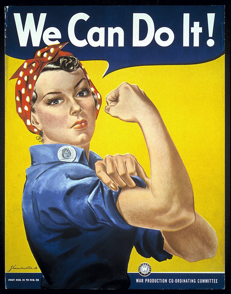
Patriotic red, white, and blue is added through Rosie’s blue collar work shirt and her red and white bandana; the bold yellow background emphasizes the primary colors. It creates great contrast and places your attention on the woman. The use of the word balloon makes this feel approachable, like a comic book cover, but effectively communicates the message that the woman is the one speaking. She’s strong, tough, and ready to help. Message received–for both the intended audience of the women and for the secondary audience of the men whose significant others will clearly remain beautiful while they work.
THe assignment
You have been working through this course to try different types of illustration. Now it’s time to let your imagination wild with only one constraint. You may find that it is easier to set one or two constraints to help rein in your thoughts and spur creativity.
The Pitch!
You will be creating a vertical poster or horizontal art card for the MTA (Metropolitan Transit Authority) of New York City.
- The Client: The NYC Metro Transit Authority (MTA)
- The poster must follow the required proportions listed below
- The illustration must relate in some way to the MTA–whether the subway, bus, Metro North, Long Island Railroad, or the stations.
The Challenge
-
the subway
-
the bus
-
your neighborhood with train, bus, or subway
-
platforms
project specifications
You may choose between the vertical poster, which hangs above the just above the seats, or a horizontal artcard, which hangs just below the ceiling of the train.
- Vertical poster: 21×22″. Include a 1/2″ trim on each side.
- Subway art card should be 9.5″ x 44″.
- The poster should include the MTA logo.
- Should be in full color,
- Text should be added on the computer or carefully hand-lettered
- Scan at 300dpi jpg for your print quality image 72dpi for the web-quality image.
- Final poster must be presented professionally.
approaching the assignment
You will want to make at least three refined sketches to review with the professor in advance of your final work. Make sure you are considering composition, as the long poster is an unusual format.
Technical Considerations for this assignment
Consider what paper you will use if you are working traditionally. Do you have access to paper that is long enough for this assignment? Will you need to stitch two images together on Photoshop? If this is the case, you might plan a natural break into the illustration.
If you are working digitally, consider which program. A desktop program like Photoshop will give you the most power and flexibility for such a large file. If working on another program like Procreate, test out how many layers you will have access to with the dimensions and required resolution for this poster. This will depend on the power of your tablet. If you have very few layers, plan carefully and accordingly before proceeding.
Student Example: Donivan Bonilla
Donivan played into his strengths of working in his graphic style for this poster to create an “art card”–the long poster designed to be placed over seats and doorways in the subway.


Donivan imagined what it would look like to have the posters used in-situ, a good test of the effectiveness of the illustration.
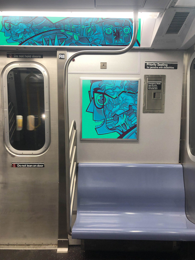
Professor’s note
For this to match the assignment precisely, the artist should add the title of the work as well as the logo of the MTA.
Student Example: Benjamin Alexander Taveras Gonzalez
Read below to hear another process of making a poster specifically for the MTA.
(JMB= Dr. Boehman, BATG=Benjamin Alexander Taveras Gonzalez)
JMB: Did you find this project useful?
BATG: Yes. At the beginning, with a lot of major assignments, I felt like I was stuck. I had a lot of ideas I wanted to do for this project, and I knew time was against me, so I was able to be quick and find the concept and just decide. If I stayed and just thought about it–like I do with a lot of personal projects–it is hard to know where to start, and I get stuck. So it was good to just get started. Also, I want to submit this to the MTA one day–it would be so fun. I didn’t know they accepted submissions until we talked about it in class. That’s so fun! I think that is one of the things I have as a goal on my artist’s checklist.
JMB: Me, too! Do you think having the perimeters of “this must be related to the MTA in some way” help to give you a boundary to work within, so it was easier for your imagination?
BATG: Yes, if we didn’t have that perimeter, I think I would have been lost. Those perimeters or rules made it so much better for me as a starting point. It has to be transportation related, though I made it fantasy-like, more expressive, but it still has a train. It made it easier to enjoy the process by having a base within I could explore my creativity. With illustration, those perimeters and limitations really help to navigate within a bubble of things you can do.
JMB: I agree. It just gives your brain something to focus on, and you still have free rein within that. If you look at all of the works by all of the students, they are completely different. One wouldn’t think that fantasy and the MTA would go together, but in your mind, it did. So I think that’s one of the nice things about illustration in general, is that you have some sort of limitation, but the challenge is to make your imagination shoot upwards within that smaller space. How did you approach the process of making this?
BATG: I did a lot of research about the trains, and spent a lot of time observing the way the lights reflected off the 7 train when I would be headed home at golden hour or nighttime, so I could have a starting point. I would stare at it and see how the lights played on the surface. I had a lot of pictures of the trains coming in.
JMB: That’s interesting, because your picture has the trains running overhead through the night sky, and the 7 Train (Queens to Manhattan) is one of the few elevated lines we have, so that makes sense.

BATG: Yes, that was a perfect reference since I knew I wanted it to be up above. In the beginning, I wanted clouds as tracks, but to make it more mystical, I thought of having the fairies lift the train and have their dust be the thing that lifts the trains from the city to the clouds. I had idea after idea and sketched it out. I grabbed a pencil and started scribbling in yellow to see the tracks of the dust. I had fun making the lines and arranging the composition. It was a lot of fun once I came up with my concept because of the freedom I had with the subject.
JMB: This has a good painted texture for a digital work. What program were you using?
BATG: Procreate.
JMB: So one of the things I wrote about in this assignment is that you might be limited in the number of layers you can have because of the size and resolution requirements of this image. Do you remember if you were very limited?
BATG: Yes, I think I only had three or four, so I had to keep merging. Sketching on one layer and then merging it, or working in a different file and import it and merge it so I could have more layers to play around with.
JMB: So that made you approach it more like a traditional work of art because you didn’t have 200 layers to play around with. Did you have any artistic or cultural references when you approached this work?
BATG: Not really. I think I wanted to make it fantasy and mostly for kids to wonder and look at it while they’re in the train. If I was a kid, I would love it. I wanted to have something to capture children’s attention. Not cultural, but something universal. As for artistic inspiration: I looked at the sun, the nighttime–natural inspirations–merged with the mechanic, modern element of civic life we have now, combined with something carefree.
JMB: It kind of reminds me of Art Deco decor we have in the city with the luscious gold. It gives a shining city sort of feeling, like Rockefeller Center. Because this was the final assignment and late in the semester, it may have been different in the way that you got feedback. Do you remember the feedback you got?
BATG: I remember you told me to change the figures in the windows–define or show the people in the windows. But I think this feedback, if I recall, was after I submitted the work at the final exam. You told me to keep in mind that it would be seen large, and not tiny, in real life. It will be expanded, people will see the details. So that made sense.
JMB: If you were to do this again today, what would you change, and why?
BATG: The same work?
JMB: Sure, you can answer the question as you like.
BATG: I would want to make the fairies have more drama, more variety, more diversity. I wish I had made the tracks out of fairy dust in the same gold color as if they were forming it with the dust.
JMB: That would have been difficult. I like the magical quality you got, and I really like how the gold looks gold and yellow.
BATG: It took a long time!
JMB: Because gold is different than you would think. You got those deep brownish tones in there. It works nicely. So what advice would you give to another student approaching this same assignment?
BATG: Would it be too hippyish of me to tell them to have fun and at the same time, to listen to the feedback you get? Find that balance. That comes easier with building a relationship with your professor. Because if I build that, I can have the confidence to tell the professor how I feel about the work that I am making. Because you have more experience, you will tell us what you see. But if we have trust, we can be more open to receive that feedback. The relationship I had with the professor made it a much better experience. I feel like if I was very shy, I think I would have felt more stuck, as I have in other classes. But because I was able to have a conversation, and have feedback and engage with you…I would tell the students to be open, to have a relationship with the professor, because she wants to see you succeed. Be open to hearing a different perspective, and have fun.
JMB: That’s funny, because the challenge of that class for me is getting people to open their walls enough that I can come in and talk to them in a way that they don’t feel defensive. Because it’s hard to take feedback, right? You come in with your ideas and sketches, and you think they’re the best thing ever, and someone tells you what you need to work on, your first reaction might be to put up a defense. But I think knowing that that person has your back and is not being critical and is trying to help you to do better–that’s what I try to do. So each semester, it’s like 20 different students that I have to figure out the right way to talk to them, and it takes me a while. Some people are naturally easier because they really want to be pushed.
BATG: You have to be able to realize that the things you do and think are being perceived outside of yourself. The metacognition. Having someone else tell you–this work needs a bit of this or that–if you can’t step away and reflect on your work and have a different view of it, from a different angle–this is how others see it–this is something I struggle with a lot, to take my ideas outside of myself. But I need to trust: if someone tells me to jump, it’s ok, you’re not going to die–I would jump! I would jump and see how it is, rather than not changing–I can at least try. I can always go back, but seeing how something different would look can be therapeutic, too.
JMB: I remember this. It still can be difficult if people are critical. The way I see it: I’m not trying to change the way you make art, but maybe I’ll try to get you to look at a work conceptually in a different way, and perhaps push you to see if you can do what you naturally do better. But I do push because I know you have the capacity and the ability and I want you to leave my class feeling like you’ve gotten better. But it’s a lot of emotional labor! I am exhausted at the end of class, haha. I’m introverted, so it’s tiring. But it’s a great feeling (and then I get a good sleep).
Media Attributions
- “La Goulue at the Moulin Rouge” © Henri de Toulouse-Lautrec adapted by Art Institute of Chicago is licensed under a Public Domain license
- Zodiaque (“La Plume”) © Alphonse Mucha adapted by Art Institute of Chicago is licensed under a Public Domain license
- Art Institute by the Elevated Lines © Willard Frederic Elms adapted by Art Institute of Chicago is licensed under a Public Domain license
- 87-13107.tif © J. Howard Miller adapted by The Smithsonian is licensed under a Public Domain license
- MTA Poster © Donivan Bonilla is licensed under a CC BY-NC-ND (Attribution NonCommercial NoDerivatives) license
- Detail of the MTA Poster © Donivan Bonilla is licensed under a CC BY-NC-ND (Attribution NonCommercial NoDerivatives) license
- MTA Poster on the Train © Donivan Bonilla is licensed under a CC BY-NC-ND (Attribution NonCommercial NoDerivatives) license
- Riding the MTA on Fairy Dust © Benjamin Alexander Taveras Gonzalez is licensed under a CC BY-NC-ND (Attribution NonCommercial NoDerivatives) license
a printing technique that utilizes a mesh screen to transfer ink onto a substrate, with a stencil blocking out areas that should not be printed.
a color print made using the lithographic process with multiple stones or plates, each inked in a different color. Made popular in the second half of the 19th century.
Items that are not meant to last, such as artworks on paper.
