Chapter 2.1: Theories and Economic Models
2.1 How Economists Use Theories and Models to Understand Economic Issues
Learning Objectives
By the end of this section, you will be able to:
- Explain the importance of economic theories, the role of assumptions and learn two economic models
- Interpret a circular flow diagram
- Interpret the production possibility frontier
Sometimes economists use the term model instead of theory. Strictly speaking, a theory is a more abstract representation, while a model is a more applied or empirical representation. We use models to test theories, but for this course we will use the terms interchangeably.
In this unit we will learn 2 economic models: Circular Flow Diagram and the Production Possibility Frontier.
Circular Flow Diagram
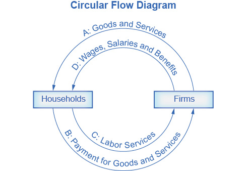
A good model to start with in economics is the Circular Flow Diagram (Figure 2.1). It pictures the economy as consisting of two groups—households and firms—that interact in two markets: the goods and services market in which firms sell and households buy and the labor market in which households sell labor to business firms or other employees.
 “The Circular Flow Diagram” by OpenStax, is licensed under CC BY 4.0
Figure 2.1 The Circular Flow Diagram
The circular flow diagram shows how households and firms interact in the goods and services market, and in the labor market. The direction of the arrows shows that in the goods and services market, households receive goods and services and pay firms for them. In the labor market, households provide labor and receive payment from firms through wages, salaries, and benefits.
Firms produce and sell goods and services to households in the market for goods and services (also known as the product market). This is indicated by Arrow “A”. Households pay for goods and services, which becomes the revenues to firms. This is indicated by Arrow “B”. Arrows A and B represent the two sides of the product market.
Where do households obtain the income to buy goods and services? They provide the labor and other resources (e.g., land, capital, raw materials) firms need to produce goods and services in the market for inputs (or factors of production). This is indicated by Arrow “C”. In return, firms pay for the inputs (or resources) they use in the form of wages and other factor payments. This is indicated by Arrow “D”. Arrows “C” and “D” represent the two sides of what is known as the factor market.
Of course, in the real world, there are many different markets for goods and services and markets for many different types of labor. The circular flow diagram simplifies this to make the picture easier to grasp. In the diagram, firms produce goods and services, which they sell to households in return for revenues. The outer circle shows this and represents the two sides of the product market (for example, the market for goods and services) in which households demand and firms supply. Households sell their labor as workers to firms in return for wages, salaries, and benefits. The inner circle shows this and represents the two sides of the labor market in which households supply and firms demand.
This version of the circular flow model is stripped down to the essentials, but it has enough features to explain how the product and labor markets work in the economy. We could easily add details to this basic model if we wanted to introduce more real-world elements, like financial markets, governments, and interactions with the rest of the globe (imports and exports).
Production Possibility Frontier
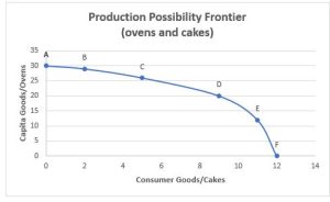
The Production Possibility Frontier (PPF) is a graph that shows the maximum amount of consumer goods and capital goods a society can produced at a certain point in time given the available factors of production and the available production technology.
Because society has limited resources (e.g., labor, land, capital, raw materials) at any point in time, there is a limit to the quantities of goods and services it can produce. Example: suppose a society desires two products, consumer goods and capital goods. The production possibilities frontier in Figure 2.2 illustrates this situation.

Figure 2.2 Capital Goods vs. Consumer Goods Production Possibilities Frontier
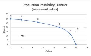
Figure 2.2 Let’s recall that capital goods are machinery and buildings while consumer goods are goods for immediate consumption. Examples of each are shown. Capital goods can be an oven and consumer goods can be a cake. Capital goods/Ovens are shown here on the vertical axis and consumer goods/cakes are shown on the horizontal axis. If a society were to allocate all of its resources to only producing capital goods/ovens only, it would produce at point A. However, at point A this society does not have any resources available to produce consumer goods cakes, in other words at point A this society is producing 30 units of capital goods, ovens and 0 units of consumer goods, cakes. That would be a very hungry society! If, on the other hand, it were to allocate all of its resources to producing consumer goods/cakes, it could produce at point F. However, it would not have any resources available to produce any capital goods such as ovens. Alternatively, the society could choose to produce any combination of capital goods such as ovens and consumer goods such as cakes on the production possibilities frontier.

|
|
Cakes |
Ovens |
|
A |
0 |
30 |
|
B |
2 |
29 |
|
C |
5 |
26 |
|
D |
9 |
20 |
|
E |
11 |
12 |
|
F |
12 |
0 |
Figure 2.3 and Table 2.1 Ovens vs. Cakes Production Possibilities Frontier, Curve and Table
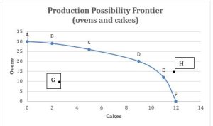
In Figure 2.3 shows the production possibility frontier for a society that is choosing between producing cakes or/and ovens. In this example the resource is the labor force in this society. Point A indicates, all workers are producing 30 units of ovens and 0 units of cake. Point F indicates that all workers are producing 12 units of cakes and no ovens. It is important to note that all the points on the curve (A, B, C, D E and F) are efficient. Meaning this society is using all available resources and all workers are working. In other words, full employment. A society can also produce any combination inside the curve, for example, point G. Point G indicates that this society is producing 2 cakes and 10 ovens. However, according to the graph, if this society produces 2 cakes, they can also produce 29 ovens, but are only producing 10. We call this phenomenon inefficiency – because this society is not using all its resources. In other words, there are workers that could be working but are not-this is also known as unemployment. Finally, a society does not have enough resources to produce outside the PPF, point H.
Society can choose any combination of the two goods on or inside the PPF. However, it does not have enough resources to produce outside the PPF.
Most importantly, the PPF production possibilities frontier clearly shows the tradeoff between ovens and cakes. Suppose society has chosen to operate at point B, and now it is considering producing more cakes. Because the PPF assume fixed resources (a certain number of available workers) and is downward sloping from left to right, the only way society can produce more cakes-it is by giving up producing some ovens. That is the tradeoff society faces. Suppose it considers moving from point B to point C. What would the opportunity cost be for the additional units of cakes? The opportunity cost would be the number of ovens this society has to forgo. The slope of the production possibilities frontier shows the opportunity cost.
Why Society Must Choose
In chapter one we learned that every society faces the problem of scarcity, where limited resources conflict with unlimited needs and wants. The production possibilities curve illustrates the choices involved in this dilemma.
Every economy faces two situations in which it may be able to expand consumption of all goods. In the first case, a society may discover that it has been using its resources inefficiently, in which case by improving efficiency and producing on the production possibilities frontier, it can have more of all goods (or at least more of some and less of none). In the second case, as resources grow over a period of years (e.g., more labor and more capital), the economy grows. As it does, the production possibilities frontier for a society will tend to shift outward and society will be able to afford more of all goods. In addition, over time, improvements in technology can increase the level of production with given resources, and hence push out the PPF.

Figure 2.3 (same as above)Ovens. vs. Cake
Summary and Characteristics of the PPF Graph:
- All points on the PPF graph, (A, B, C, D, E and F) indicate–production efficiency. Efficiency means that all resources are being used. If your resource is labor, then everyone in that society has a job and is producing. Those points are also known as full employment.
- Points outside the graph, (H) means not feasible, meaning that this society does not have enough resources to produce at that level.
- Inside the graph (G)- means inefficient– not all resources are being used. If your resource is labor- it means unemployment.
- The PPF graph illustrates the concept of opportunity cost. In order to produce more of one good- must give up production to the other good. (moving from C to D)
- To increase overall production- resources must increase, this can be seen by a shift outward of the PPF curve.
This chapter is a remixed version of the chapters 1.3 How Economists Use Theories and Models to Understand Economic Issues and 2.2 The Production Possibilities Frontier and Social Choices in Principles of Macroeconomics 3e by OpenStax, published under a Creative Commons Attribution 4.0 International License. . Other additions and modifications have been made in accord with the style, structure, and audience of this guide.
