Chapter 7: The Role of Quantitative Analysis in Healthcare
Sitaji Gurung
Learning Objectives:
- Understand the principles of quantitative analysis in healthcare research.
- Apply descriptive and inferential statistics using Excel and SPSS.
- Perform data visualization to identify patterns and relationships.
- Analyze healthcare datasets using regression, t-tests, ANOVA, and chi-square.
- Interpret and communicate statistical findings in a clear and concise manner.
Quantitative analysis involves the use of numerical data to understand and improve healthcare systems. It is foundational for evidence-based practice, allowing researchers and practitioners to analyze trends, test hypotheses, and make informed decisions. Through tools such as descriptive statistics, regression analysis, and hypothesis testing, quantitative analysis helps healthcare professionals determine what interventions work best and how to allocate resources efficiently. For example, statistical findings can reveal patterns in hospital readmission rates or identify factors affecting patient satisfaction. Without such analysis, healthcare decisions would rely heavily on anecdotal evidence or guesswork.
Discussion Questions
- How does quantitative analysis improve patient care and healthcare systems?
- Why is evidence-based practice essential in modern healthcare?
An Overview of Key Statistical Methods
Quantitative analysis relies on several core statistical techniques, including regression analysis, t-tests, ANOVA, and chi-square tests. Regression analysis predicts relationships between variables; for instance, how communication quality affects patient satisfaction. T-tests and ANOVA help compare means between two or more groups, such as comparing patient outcomes across treatments. Chi-square tests examine relationships between categorical variables. Understanding the appropriate context for each method is critical, as misapplication can lead to inaccurate conclusions.
Discussion Questions
- What is the difference between a t-test and ANOVA?
- In what types of studies would you use a chi-square test?
Performing Descriptive Statistics in Excel
Excel is widely used for basic quantitative analysis, particularly for calculating descriptive statistics. Descriptive statistics summarize large datasets using metrics such as the mean, median, mode, and standard deviation. In Excel, these can be computed using built-in formulas like =AVERAGE(range) or =STDEV.S(range). These statistics are crucial for understanding data distributions and for quality control before applying more complex inferential tests. For example, knowing the average patient age in a dataset helps contextualize outcomes.
Table 1: Calculating Descriptive Statistics in Excel
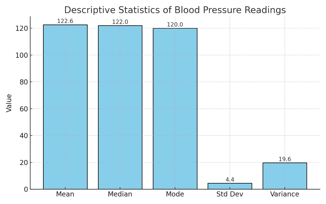
Open a new Excel spreadsheet and enter your data in column A. For example, we want to analyze the blood pressure readings of 10 patients (120, 122, 118, 130, 126, 128, 124, 122, 116, 120).
|
Statistic |
Excel Formula |
Cell Range Example |
Description |
|
Mean |
=AVERAGE(A1:A10) |
A1 to A10 |
Calculates the average of the values. |
|
Median |
=MEDIAN(A1:A10) |
A1 to A10 |
Returns the middle value in the dataset. |
|
Mode |
=MODE(A1:A10) |
A1 to A10 |
Identifies the most frequently occurring value. |
|
Standard Deviation |
=STDEV(A1:A10) |
A1 to A10 |
Measures the spread of values around the mean. |
|
Variance |
=VAR(A1:A10) |
A1 to A10 |
Measures the average squared deviation from the mean. |
Figure 1: Bar Graph showing Descriptive Statistics in Excel
Discussion Questions
- What are the advantages of using Excel for descriptive statistics?
- How might outliers affect the results of descriptive statistics?
Visualizing Data with Excel
Visualization plays a vital role in identifying trends and patterns. Excel allows users to create scatter plots, histograms, and bar charts with ease. For instance, a scatter plot showing the relationship between patient age and weight helps visualize any correlation. Visualizations can make statistical concepts more accessible to diverse audiences, especially when explaining data to stakeholders unfamiliar with technical terminology.
Here is a simple step-by-step guide to help you create a scatter plot of Age vs. Weight in Excel.
Step 1: Enter the Data
Open Excel and enter the following data into two columns:
|
Column A (Age) |
Column B (Weight) |
|
22 |
140 |
|
25 |
145 |
|
28 |
150 |
|
31 |
155 |
|
34 |
160 |
|
37 |
162 |
|
40 |
165 |
|
43 |
170 |
|
46 |
175 |
|
49 |
178 |
Step 2: Select the Data
Click and drag to select both columns (A1:B11 including headers “Age” and “Weight”).
Step 3: Insert a Scatter Plot
Go to the Insert tab.
In the Charts group, click Insert Scatter (X, Y) or Bubble Chart.
Choose “Scatter with only Markers”.
Step 4: Customize Your Chart
Add a Chart Title (e.g., Age vs. Weight).
Add Axis Titles by selecting the chart → Chart Elements (+) → Axis Titles:
X-axis: Age (years)
Y-axis: Weight (lbs)
Right-click on dots to change marker style or color if desired.
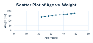
Figure 2: Scatter Plot of Age vs. Weight
Discussion Questions
- How can data visualization make healthcare data more understandable?
- What are some best practices for creating effective graphs?
Conducting Inferential Statistics in Excel
Inferential statistics allow us to make predictions or generalizations about a population based on sample data. A common example is using a two-sample t-test to determine whether a new treatment yields better results than the standard one. In Excel, researchers input the two groups’ data, then use the Data Analysis ToolPak to compute the t-test. If the p-value is less than 0.05, the result is considered statistically significant, suggesting that the difference is unlikely due to chance.
Discussion Questions
- What does a p-value tell us about a hypothesis test?
- Why is inferential analysis critical in healthcare research?
Using SPSS for Advanced Analysis
SPSS is a powerful software designed specifically for statistical analysis. It offers a user-friendly interface and advanced capabilities for descriptive statistics, regressions, ANOVA, and more. To start, researchers enter and label data in the SPSS spreadsheet, then select analysis tools through menu commands. SPSS also generates tables and visualizations, making it easier to interpret and share findings.
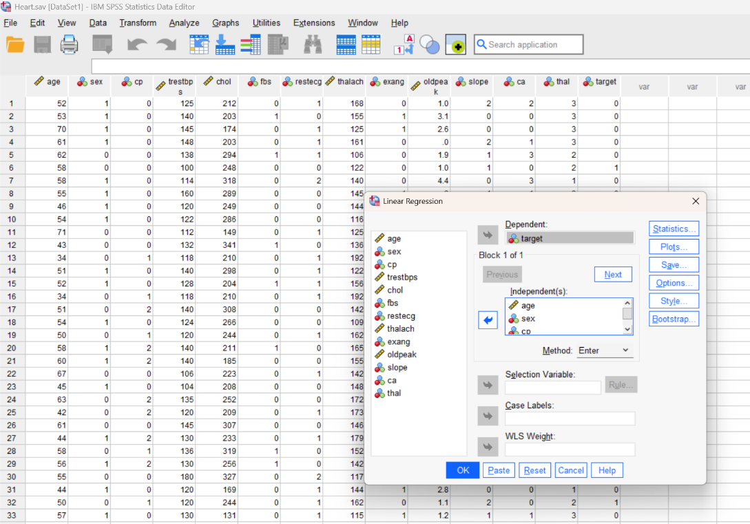
Table 2: Conducting Simple Linear Regression in SPSS
|
Step |
Action |
Notes |
|
1 |
Open your dataset in SPSS |
Make sure your dependent and independent variables are correctly labeled and coded. |
|
2 |
Click “Analyze” → “Regression” → “Linear…” |
Opens the Linear Regression dialog box. |
|
3 |
Assign Variables |
Move: • Dependent (Y) variable into the Dependent field. • Independent (X) into Independent(s). |
|
4 |
Click “Statistics” |
Select options like Descriptives, Confidence intervals, and Coefficients. |
|
5 |
Click “Plots” |
Choose “Scatter” or “Line fit plots” to visualize the regression line. |
|
6 |
Click “OK” |
SPSS will run the analysis and display output including tables and plots. |
|
7 |
Review Output |
Check: • R² and significance (p-value) in Model Summary. • Coefficients table for regression slope. |
|
8 |
(Optional) For Multiple Regression |
Include more than one independent variable in Step 3. |
Figure 3: Conducting Multiple Linear Regression Analysis in SPSS
Discussion Questions
- What are the benefits of using SPSS over Excel?
- What steps are necessary to ensure data is ready for analysis in SPSS?
Data Visualization in SPSS
Like Excel, SPSS allows users to create meaningful visuals such as histograms, line graphs, and scatter plots. These visuals can help highlight trends such as changes in patient outcomes over time. For instance, a line graph may show how patient satisfaction improved after implementing a new communication protocol. These visuals are often included in research reports and presentations to enhance understanding.
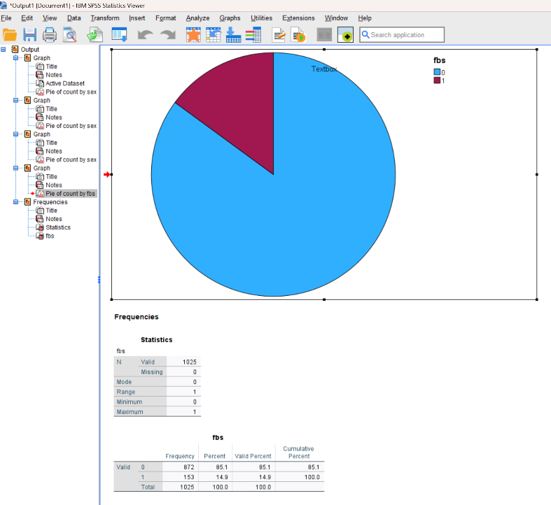
Figure 4: Creating a Pie Chart in SPSS
Discussion Questions
- When would you choose a histogram over a line graph?
- How can SPSS-generated visuals support decision-making in healthcare?
A Hypothetical Case Study: Patient Satisfaction and Hospital Care
A study analyzed responses from 500 patients on various hospital care aspects including doctor-patient communication, cleanliness, and wait times. Using SPSS, descriptive statistics were calculated and regression analysis conducted. The results showed that communication with doctors and nurses had the strongest impact on overall patient satisfaction, followed by cleanliness and then wait times. This quantitative analysis guided administrators in prioritizing improvements.
|
Predictor Variable |
Impact Level (β) |
Significance (p) |
|
Communication |
High (0.65) |
< 0.01 |
|
Cleanliness |
Moderate (0.42) |
< 0.05 |
|
Wait Times |
Low (0.33) |
< 0.05 |
Discussion Questions
- How did quantitative analysis help prioritize areas for improvement?
- What might be limitations of relying solely on self-reported data?
Recommendations Based on Statistical Results
Based on the findings, several strategies can be proposed: staff training to improve communication, hiring more janitorial staff for cleanliness, and streamlining appointment scheduling. These recommendations are supported by the statistical evidence and aimed at boosting overall patient satisfaction. By grounding interventions in quantitative analysis, the hospital could target areas with the most significant impact.
Discussion Questions
- How does data-driven decision-making benefit healthcare organizations?
- What are the challenges in implementing research-based recommendations?
Ensuring Data Quality and Integrity
Before conducting any analysis, data must be cleaned and checked for accuracy. This involves removing duplicate entries, handling missing data, and verifying proper formatting. Both Excel and SPSS provide tools for data validation and error checking. Without this step, results may be skewed or misleading. Clean data ensures that statistical results are reliable and actionable.
Discussion Questions
- What are the consequences of analyzing unclean or incomplete data?
- What methods can be used to deal with missing data?
Communicating Statistical Findings
Clear communication of findings is just as important as the analysis itself. Researchers must tailor their message to the audience, using simplified language for patients, technical language for clinicians, and visual aids for administrators. Including context, like benchmarks or national averages, can also enhance understanding. Effective communication ensures that results lead to meaningful action.
Discussion Questions
- How would you present statistical findings to a non-technical audience?
- What role do visuals play in communicating complex results?
Limitations of Quantitative Methods
While quantitative methods provide powerful insights, they also have limitations. They often lack context or depth that qualitative research can provide. For example, numbers may show that wait times are too long but won’t explain why. Furthermore, statistical results can be misinterpreted without proper training. Researchers should acknowledge these limitations and, when possible, complement quantitative data with qualitative input.
Discussion Questions
- What are the limitations of relying solely on quantitative data?
- How can combining qualitative and quantitative methods improve research?
Conclusion
Quantitative analysis is essential in healthcare for evaluating interventions, identifying trends, and guiding policy decisions. Whether using Excel for basic statistics or SPSS for complex modeling, healthcare professionals benefit from these tools to improve outcomes and efficiency. By understanding the strengths and limitations of different techniques, students and professionals alike can better serve patients and communities.
Discussion Questions
- How will you apply quantitative analysis in your future career?
- What additional skills or training would you need to use SPSS or Excel confidently?
Key Terms
Quantitative Analysis – Analysis involving numerical data and statistical methods.
Descriptive Statistics – Statistics that summarize data (e.g., mean, median).
Inferential Statistics – Techniques used to draw conclusions from sample data.
Regression Analysis – A statistical method for identifying relationships between variables.
T-Test – A test comparing means between two groups.
ANOVA – Analysis of Variance used to compare means of three or more groups.
Chi-square Test – A test for associations between categorical variables.
P-value – Probability value indicating statistical significance (<0.05 is typical).
Mean – Average of a dataset.
Standard Deviation – Measure of data variability or spread.
SPSS – Software for advanced statistical analysis.
Excel – Spreadsheet software for basic statistical calculations and visuals.
Data Cleaning – Process of identifying and correcting data errors.
Scatter Plot – Graph showing the relationship between two variables.
Histogram – Graph showing frequency distribution of a variable.
References
Excel Easy. (n.d.). Descriptive statistics in Excel. Excel Easy.
Excel Easy. (n.d.). Data analysis in Excel. Excel Easy.
Laerd Statistics. (n.d.). Chi-square test for association using SPSS Statistics. Laerd Statistics.
Laerd Statistics. (n.d.). Independent t-test using SPSS Statistics. Laerd Statistics.
Laerd Statistics. (n.d.). One-way ANOVA in SPSS Statistics. Laerd Statistics.
Excel Easy. (n.d.). Analysis ToolPak in Excel. Excel Easy.
Excel Easy. (n.d.). Histogram in Excel. Excel Easy.
Excel Easy. (n.d.). Regression Analysis in Excel. Excel Easy.
IBM Corporation. (n.d.). IBM SPSS Statistics documentation: Sample Files.
