A Few Other Ways Ads Go Bad
- Irrelevant Spokesperson
- Boring
- Obvious
- Pretzel Logic
- Meaningless Gimmick
- Cleverness vs Clarity
- Borrowed Interest
- Lack of Focus
- Tonality/Visual undercuts message/product
Redundancy is the #1 issue for most ads. But unfortunately, there are plenty of other ways for ads to bad. Here are a few examples.
Irrelevant spokespeople
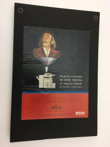
Salvador Dali was one of the greatest surrealist artists of all time. He’s long since dead. The poor copywriter tried to make a connection with the headline: Making copies is one thing. It takes vison to invent a solution. But if you know Dali, you know that he did have vision. But it would not include being a spokesperson for a dull office copier manufacturer.
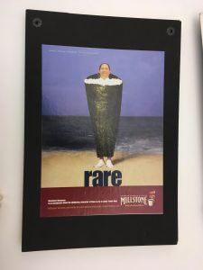
In this ad for a company that makes very average, dare I say “run of the mill” coffee, we see Masaharu Morimoto – a chef who changed Japanese cuisine and influenced cuisine in general, wrapped as if he were a hand roll. The headline: rare. Chef Morimoto is indeed rare. But Millstone coffee is anything but.
Boring
The pharmaceutical and healthcare industries are bound by many regulations. But that doesn’t mean they are stuck doing boring ads like this one. This is a what’s called a testimonial ad. People do trust doctors. But their doctors. Not someone else’s doctor. Or worse yet, an actor pretending to be a doctor.

Here’s another boring ad. We see a few bottles of juice and a headline that says: Northland. Always 100% Juice. Juice that’s nothing but is a good thing to tout. But this headline is what’s called a walking strategy. It’s like the copywriter figured out the main message, said it straight and called it a day. Surely there’s a more interesting way to say it.

Obvious
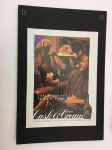
This ad is redundant in a very specific and particular way. We see a privileged white man with his two fancy dogs who are bringing him his slippers and newspaper as he sits in his fancy living room drinking his fancy liqueur. The headline: Seem a bit indulgent? Now you’re catching on. This ad is see-say and stereotypical. It’s a double whammy of bad.
Pretzel logic
It’s good to create a puzzle for the consumer to solve for themselves. But this ad is a puzzle no one can solve. Why would you pair Amelia Earhart – the most famous female aviator ever – with an expensive refrigerator and add a headline that says: Because I want to. This is what’s called pretzel logic because it requires the consumer to try to twist and turn this puzzle over in their head – with no chance of success.

Edgy for the sake of being edgy
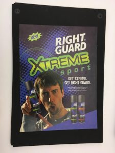
In this ad, the spokesperson, a stand-up comic is hyping Right Guard’s Xtreme sport deodorant. He doesn’t base jump. He’s doesn’t participate in the X games. His stand-up material might be a little edgy. But the truth is, he’s nowhere near extreme. This ad clearly tries too hard by pairing an image of him making a weird face with a headlines that says Get extreme. Get Right Guard. #notbuyingit
Multitude of Sins

How is this ad bad? Let me count the ways. It uses borrowed interest by putting someone on another planet and talking about the world’s greatest rum. It puts the astronaut in a bathing suit and flippers and splashes them with Bacardi, which is a meaningless gimmick. In summary, this ad is completely unfocused. It could be the result of a client who couldn’t make up their mind and a creative team who gave up. The result, a waste of money and time.
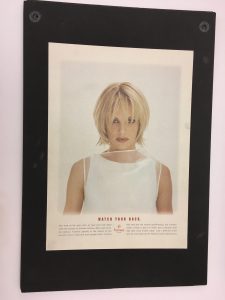
Cleverness vs Clarity
In this ad, we see a beautiful woman and a headline that says Watch your back. Is this ad for a movie about a seductive serial killer? Not at all. It’s for Framesi, which makes hair products. Unfortunately, the logo is so tiny you don’t know what the heck the ad is for – unless you read the tiny print. Clever? Yes. Clear? Clear as mud.
Tonality/Visual undercuts message/product
In this ad, we see a man energetically jumping from one Nicoderm lozenge to another. The headline, which is in all caps and HUGE on the page says A calmer way to quit. Does this man look calm? Does the monstrously big headline look calm? Anything but.

