The #1 Reason Ads Go BAD
Redundancy vs Synergy

In the ad above, the headline says SEXY BEACH. And what do you see? You see Paris Hilton, considered a sexy woman and you see a beach. The headline is redundant with the visuals. This is a “see say” ad.
You see the word “sexy” and you see a sexy woman. You see a beach and it says “beach”. There is NO synergy here. Only Redundancy.
What is Synergy?
What is synergy and why does it matter? Synergy is what makes the unexpected expected. Synergy brings new meaning out of the familiar. It’s when the headline and image work together in an unexpected way, like a puzzle that makes sense when the pieces come together. Each piece on its own – the headline and the visual – won’t have the same meaning as when they come together. An ad with synergy actually makes the consumer do a little bit of work so the idea comes together in their head. That’s a good thing because when we put things together for ourselves, we feel more invested in them.
Redundancy vs Synergy
- See-Say
- Not See-Say
If you’ve ever read the New Yorker magazine, you know each weekly issue includes a caption contest. Readers are invited to write a caption for an illustration. Let’s look at one illustration with two different captions and see which caption is less see-say; less expected; which is best.
Here we see two chairs stacked on top of each other.
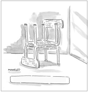
Let’s add a caption.
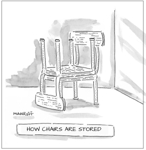
The caption says “How chairs are stored”. And what does the illustration show? It shows how chairs are stored. This is an accurate description. But it’s “see say”. The words don’t add anything. If this were an ad, it’d be boring as hell – which is exactly what Prof Nancy Tag had in mind when she wrote this caption. Her goal was to demonstrate how just telling us what we’re seeing is see-say and DULL.
How can we make this more interesting? By writing a caption that is less expected; that creates synergy with the image. The illustrator, Bob Mankoff, of the New Yorker, wrote this caption.
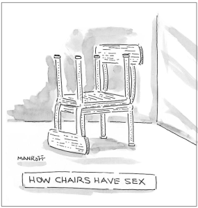
So we see the same illustration – two chairs stacked. But the caption “How chairs have sex” combined with the image creates a whole new (and funny) meaning. That’s synergy. On its own, neither the caption nor the image can create this meaning. You must combine them to create this twist – to have a totally different, unexpected and humorous message.
Synergy is when image and copy combine to create a whole meaning that they could not create individually.
The purpose of SYNERGY is to provide a puzzle for the consumer to put together for themselves in their own head. When it comes together, it’s worth the effort.
Add another New Yorker caption contest as a classroom assignment.
Let’s look at a few ads that you’ve already seen and identify how they created synergy.
In this McDonald’s ad, we see French fries arranged as if they were a WiFi icon. The copy says “Love free wi fi”. The image and the copy together are telling us that you can get free wifi when you hang out at McDonald’s – and enjoy some tasty fries. You can’t get that at Starbucks.

In this ad, we see that someone doodled what looks like water ripples, turning a notebook full of boring information into a swimming pool. The headline: Dreaming of a holiday? The image and headline together conjure someone who’s in desperate need of a vacation.

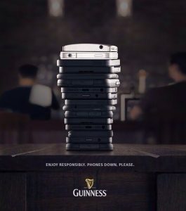
In this ad, different shapes and sizes of mobile phones have been stacked in the shape of a pint glass, with what almost looks like the frothy head on a tasty Guiness stout. The headline: Enjoy responsibly. Phones down, please. Is Guiness trying to tell you not to use your phone while driving home after you’ve been drinking? Is it telling you to get off your phone and enjoy the company of your friends? It’s up to you as the consumer to decide.
Let’s look at another example of how changing a headline can make a holiday ad more jolly. Here’s a banner ad from Lacoste. Because it’s running near Christmas, the background is red, the alligator is green and the headline is Merry Christmas from Lacoste. It’s perfectly fine. Red & Green. Christmas colors. Christmas message. But I believe if you’re going to interrupt someone’s day and ask for their attention, the least you can do is provide a little entertainment.

Here’s the same visual with a new headline. Fa la la la la la la Lacoste. The words are riffing on a well-known Christmas carol and the Lacoste name. Making this a more jolly message by far.