Brightspace Accessibility
15 Templates, Font, and Color
Templates
Create great-looking, responsive, and accessible content topic pages using the page layouts provided in the template package. The layouts are designed to be edited using the HTML Editor in the Learning Environment.
To access the templates, Create a File and then click on Select a Document Template menu next to the title text box.
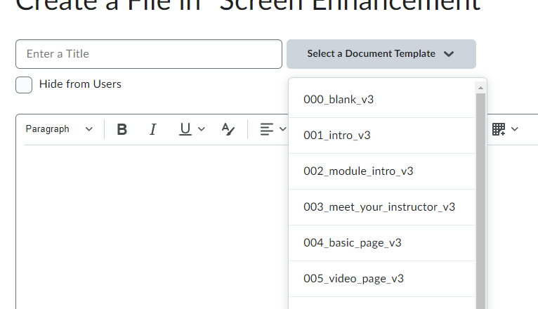 Choose the appropriate nnn_x_v3 template.
Be consistent: use the introductory template for all introductory pages, the video page for videos, etc.
Each Brightspace content page requires a title. Give each page a descriptive, unique title.
Font
Use the built-in editor tools to change font. All font options are available on the Brightspace editor toolbar.
- Use a sans-serif font with a minimum size of 16
- Avoid excessive italics
- Left align text for languages that read left to right
Color Contrast
- Contrast must be at least 4.5:1 for normal text (11-12 point) and 3:1 for large text (18 point +)
- Use the Accessibility Checker
To select font colours:
- Highlight the text
- Select the Select Color button in the toolbar
- In the Select a Color dialogue, use the sliders to change your color until the contrast is at least 4.5:1
Do not use color alone to convey meaning or emphasis. You may use colored text to highlight content, but best practice would be to also bold the text and include an indication, such as “important” or “remember” in text form. Further, ensure charts and diagrams do not rely on color alone to convey meaning or relationships, consider using different line shapes, symbols, and labels.
Attributions
- This page comes from “Accessibility Handbook for Teaching and Learning” by Briana Fraser and Luke McKnight is licensed under CC BY-NC-SA 4.0
