Best Practices
3 Organizing Content
Organizing content so it has a logical flow just makes sense. Using chapters, headings, and sub-headings to organize a resource allows students to clearly see how the main concepts are related. In addition, built-in heading styles are one of the main ways that students using a screen reader navigate through a chapter. But don’t worry if you don’t like how pre-formatted headings look. You can restyle headings once you set them.
Who are you doing this for?
Who benefits?
While everyone benefits from having content that’s clearly organized, organizing content using preset headings is essential for students who rely on screen readers.
In addition, using headings helps students (among others) who:
- Have ADHD
- Are still learning how to determine salience in the discipline
- Have low vision but do not use a screen reader
- Use a keyboard for navigation because they cannot control a mouse or touchpad
- Study in short spurts to accommodate cognitive or scheduling needs
- Want to use a file’s document map to preview material
- Want to revisit material for final exams or projects
Why is this important?
Headings help to identify the hierarchical structure of a document (e.g., sections, sub-sections). They provide a visual cue that helps sighted readers quickly navigate through sections of a document, skimming until they find the section they are looking for. They also feed into document maps that many people use to navigate longer documents. Similarly, headings create logical divisions in the content and allow a non-sighted user to navigate a page or document easily using a screen reader.
When it comes to using visual references to indicate the hierarchy and structure of a document, you might be accustomed to changing the font style, enlarging the type size, or highlighting the text with bold, underline or italics to create the impression of a heading. This approach presents problems when creating material with accessibility in mind because screen readers won’t identify the text as a heading. Instead, the screen reader will just “read” through the text of a heading as if it were regular content, missing your intended cues about structure and organization.
What do you need to do?
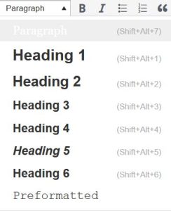
To ensure you are communicating the hierarchy and structure of your document to all learners, look in any text editor for a drop-down menu allowing you to format text as a hierarchical heading. For example in Pressbooks, where this resource was created, the visual editor has a drop-down menu to tag sections with Heading 1, sub-sections with Heading 2, sub-sections of sub-sections with Heading 3, and so on.

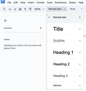
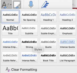
In Google Docs and other word processing programs, these styles are available in similar drop-down menus.


What if you don’t like how the headings look?
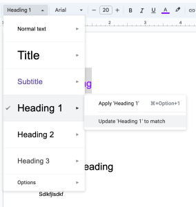
Once you’ve set your headings, you can alter its look as you would any text, changing the font, size, color, and style. The marked headings will continue to function as headings for screen readers, document maps, and other assistive devices or support tools. In Google Docs or other word processing programs, you can make that styling a default for an individual document or for all documents. Once you have restyled one heading the way you like it, you can select it, and then head back to the headings menu to set it as the default for that page. It will automatically restyle all of the headings of that level in the document, and any you add to that document as well. You can also head all the way down to the Options menu to set that style as the default for all of your Google Docs.

Attributions
- Intro, “Why is this important?,” and “What do you need to do?” adapted from “Accessibility Toolkit—2nd Edition” by Amanda Coolidge, Sue Doner, Tara Robertson, and Josie Gray (a collaboration between BCcampus, Camosun College, and CAPER-BC) licensed under CC BY 4.0.
