53 Visual Learning
Mariya Gluzman
Document Overview
This document contains several examples of multimodal content for visualizing data and helping visual learners engage with course material.
Document Purpose
The purpose of this document is to explore how several open-source digital tools can be used to create interactive multimodal content for courses to improve students’ engagement.
Introduction
Visual learning enables students to see information presented visually, not simply as text that can be read, but as graphs, pictures, charts, photographs, videos, etc. Statistically, 65% of people are visual learners. What that means is that they tend to process, understand, and recall information better when it’s presented to them visually.
When we are building OER courses we have an opportunity to not only use static text, maybe peppered with some images, but to create some multimodal content and dynamic content. There is no shortage of tools that are useful in helping faculty create engaging visual content. This document, however, focuses on open-source technology free-to-use technology.
One easy way to add exciting content that would, at the same time, help students learn is by using data visualization. Suppose an important painter changed their technique throughout their career and you wanted students to understand how and when those changes took place by examining the works that demonstrated those shifts clearly. Sure, students can read an article about it. But would it not be great if they can explore those shifts on a visual timeline?! Or if there are important related events that occurred in different places in a country, continent, or the world, wouldn’t it be great to explore them on a map that allows you to travel from one place to another at will? Or perhaps you are demonstrating a complex process of a project or experiment and want students to be able to interact with the order or timeline to be able to understand the steps? All of this and more can be done with a fairly small time investment and just a little bit of creativity.
Using Timeline JS
Introduction
Timeline JS is an open-source free tool developed by Knight Lab. It creates visual interactive time slices or slides from a simple Google Sheet. The app provides the google sheet template that the end-user will populate with their own data and plug back into the app. The app processes the data and provides a link and an embed code that can be easily shared so the timeline can be viewed. Timelines are very easy to update – just modify the original Google Sheet.
This tool can be very useful in visually presenting sequences of data in which the specific “when” (time) is essential and the specific “where” is not as important to the relationship between the individual data points.
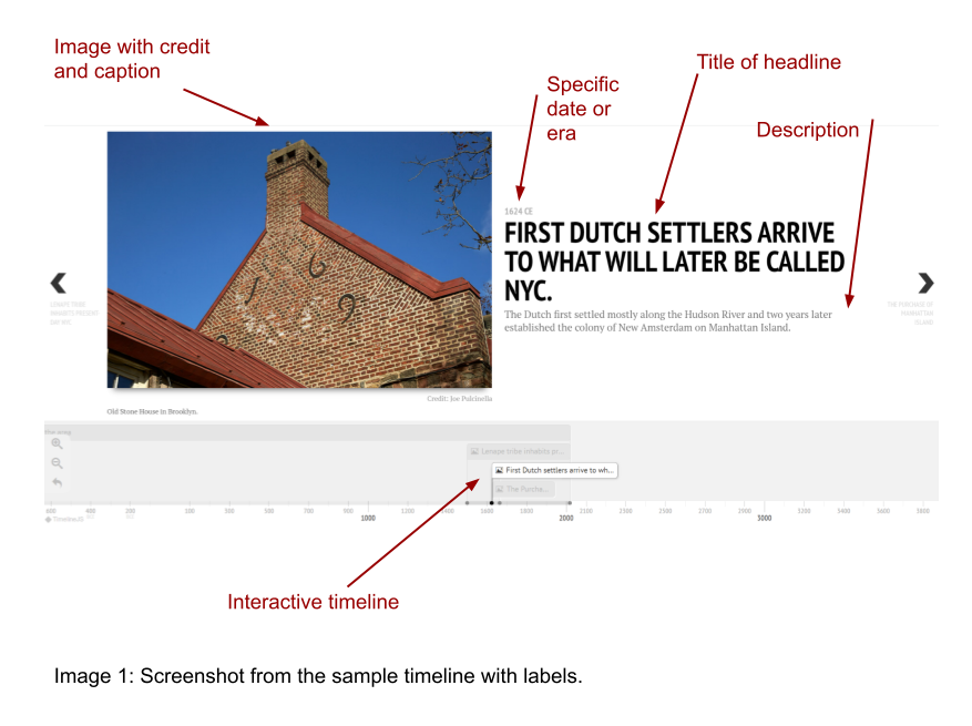
One obvious, but nonetheless exciting, use of Timeline JS is to create timelines. Here is an example of a sample timeline that lets users explore, via important snapshots/events in history, how the NYC area was populated by humans from antiquity until colonization.
Image 1 below shows a screenshot of a Timeline time slice/slide. In addition to the typical things you would see in a slide, such as a title, description/information, and image, on the bottom there is an interactive timeline on which different events or eras in your timeline are mapped and shown in relation to each other. This type of visualization can be very helpful.
Possible uses
Historical mapping of significant events, dynasties, wars, eras, periods, incidents, works of art, policies, laws, rulers, discoveries, and influential people, etc.
Visually presenting biographies.
Laying out, step by step, certain processes that involve phases. Can also be used to visually present topics from a syllabus or a major project in a course.
Using Storymap JS
Introduction
Storymap JS is an open-source free tool developed by Knight Lab. It creates visual interactive maps on which data points are located. The app has a graphical interface that allows content creators to input their information for each “slide”.
This tool can be very useful in visually presenting sequences of data in which the specific “where” (location) is essential and the specific “when” (time) is not as important to the relationship between the individual data points.
Storymap JS allows the content creator to take visitors on a journey, where every data point appears on a map and the entire “route” is visible and interactive.
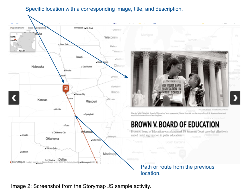
Here is the link to view a sample Storymap JS activity that explores the journey of Black Americans, from enslavement to the end of segregation.
Image 2 below shows a screenshot of a Storymap slide. The map is set as a background. A specific location on the map is marked with a symbol. This location corresponds to the title image, slide title, description, etc. The route or path is represented by a dotted line. The most recent “leg” of the trip is highlighted. Others are grayed out.
Possible uses
Mapping out how ideas, concepts, people, diseases, traveled in a particular part of the world or globally.
Highlighting important locations of historical events, famous figures, tragedies, wars, etc.
If using a Gigapixel image instead of a map, great works of art or important historical documents can be explored in detail using Storymap JS.
Using TimeMapper
Introduction
TimeMapper is an open-source free app developed by Open Knowledge Labs. It creates visual interactive maps with timelines. The app uses a simple spreadsheet (a sample Google Sheet is provided that content creators can customize) to present data visually.
This tool is useful when both the “when” (specific point in time) and the “where” (specific location) are equally important.
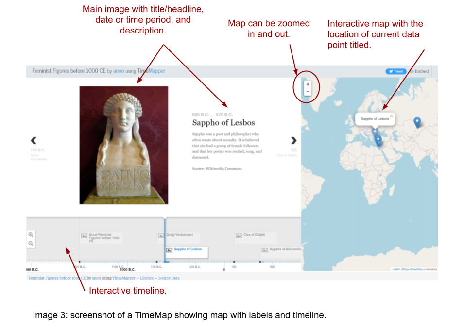
Here is the link to a sample TimeMap created to highlight some feminist figures in antiquity. The TimeMap plots both the lifetimes and geographical locations of remarkable female scholars and philosophers in an interactive timeline-map combination.
Image 3 below shows a screenshot of a TimeMap slide. The map with all the locations is interactive and can be zoomed in or out by the viewer. There is an interactive timeline on which different dates or intervals are plotted.
Possible uses
This is app combines the functionality of Storymap JS and Timeline JS, so any timeline activity that can benefit from a map component is a good candidate.
