10 Measuring the Price Level: The Consumer Price Index
Bettina Berch
Consider this
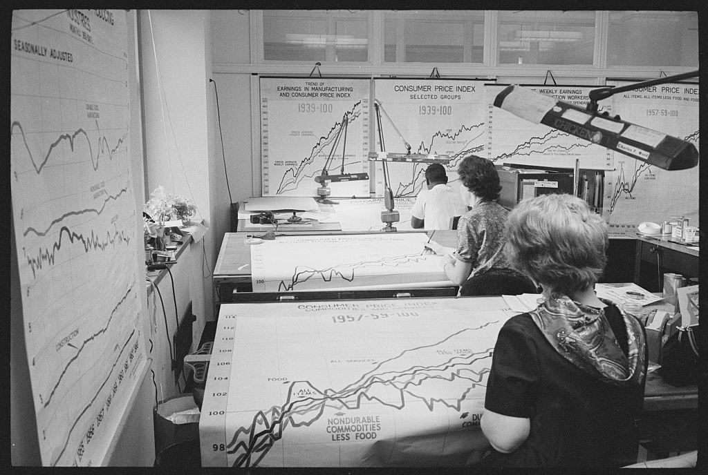
Imagine what it must be like gathering the data for our Consumer Price Index. Then imagine what it was like when no one had computers! Are you surprised to see women workers in this office?
As we’ve just seen, measuring the size of our economy, our GDP, may not tell us what we really want to know. Probably the actual size isn’t as important as whether it’s growing–and how fast? And as we’ve just seen, we could do a better job including more meaningful components. We still have the problem of sorting out changes in prices. If our GDP in 2020 [Σ(P x Q)] is 5% higher than it was the year before, does it mean we produced 5% more goods and services? Or, did we produce the exact same amount from one year to the next, but the price level went up by 5%? We’d be cheering if real growth was 5%. We’d be very unhappy if output (Q) stayed the same–or even fell–and all the increase in (P x Q) was due to prices shooting up. We already looked at one way of dealing with changes in prices–the GDP deflator. Now we’re going to develop another method, the Consumer Price Index, or CPI.
A second tool for dealing with price level changes: the Consumer Price Index (CPI)
Suppose we could put together a totally typical market basket for the totally typical American consumer, a long list of the goods and services most people buy in a month. This market basket might be filled with milk and eggs and tee-shirts and socks and teeth-cleaning visits–not necessarily high value items or crazy interesting things, just typical things that typical people buy over and over. Then imagine we priced-out this same basket, month after month, year after year, to see how prices for that basket of typical things were changing. Suppose we then converted that price series into index numbers, which we could use to evaluate a range of important things, like a proposed wage hike, or the annual increase in rent control. The process we’ve just described is what the Bureau of Labor Statistics actually does, when it produces the Consumer Price Index, or the CPI.
What goes into the CPI
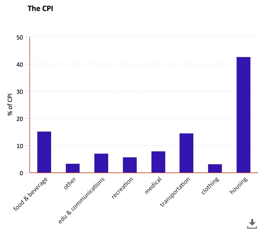
The bar chart above shows the relative importance of different categories of goods and services in the CPI. We see that housing is huge, transportation and food are both about equal, and only then come medical services. You might find that surprising, since medical care is notoriously expensive. This is why we use data (that’s been gathered by an unbiased agency) rather than our own opinions when assessing reality. With the relative weights of different things in the typical market basket established, the BLS will price the basket over time, developing an index of changes in the price level that people can use for a variety of purposes. Since that sentence just papered over the question of ‘how do they do it’ we can stop for a moment and create our own simplified CPI, with only two products and three years and see how it’s done.
Our simplified CPI
Let’s start with an economy in 2008, 2009, and 2010 that only produces hot dogs and hamburgers. We do consumer research and discover that the typical shopper buys 4 units of hotdogs and 2 units of hamburgers. We decide these will be the quantity weights in our index. We price out the basket each year keeping the 4 units of hot dogs/2 units of hamburgers as our weights:
| YEAR | PRICE OF HOT DOGS | QUANTITY OF HOT DOGS | PRICE OF BURGERS | QUANTITY OF BURGERS |
| 2008 | $1 | 4 | $2 | 2 |
| 2009 | $2 | 4 | $3 | 2 |
| 2010 | $3 | 4 | $4 | 2 |
We can then add a “cost of market basket” column in our chart:
| YEAR | PRICE OF HOT DOGS | QUANTITY OF HOT DOGS | PRICE OF BURGERS | QUANTITY OF BURGERS | COST OF MARKET BASKET |
| 2008 | $1 | 4 | $2 | 2 | $8 |
| 2009 | $2 | 4 | $3 | 2 | $14 |
| 2010 | $3 | 4 | $4 | 2 | $20 |
Now we are going to compute the CPI for this little economy. Let’s start with the definition of CPI:
CPI = (the cost of the basket in the selected year ÷ the cost of the basket in the base year ) x 100.
So, let’s set 2008 as the base year, and fill in:
the CPI numbers for 2008: ($8 ÷ $8) x 100 = 100
the CPI numbers for 2009: ($14 ÷ $8) x 100 = 175
the CPI numbers for 2010: ($20 ÷ $8) x 100 = 250.
| YEAR | PRICE OF HOT DOGS | QUANTITY OF HOT DOGS | PRICE OF BURGERS | QUANTITY OF BURGERS | COST OF MARKET BASKET | CPI (base 2008) |
| 2008 | $1 | 4 | $2 | 2 | $8 | 100 |
| 2009 | $2 | 4 | $3 | 2 | $14 | 175 |
| 2010 | $3 | 4 | $4 | 2 | $20 | 250 |
Now we have CPI figures for our little economy. Maybe you are thinking–who cares? Let’s take this information and transform it into something people do care about: the inflation rate.
First, let’s define the inflation rate: Inflation rate = [(CPInew year– CPIformer year )÷ CPIformer year ] x 100.
Using this data, we can compute some inflation rates, something people do care about:
inflation rate for 2009, compared to the previous year = [ (175-100) ÷ 100 ] x 100 = 75% inflation rate
inflation rate for 2010, compared to the previous year = [ (250-175) ÷ 175] x 100 = 43% inflation rate
The actual CPI over time
We created a tiny CPI for a couple years, to see how we could get from something unfamiliar, like the CPI, to something we cared about, like the inflation rate over time. You might be wondering how the actual U.S. CPI has moved over time. This graph shows the movements of our (urban) CPI over time, where the grey vertical bars mark recession periods:
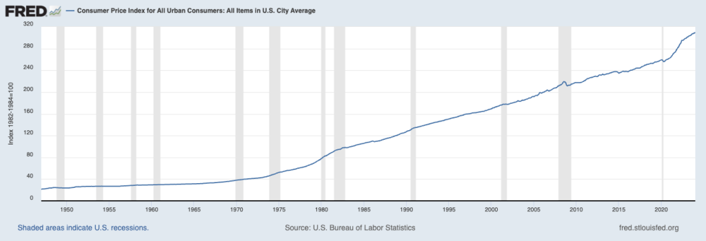
You see a definite drop around 2008 (the crash of financial markets) a jump upwards after 2020 but less volatility in general in the modern age–maybe because economists have gotten better at using policy tools? In any case, now that we know what the inflation rate is, where it comes from, and how it’s been moving over time, we need to ask ourselves ‘what difference does it make’? What is the meaning of the CPI going up, and what kind of costs does it impose on society?
The Costs of Inflation
First, when the CPI goes up, it means that the typical things consumers spend money on–rent, food, transportation, etc–have gotten more expensive. Unless we are also getting more money in wages or other income, our standard of living is falling. We aren’t able to get as much stuff. That’s the pain of inflation that we think about most often, when we are buying groceries, and they’re 2-8% more expensive each visit. But imagine you lived in a country with 80% inflation or 200% inflation–what’s sometimes called hyper-inflation. Hyper-inflation brings a new set of problems. First, imagine you’re working in Argentina or Venezuela or Zimbabwe, countries which have had super-high inflation in recent years. When you got paid on Friday, what would you do? You’d take your paycheck right to the bank and cash it so you could spend the rest of Friday buying up necessities before they went up in price. You might have spent most of Friday planning your spending, instead of thinking about work. All of this–the planning, the rushing around–is very unproductive for the economy as a whole. Economists, being very ‘retro’, call these ‘shoe leather costs,’ as they imagine you wearing down the soles of your shoes spending your cash quicker. Another ‘retro’ cost of inflation is called ‘menu costs,‘ when prices change so fast that restaurants and other retail units have to constantly paste over the prices on menus to keep them updated. While many price lists these days are not real life paper menus that have to be expensively updated, but virtual prices on the internet that can be updated electronically (or even ‘dynamic prices’ that update via algorithm) the fact of price lists changing can imply some expensive decision-making. Imagine you produce furniture. You see the prices of furniture in the market rising fast. You now have some expensive decisions to make. If you decide that furniture prices are going up because everything is going up (general inflation), you will just increase your prices to match and keep going. But suppose you see furniture prices rising and decide–wow, there’s a lot of new demand for furniture out there! I better open a new factory and start producing more furniture! Which do you choose? As a manufacturer, you are not sure how to interpret a price change in your business–and this can be costly. Consumers can also wonder when they see certain prices going up rapidly–is that increase particular to dairy products, let’s say, or to all food? Depending on which it is, you will make different choices, but it isn’t easy to know for sure.
Inflation Can Impact Some People More than Others
Inflation can also be costly for particular groups of people in society–even though inflation means a general increase of the price level. It still hits some particular folks more than others. First, let’s think about people whose paycheck does not go up with a rise of the price level: people earning the minimum wage. The Federal minimum wage was raised to $7.25 an hour in 2009, although many of us live in states with much higher minimum wage laws. As inflation increases, that $7.25/hour buys less and less groceries. Because the Federal minimum wage is fixed in nominal terms, its purchasing power goes down as inflation goes up. There are other people on fixed income–retired people receiving Social Security benefits, for example. Every January, Congress announces how much that check will increase or decrease, and grandma gets that set amount all year long, even if terrible inflation starts in February and rages for the whole year. Grandma will have to get by until the following January, when her check may increase. (Whether seniors can keep up with the cost of living is a tricky question, since the seniors spend a disproportionate amount on health expenses, which may not be reflected in the CPI averages.)
Another specific group impacted by inflation are people who hold onto a lot of their savings in cash. Many people don’t trust banks. Many people feel safer hiding cash in their homes. Many people don’t live in the U.S. but keep a stash of dollars in their bedroom in case their own country’s currency goes bad. Whatever their reasons–inflation eats away at the purchasing power of those dollars.
A final group impacted by inflation are lenders, either individual, institutional or governmental. They feel a special impact if they have lent someone money and there’s unexpected inflation before it’s paid back. Let’s take a simple example. Suppose you lend your friend $100 to buy 3 textbooks. He says he’ll pay back your $100 next year–and you are ok with that, because he’s your friend and you wouldn’t charge him interest. But imagine during this year, we have huge inflation. Prices go way up on everything. Your friend comes back to you a year later with his $100 to pay you back. Now you, the lender, are upset. Why? Because that $100 he is giving you has less purchasing power than when he borrowed it. Maybe that $100 will only buy 2 textbooks now. If you had expected that inflation, you would have factored it into the deal. You would have told him how much inflation you expected to occur, and reset the amount he owed you to maybe $125. Obviously, your debt issues with your friends may not be a big deal. But in the U.S. in the late nineteenth century, fierce political campaigns were fought by a big borrower class (farmers) against the lender class (big banks) over the gold standard and the status of silver. And in the modern day, when countries like China hold a lot of U.S. debt, signs of high inflation in the U.S. are very worrisome to Chinese policymakers. The bottom line: unexpected (or unanticipated) inflation hurts lenders but benefits borrowers.
Other Measures of the Price Level
In an earlier chapter we developed the GDP deflator, which dealt with inflation puffing up our nominal GDP year after year, by creating an index with fixed prices, and adjusting GDP figures by this index. Why have a CPI and a GDP deflator? We have them both because they include different things. The GDP deflator is based on the total of goods and services produced by our economy in any given year. The CPI is based on what typical shoppers buy. Some things are included in one and not the other. For instance, our GDP deflator includes some very high-ticket items–like satellite systems and military weapons–that typical shoppers never buy. But typical shoppers buy imported goods–my breakfast mango, my tee-shirts made in Cambodia–goods that were not produced by our economy, so they are not in our GDP. Understanding this, you can see why the CPI is used for a lot of average-person applications: adjusting wages with a COLA (cost of living adjustment) clause, or adjusting Social Security payments. The GDP deflator is used more for national income accounts and measures which look at the growth of our economy overall.
That said, we do have other indices. We have one index (and its variations) that’s called the core inflation index. This index leaves out elements of the CPI that economists know are very volatile and can sometimes throw things off, like food and energy costs. If there’s a war, or rumors of war, the price of oil may shoot up, even if other elements of our price index are fairly constant. Coffee prices can go up after a bad harvest, but they don’t represent a change in overall prices, so they’re not included in the core index either. Of course, for many of us, leaving out fuel and food means leaving out most of what we buy, so the core index might be something we ignore. But imagine an index that told us how consumer prices would look in a few months? That could be useful, right? We have a version of that, called the Producer Price Index (PPI), which tracks wholesale prices–which usually become our retail prices in a little while.
Finally, we have the ‘personal consumption expenditures price index‘ or PCE, which the Federal Reserve considers its go-to measure for evaluating inflation. This measure is designed to be more inclusive, so spending done by institutions on the behalf of consumers, like Medicare and other social services, is also included. Its methodology also corrects for some of the substitution bias of the CPI, and allows the market basket weights to change over time as consumers move away from some goods. As with the CPI, there’s also a ‘core’ version which leaves out spending on groceries and energy.
Problems with the CPI
While the CPI is an extremely useful tool, it has a couple problems we need to consider. The rotary dial phone of your grandparents is nothing like the smart phone you’re carrying. The grandparents would be surprised to bite into an Impossible Burger and find out it wasn’t meat! The world is full of new things to buy. Some are improvements on an old model, others are completely new. If our market basket weights stay constant, we need ways to take into account improved features of existing products, and find room for totally new products, while still keeping the basic structure of the CPI, so it’s meaningful. To deal with new or changing products, the BLS makes what it calls hedonic quality adjustments, that evaluate how much those product tweaks are worth.
There’s another CPI problem that we all know is there: the substitution problem. When we go shopping, we might bring a list. But if something on our list is very expensive this week, we might substitute something cheaper. We substitute if we can, but the CPI doesn’t substitute–it will keep including the more expensive item because it’s keeping the basket contents constant. This means the CPI will over-estimate our cost of living–we are busy substituting cheaper items, while the CPI is keeping them in. This problem is so well-known, that we just accept that the CPI over-estimates changes in the price level, and we leave it at that.
Let’s Try Using the CPI
Now that we know what the CPI is–and isn’t–let’s try using it. Here’s an example from real life. In 2008, I was riding the subway in NYC. It was just before a proposed fare increase, and the folks who run the subway put up an ad:
“In 1986, the subway fare was $1. That’s $1.89 in 2008 dollars! Believe it!”
I decided to check into this ad–and to take a deeper look at whether subway fares were really going up by a lot, or what. To do this, I started with the basic equation for converting prices from one period to another using the CPI:
price in today’s dollars = price in an earlier time x (price level today/ price level in earlier time).
I then looked up the subway fare over recent decades, and the CPI figures so I’d have the ‘price level’ for those years. I called 2008 the base year, a comparison suggested by the MTA’s ad. Then I did the arithmetic to convert the nominal fare in the selected years (the price you paid at the fare booth) into a price in constant 2008 dollars:
| Year | nominal fare | CPI in this year | Calculate fare in 2008 dollars | fare in constant 2008 dollars |
| 1970 | .20 | 38.8 | .20 x (215.3/38.8) | $1.09 |
| 1986 | $1.00 | 109.6 | $1 x (215.3/109.6) | $1.96 |
| 2008 | $2.00 | 215.3 | $2 x (215.3/215.3) | $2 |
| 2010 | $2.25 | 218.3 | $2.25 x (215.3/218.3) | $2.22 |
| 2013 | $2.50 | 230.28 | $2.50 x (215.3/230.28) | $2.34 |
| 2015 | $2.75 | 233.71 | $2.75 x (215.3/233.71) | $2.53 |
| 2023 | $2.90 | 299.17 | $2.90 x (215.3/299.17) | $2.09 |
We see that the fare went from an equivalent of $1.09 in 1970, to $1.96 in 1986, to $2.00 in 2008. The point in the MTA’s ad–that the 1986 fare was almost the same as what they wanted to raise it to in 2008 constant dollars–was pretty true! They were raising the nominal fare but the real fare hadn’t changed much since 1986. For fun, I continued the chart to include more modern increases. My own takeaway, was that the big jump in fare actually happened in 1986, when the real fare nearly doubled from its level in 1970. The fare increased to $2.90 in 2023 but inflation was so high that this increase didn’t keep up with the general rise in the cost of living.
So the next time grandma looks shocked at how much money you stick in a vending machine for a coke…..well, you can do the arithmetic!
Some Useful Materials
Watch a good video on measuring inflation and the CPI.
Learn about how “hedonic adjustments” address quality changes in elements of the CPI.
Media Attributions
- Graphing the CPI is licensed under a Public Domain license
- the-cpi is licensed under a Public Domain license
- CPI over time © US BLS is licensed under a Public Domain license
