9 Evaluating GDP: Does It Measure What We Want It To?
Bettina Berch
Consider this

If having a big GDP is great, then a GDP that gets bigger and bigger every year must be fabulous. Or is it? Sometimes bigger GDP just means adding more to the landfill.
In the last chapter, we said that GDP was the “market value of ‘all’ final goods and services produced within a country in a given period of time.” And we found out, that when you do the calculations, the U.S. GDP was valued around $28 trillion dollars, a huge figure. How can we even use such a number? One idea would be to ask ourselves, is that GDP of $28 trillion dollars bigger than it was a decade ago? (i.e., did we grow?) At what rate did we grow? These seem like simple questions to answer—but they’re not.
The Problem of Nominal Versus Real
When we defined GDP as the “market value” of everything, we said it was the sum of all (market “P” multiplied by market “Q,”). We could write that as
If we compare the GDP figure for 2010 to the GDP for 2020, we might see an increase. An increase in GDP sounds great, since it should mean that we had more stuff in 2020, that we were living better, that our standard of living increased. Now, every part of that sentence is a problem—but we’ll take on the nominal versus real problem first. If
The GDP Deflator
We have two main ways of adjusting for changes to the prices level. The first method produces what’s called a GDP deflator, a tool for evaluating GDP year after year using a fixed set of prices. (Essentially it ‘deflates’ the hot air of rising prices out of the GDP figures.) To see how such a deflator is built, let’s imagine three years of an economy that only produced two goods, hot dogs and burgers. The nominal GDP for this economy would be the sum of the P x Q for hot dogs and burgers each year:
Building the GDP Deflator
| Year | price of hot dogs | quantity of hot dogs | price of burgers | quantity of burgers | NOMINAL GDP |
| 2008 | $1 | 100 | $2 | 50 | $200 |
| 2009 | $2 | 150 | $3 | 100 | $600 |
| 2010 | $3 | 200 | $4 | 150 | $1200 |
Then we could pick one of those year’s prices—say 2008’s prices and call that our base year. We could then go ahead and compute the real GDP for each year by multiplying those years’ quantities by the base year (2008) prices:
Real GDP (2008) = ($1 x 100) + ($2 x 50) = 200
Real GDP (2009) = ($1 x 150) + ($2 x 100) = $350
Real GDP (2010) = ($1 x 200) + ($2 x 150) = $500
Building the GDP Deflator
| Year | price of hot dogs | quantity of hot dogs | price of burgers | quantity of burgers | NOMINAL GDP | REAL GDP (at 2008 prices) |
| 2008 | $1 | 100 | $2 | 50 | $200 | $200 |
| 2009 | $2 | 150 | $3 | 100 | $600 | $350 |
| 2010 | $3 | 200 | $4 | 150 | $1200 | $500 |
From that Real GDP column, we can develop a GDP deflator using the definition,
GDP deflator = (Nominal GDP/Real GDP) x 100
So:
GDP deflator for 2008 = ($200/$200) x 100 = 100
GDP deflator for 2009 = ($600/$350) x 100 = 171
GDP deflator for 2010 = ($1200/$500) x 100 = 240
.With the figures we’ve used, you can see our own little GDP deflator rises from 100 to 171 to 240. We could then take any year’s nominal GDP, divide it by this deflator, and get real GDP.
How to Use the (actual) GDP deflator
Fortunately, the U.S. government saves us a lot of work by publishing GDP deflator data that we can use:
| Year | Nominal GDP (billions of dollars) | GDP deflator |
| 2017 | 19,479.6 | 108 |
| 2018 | 20,527.2 | 110 |
| 2019 | 21,372.6 | 112 |
| 2020 | 20,893.7 | 114 |
| 2021 | 22,997.5 | 118 |
We can now translate nominal GDP into real GDP by dividing the nominal GDP by the deflator and multiplying by 100. So for 2020, for example, real GDP would be: ($20,893.7 ÷ 114) x 100, or $18,328 billion.
Real GDP (Nominal GDP adjusted for Changes in the Price Level) Still May Not Tell Us What We Want
With our GDP data adjusted for changes in the price level, we could now look at real GDP growth in the U.S. over time. Not so fast! What if our real GDP is increasing, but our population is growing two or three times as fast? This is the case in many developing countries. In this case, rising GDP won’t mean the average person has more stuff because there are more people ‘eating at the table.’
On the other hand, GDP may be constant with a falling population size (this happens in some developed countries). In this case, slow GDP growth still produces a higher standard of living. For these reasons, we usually divide real GDP by population size, to get real GDP per capita (“per head,” or “per person”):
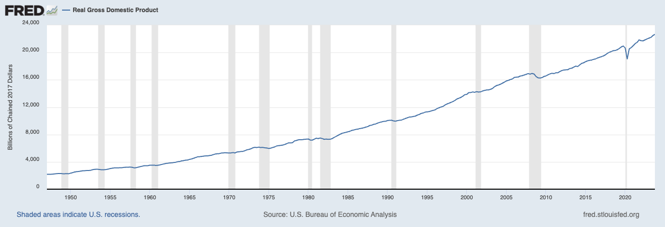
U.S. real GDP per capita over time
As you can see, real GDP per capita has been rising steadily over time, except for the shaded years, marking drops in growth or recessions. This might not be a big ‘aha’ moment, since you know the U.S. is a strong economy. Maybe you’re wondering, how does U.S. growth compare to growth in France? Or Germany?
Comparing GDPs of Two Countries
Let’s go through the steps of making such a comparison. First, we’d have to convert currencies, since Germany’s GDP is reported in Euros, and the U.S. GDP is in dollars. Let’s convert Germany’s real GDP to dollars:
German’s real GDP in dollars = (Germany’s GDP in Euros) / (exchange rate of Euros to dollars) …or 2737billion Euros/ .753…which equals $3636 Billion U.S. dollars.
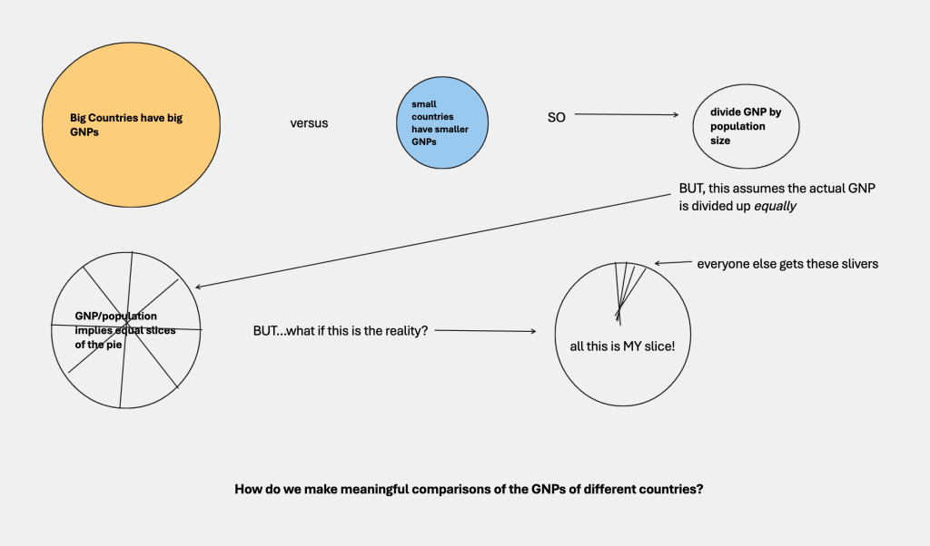
If we compare Germany’s $3636 billion with the U.S.’s $16,768 billion, the U.S. economy seems like it’s five times bigger than the German economy. But these are countries of very different sizes (more people means more production). The U.S. is much bigger than Germany. China is much bigger than the U.S. As we just saw, we need to divide real GDP by population size. If we do that in the example we started, Germany comes out to $46,241 per capita and the U.S. at $65,474 per capita. So the average German doesn’t have as much stuff as the average American—but it’s nowhere near that factor of five!
Now, it might be bothering some people—especially people who have actually lived in other economies in this world—that the official exchange rates of currencies, which this whole process started with, might be more than a little off. Some countries purposely undervalue their currencies (which we’ll explore in a chapter on world trade). When we use that undervalued exchange rate, that will skew the $GDP conversion, which will then throw off comparisons of well-being. For this reason, economists like to adjust GDPs by the PPP (purchasing power parity), an index that takes into account the purchasing power of different currencies. It’s worth trying out the interactive tool developed by the World Bank to make comparisons of different countries’ GDPs per capita adjusted for PPP.
Here’s an example comparing the U.S., Canada, Mexico, Honduras, and China:
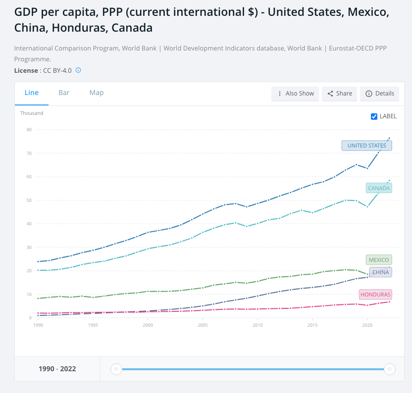
The chart shows you trends in real GDP growth over time in a few countries, which should tell you something about relative standards of living in these countries. But is that really what you are seeing?
‘Average Living Standards’ Can Be Misleading
Remember the definition of ‘real GDP per capita’: it’s real GDP divided by population size. It’s a straight average. But suppose everyone in the country is not getting an equal slice of the economic pie. Suppose I’m the dictator, and I take 95% of the GDP for myself and my families, and I leave 5% for everyone else to divide up. The standard of living of each citizen will be very low, compared to an economy that’s divided up more equally. Per capita comparisons cover up differences in the distribution of income.
As you could imagine, it’s not going to be as easy to make this adjustment! Before we try, let’s step back and evaluate what we’re measuring. We started by converting real GDPs to a single currency, then dividing by population size, so we were comparing real GDPs per capita. Then we realized that per capita comparisons might be very misleading, since some societies divide up their income more equally than others. Even if we adjusted for inequality, we have to stand back and question what we are comparing when we base everything on GDP. Is GDP a good proxy for well-being? What might work better?
Better Measures of Well-Being
A country’s GDP might include a whole lot of negative things (extra locks for the doors because of high crime means a higher GDP but lower quality of life). It might leave out a lot of good things (my homemade bread, your music sessions with your buddies, long walks by the sea). To find a better measure of quality of life, some UN economists developed what they call the HDI, or Human Development Index.
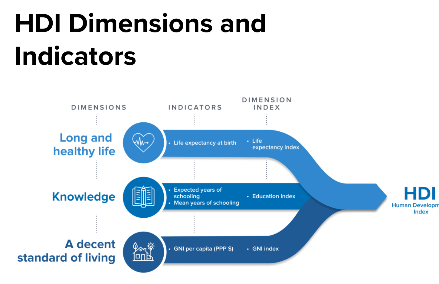
Real GDP per capita is only one component of any person’s standard of living. HDI also includes measures of education, length of life, and health. The U.N. Human Development report collects data and ranks the countries in the world according to 1) their human development index and 2) their human development index adjusted for the degree of inequality in that country. In the table below, the column to the farthest left shows the HDI ranking of the country and the column to the farthest right shows you how many positions in the ranking– up or down –that country would move if you took into account the inequality in that country.
Human Development Index (HDI) Data for 2021
| HDI rank | Country | HDI index | inequality-adjusted HDI | change for inequality-adjusted rank |
| 1 | Switzerland | .962 | .894 | -3 |
| 2 | Norway | .961 | .908 | 0 |
| 3 | Iceland | .959 | ,915 | 2 |
| 4 | Hong Kong | .952 | .828 | -19 |
| 21 | United States | .921 | .819 | -5
|
| 110 | Jamaica | .709 | .591 | 5 |
| 137 | Honduras | .621 | .479 | 4 |
You can visit the full listing of countries if there’s a country you want to check. From the data selected, you can see that the U.S. only stands at #21, and would fall to #26 if the inequality in the U.S. were taken into account. Hong Kong, at #4 in HDI, would fall to #23 if its inequality were factored in.
Bhutan Proposes an Alternative to GDP: Gross National Happiness (GNH)
While HDI is a good measure of well-being, it still gives huge importance to GDP, which might not be ideal. One small country, Bhutan, decided in 1972 to invent its own measure, Gross National Happiness. GNH, as it’s called, includes a lot of things that might be surprising: respect for cultural heritage, community vitality, time use, and more. There are 9 of these ‘domains’ and 33 indicators used to measure progress.
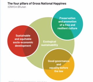
It might sound like a lot—and it certainly includes a lot of things that are difficult to measure—but there’s an old saying, ‘what you count, is what counts!’
The Material World Approach to Standards of Living Around the World
Another, very different approach to the ‘wealth of nations’ was taken by Peter and Faith Menzel and their team in 1994, when they visited 30 countries to take a look at what typical people in those countries owned and valued. When his team located a co-operating family in Iceland or Mali or Mongolia, for example, they would move all the family’s worldly possessions outside their home for a photograph and inventory, followed by some discussion of their belongings. Menzel’s team visited some families a decade later, so you can see what they bought when they got more money. In general, you can see vast differences in the amount of goods families own–one American family has so much stuff it doesn’t even fit into a single portrait. Sometimes you realize a family has no electrical appliances. Some hold up important possessions, like a family bible, with obvious affection. What’s striking, is how much people really do value their own possessions, however meager they might seem to someone else. We like our stuff.
Some Useful Materials
Watch a video explaining Real vs. Nominal GDP and more.
Read about some better ways to evaluate national well-being.
See how ‘Dollar Street’ looks at comparing living standards around the world.
Watch a video on how to compare GDPs of different countries.
Read more about GNH, Gross National Happiness, and don’t miss the video at the end!
A visit to the “happiest” country in the world, Finland–what is happiness measuring?
Media Attributions
- Rich and Poor © Mike Coghlan is licensed under a CC BY-SA (Attribution ShareAlike) license
- GDP comparisons © Bettina Berch is licensed under a CC BY-NC (Attribution NonCommercial) license
- GNH © Felix Mueller is licensed under a CC BY-NC (Attribution NonCommercial) license
