2 Economics is a Social Science: We Use Models to Analyze Real Life
Bettina Berch
Consider this
Many sciences use models to test their ideas. Are models just smaller versions of things, or do they allow us to see more?
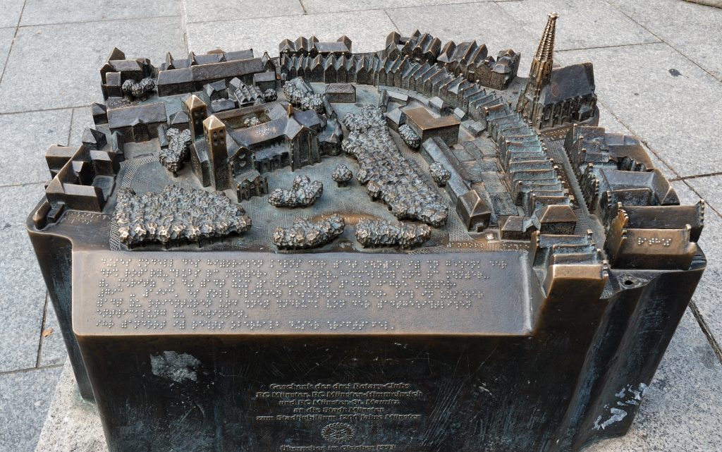
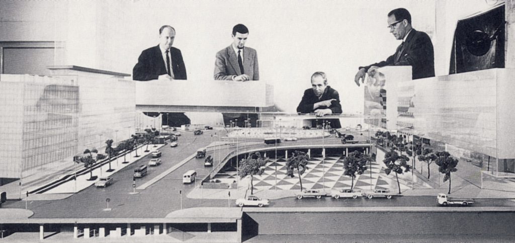
Sometimes a tactile architectural model is provided for visitors–useful for everyone!
Unlike physical sciences like biology or chemistry, economics is a social science. We study human behavior under a variety of circumstances—how we react to a change in market prices, how we decide to save or spend, etc. Because it’s human behavior we’re studying, it’s not always possible to set up laboratory experiments and see how people react to certain situations (like lack of money, or food and shelter). Sometimes, we can examine historical data, like changes in worker wages in the 19th century, for example, and see how that correlates with unemployment rates in the same period. But such historical work may be of limited usefulness.
Instead, economists, like other social scientists, rely on models. The art of model-building—and it is an art—lies in identifying the important variables driving the action and leaving out all the unimportant stuff. Once we feel we have captured the essence of the situation, we can go and test our model and see if its predictions are accurate and useful. We may then go back and refine the model so it pays attention to the issues we want to focus on and ignores the irrelevant stuff.
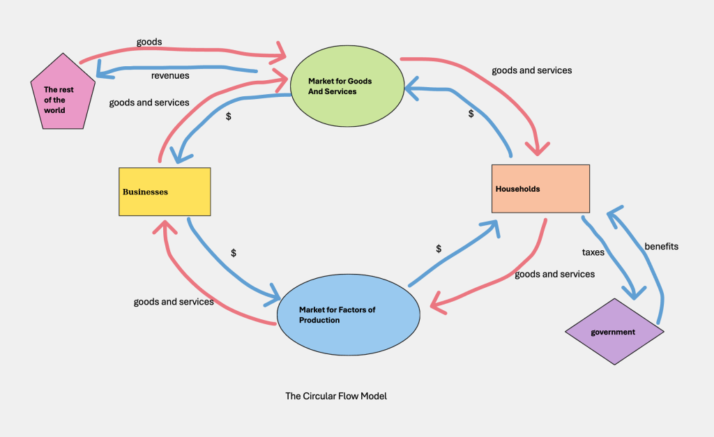
The circular flow model of the economy
Let’s try out the modeling process by looking at a very basic model we use in macro: the circular flow model of the economy. Here’s how it might look:
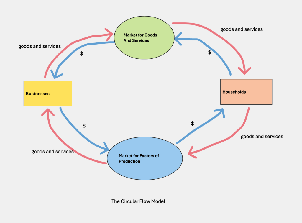
We have two major operators: businesses or firms, and households. Businesses are any units that produce goods and/or services, for example, a record company that produces records, or a university that produces education/training for people. Households are consumer units, like me living alone, or you with your family, for example. Households include various kinds of factors of production—workers who bring in wages, landlords who bring in rental payments from the properties they own, or capitalists who gain interest on the capital they lend out.
We have two kinds of markets. The market for factors of production is where inputs into production—land, labor, capital—are bought and sold. The market for final goods and services is where the things the economy produces are sold (tables, chairs, fridges, etc), and where services are sold (doctors, police, teachers, etc). The model is showing you that these four things are connected.
Let’s see how by following the red outer loop, and start with a business. Let’s say this is a business that produces vinyl records. They send those records to the market for final goods and services, in this case, maybe an actual record store. Someone from your household buys a record and brings it home. And someone from your household goes and gets a job at a market for factors of production and goes to work at a business. So far, we’re following the movement of real things—a record moving from a factory to your apartment, someone from your apartment getting a job and going to work for a business.
Following the blue inner loop, there’s a flow of money going in the opposite direction. Money from the sales of vinyl in the market for final goods and services flows back to the record company, which uses these revenues to hire workers in the market for factors of production, wages, for example, which flow into a household. The household uses such money flows to buy consumer goods in the market for final goods and services.
By showing the actors and their interconnections this way, the model encourages you to focus on interconnections, the reliance of households on businesses, of businesses on households. For example, if households don’t have enough money to spend on things, businesses will receive less revenue, which might mean they cut back on hiring factors of production, which will lead to households having less purchasing power again. This can be an important argument by economic policymakers to raise unemployment benefits, for example. Increasing household spending can translate to increased business revenues and increased hiring. Later on, we will use this circular flow model to make other points, like adding up our GDP by using income or expenditures, but even here, you can see how a simple model can drive home a point of view.
Making the circular flow model more complex
But you may be thinking, this model is SO simple it leaves out a lot of things we need to think about. For instance, where would we locate those unemployment benefits we just mentioned? And where’s grandma’s social security check? Where are taxes? Turns out, this model is so simple, it left out the government altogether, and we need it in here if we want to show certain things. But no problem, we can add it in:
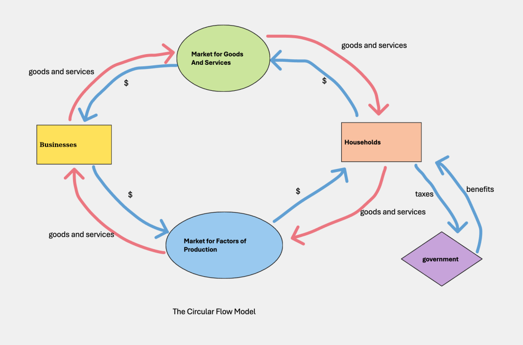
Once we add in government, we can connect it to businesses and households, recognizing that each sectors sends money to the government in taxes and receives money back in subsidies or income support payments. This would be an important addition if you wanted to focus on cutting taxes or raising various payments.
Likewise, you might look at the simple model and complain—the stuff the average household buys, isn’t made in that factory on the other side of the circular flow diagram, it’s made in another economy altogether. You can give an American household a big bump up in income, and it’s not going to flow to an American business, it’s going to go to a foreign country! The simple story we told about stimulating our businesses by increasing our households’ spending power might not work! So, first step would be to improve our model by adding in “the rest of the world”:
Once we do this, we can decide how much to embed the role of other countries—is it just going to be an import-export situation as shown here, just sending and receiving final goods and services, or will we make it more complex? It really depends on what we’re trying to do with the model. But just talking about it, we begin to see relationships—which models help us focus in on.
The production possibilities frontier model
Now let’s examine another model we use in economics, the production possibilities frontier model. This model starts with a basic question: How much stuff could our economy produce—given our state of technology—if we used all our resources as efficiently as possible? You can see how useful the answer might be, as it would give us a real sense of how strong our economy is—either relative to how it used to be, or relative to other economies.
The first issue we’d have to address is a practical one—even a simple economy produces a huge number of different goods and services, using even more different sorts of inputs. How can we possibly capture that in two-dimensional space—on a piece of paper? The answer? We simplify! Imagine our economy has two types of output possible—let’s say, farm goods and manufactured goods. How much of each output could we produce, with the technology we’ve got, if we used our resources efficiently?
To create a reasonable data table, let’s imagine if all our resources were used to produce farm goods and we produced no manufactures, or the other extreme, all manufactures and no farm goods. Then let’s fill in two intermediate positions, where we produce some of each output. And while we’re making up these numbers, they have to be sensible—to get a little more manufactures, we’re going to have to give up some farm output. Let’s look at this data on what our economy could produce, given our resources and our level of technology:
| Farm goods | Manufacturing |
| 1000 units | 0 units |
| 900 units | 1000 units (point B) |
| 600 units | 2000 units (point A) |
| 0 units | 3000 units |
If we produce ONLY farm goods, we can produce 1000 units (whatever those units are), but then we produce no manufactures. Likewise, we can produce 3000 units of manufactures if we are ok with having no farm goods. Intermediate output mixes like A or B allow us a bit of both. Now let’s graph these points, by putting farm output on one axis and manufactures on the other (it makes no difference which is which):
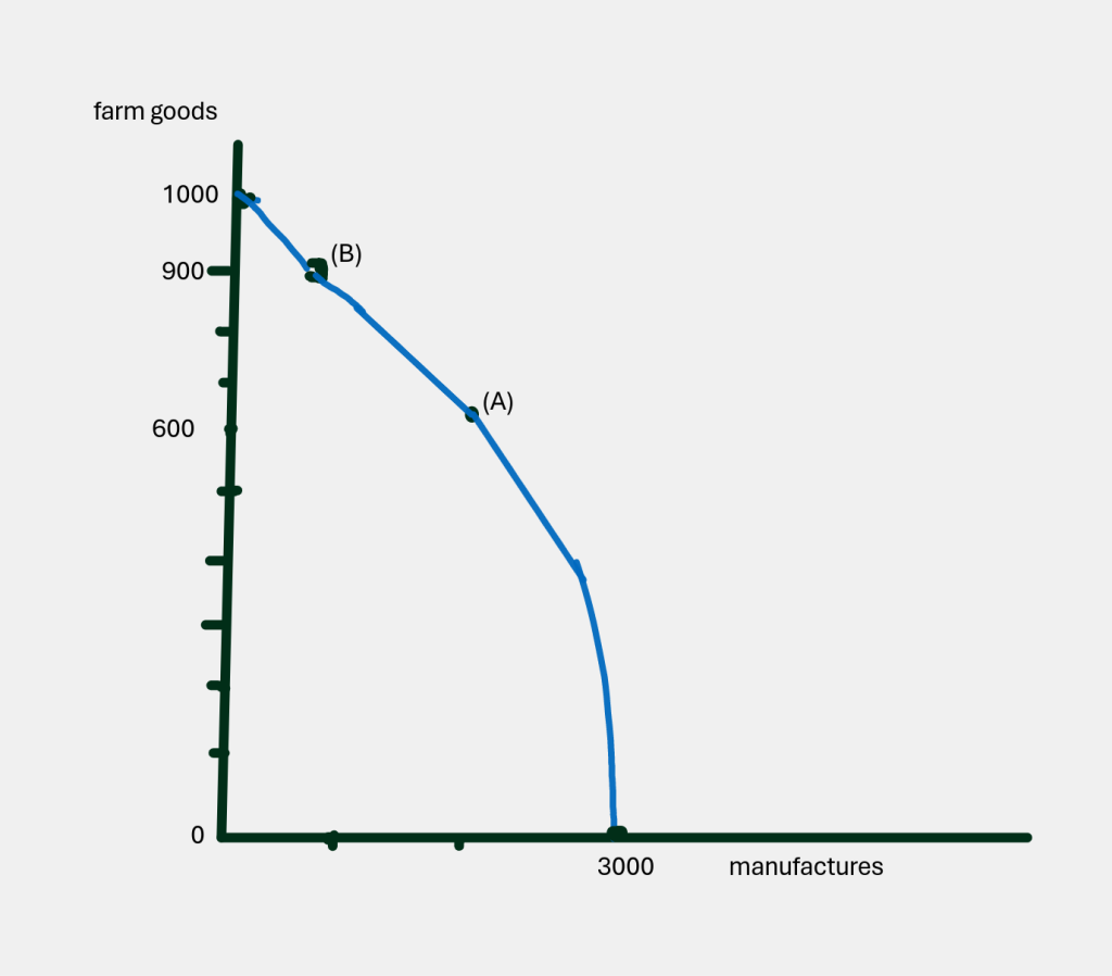
All four of these points—indeed, all the points on the curve—show us the amount of output we could get if we used all our resources efficiently, which is why we call it the production possibilities frontier. Now let’s talk about some of the points that are NOT on the frontier. Let’s consider an output mix of 600 farm goods and 1000 manufactures (D), or 600 farm goods and 4000 manufactures (C). How would we characterize those outputs? Well, let’s draw them and see how they look:
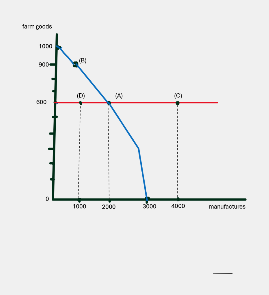
If we are at point D (600 farm goods and 1000 manufactures), someone should ask us why we’re not getting 2000 manufactures with the 600 farm goods, instead of 1000? Point D might happen, but it is NOT efficient—we are supposed to be able to produce more manufactures than that. If we look at point C (600 farm goods and 4000 manufactures) we have to say it’s just not possible yet, given our state of technology and our resources.
So: All the points on the frontier are efficient. All the points inside the frontier are inefficient. All the points outside the frontier are not possible.
Are any points on the frontier ‘better’ than others? This is a social question. Everything on the frontier is great, but society must decide what kind of mix of output we want, and how we want to use our resources. Consider one extreme—0 farm goods and 3000 manufactures. This describes a country dependent on others for basic foodstuffs. It also means that all of us are working in factories—when some of us would really prefer to work the land.
Now that we understand the model’s basics, let’s explore its shape for a moment. We’ve drawn it as a curve—not a straight line—which indicates that the trade-offs of farm vs. manufactures change along the curve. But consider these two different curved shapes:
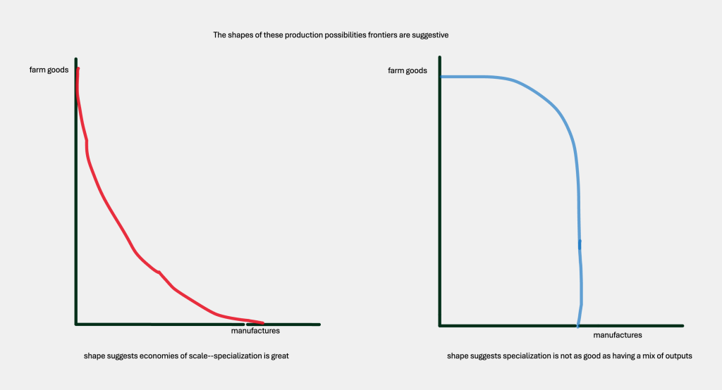
The frontier on the left suggests there may be economies of scale from specializing in farm goods or manufactures. The second graph (bowed outward) suggests that it’s more efficient to produce a mix of outputs rather than extreme specialization.
When we started with this model, we said it showed how much we could produce with our current resources, at the current state of technology. What if technology improves? What if we have some change in technology that increases the output of manufactures, although it doesn’t help farming? No problem:
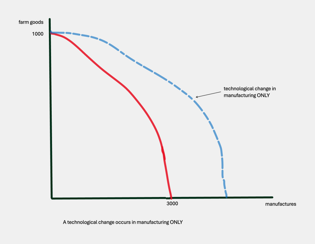
The whole curve will move outward, EXCEPT that point with 1000 farm and 0 manufactures—because at that point, no one is producing manufactures, so all that lovely technological change in manufacturing is not increasing output.
Maybe by now you are wondering what use this model could possibly have, since we don’t live in a world with just two outputs, and no one would ever know if they were operating inside or outside some hypothetical frontier. But being able to visualize an economy in terms of the tradeoffs in what we could produce is actually a good reminder that there are choices. Furthermore, when we get to the topic of economic growth, we will come right back to this model, since one way to depict economic growth is exactly the pushing out of the production possibilities frontier. And later, when we get to international trade, this model comes back again, as countries with production possibilities frontiers of different shapes may benefit from specialization and trade with each other.
The takeaway here? These two very simple models—the circular flow model and the production possibilities frontier model—offer us a way of visualizing dynamics and interconnections in an economy. They give you a lens for looking into how an economy functions that can be quite useful.
Graphing
As you might be noticing, we use graphs in economics. When some people see graphs in a book, they blink their eyes and keep reading the text, figuring a graph is like a picture or illustration they don’t really need to look at. Right and wrong. A graph is visual material–and if you consider yourself a ‘visual learner,’ you might even get more out of a graph than a whole paragraph of words. But–at least here–graphs are an important part of the story that you can’t just skip.
The first rule of graphs, is to pick the right kind of graph to make your point. If you want to show the relationship of parts to the whole–like how much of a day you spend in different types of activities–a ‘pie chart’ is often a good choice:
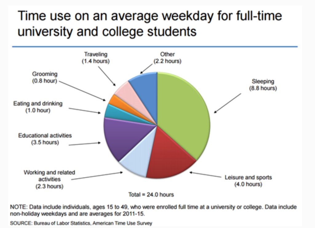
Bureau of Labor Statistics, American Time Use Study
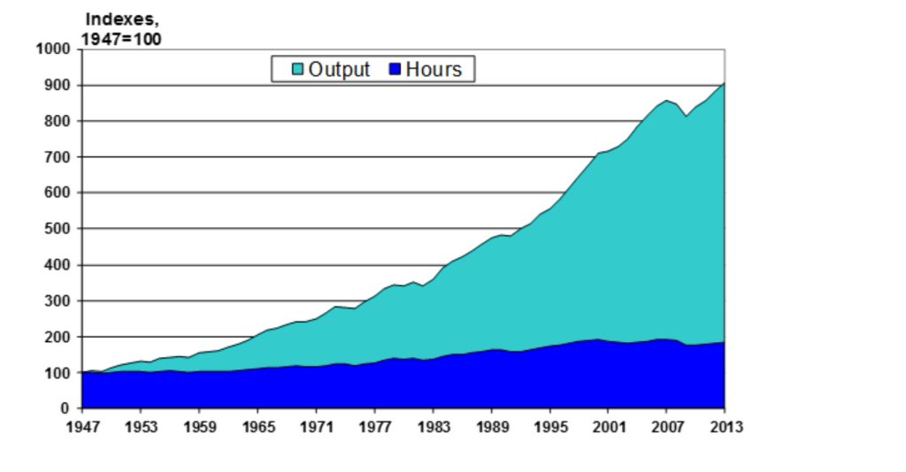
Sometimes the relationship we are highlighting is something that’s changing over time, like productivity in our economy:
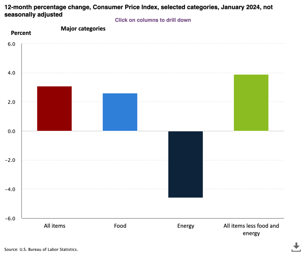
Suppose, instead, you wanted people to see how various components affected a whole–like which categories of our price index had risen and which had fallen. A simple bar chart could make the point:
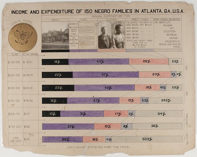
Sometimes a bar chart can get more elaborate, if the designer wants to add as much information as they can. Consider this bar chart that was shown at the World’s Fair in Paris in 1900, part of an exhibition on the conditions of African-Americans in Georgia:
The two big takeaways here on graphs:
- Pick the type of graph that gets across the point you want to make, whether it’s changes over time, relationships of the part to the whole, or comparative sizes of things.
- Stop and take a good look at any graphs presented to you. See if you can figure out the point being made.
In the next chapter we explore another kind of graph, one that relates price and quantity. These supply and demand graphs are like the crown jewels of economic modeling!
Some Useful Materials
This video on the circular flow model switches around the placement of the markets (from the way we’ve put them) but explains things very clearly.
This simple video introduces the production possibilities model.
One of the best sources of data for economics is the St. Louis Federal Reserve. In this video and subsequent ones, they introduce their resources.
Economists spin fables and call them models, explains Ariel Rubenstein. They’re really the same thing…
Media Attributions
- Architectural model, David_Hellden_1965 © David Hellden is licensed under a Public Domain license
- Munster town model is licensed under a Public Domain license
- circular flow © Bettina Berch is licensed under a CC BY-NC (Attribution NonCommercial) license
- circular flow plus govt © Bettina Berch is licensed under a CC BY-NC (Attribution NonCommercial) license
- circular flow plus rest of world © Bettina Berch is licensed under a CC BY-NC (Attribution NonCommercial) license
- Production possibilities frontier © Bettina Berch is licensed under a CC BY-NC (Attribution NonCommercial) license
- Production Possibilities Frontier, with inefficient, efficient and impossible points © Bettina Berch is licensed under a CC BY-NC (Attribution NonCommercial) license
- shapes of production possibilities curves © Bettina Berch is licensed under a CC BY-NC (Attribution NonCommercial) license
- production possibilities frontier shifts from tech change in one output © Bettina Berch is licensed under a CC BY-NC (Attribution NonCommercial) license
- Time Use, Full-Time College Students © Bureau of Labor Statistics is licensed under a Public Domain license
- Hours Worked and Output, Over Time © Bureau of Labor Statistics is licensed under a Public Domain license
- Changes in CPI components © Bureau of Labor Statistics is licensed under a Public Domain license
- Georgia African-Americans, 1900 © W.E.B. Dubois is licensed under a Public Domain license
