Module 3: Examining Relationships: Quantitative Data
Linear Regression (2 of 4)
Linear Regression (2 of 4)
Learning OUTCOMES
- For a linear relationship, use the least squares regression line to model the pattern in the data and to make predictions.
We continue our discussion of linear relationships with a focus on how to find the best line to summarize a linear pattern in data. Specifically, we do the following:
- Develop a measurement for identifying the best line to summarize the data.
- Use technology to find the best line.
Let’s begin with a simple data set with only five data points.
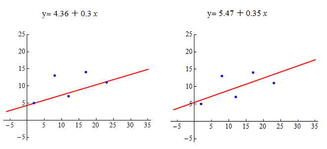
Which line appears to be a better summary of the linear pattern in the data?

Let’s make some observations about how these lines relate to the data points.
The line on the left passes through two of the five points. The point (12, 7) is very close to the line. The points (8, 13) and (17, 14) are relatively far from the line.
The line on the right does not pass through any of the points. It appears to pass through the middle of the distribution of the data. The points (8, 13) and (17, 14) are closer to this line than to the line on the left. But the other data points are farther from this line.
Which line is the best summary of the positive linear association we see in the data? Well, we may not agree on this, so we need a measurement of “best fit.”
Here’s the basic idea: The closer the line is to all of the data points, the better the line summarizes the pattern in the data. Notice when the line is close to the data points, it gives better predictions. A good prediction means the predicted y-value from the line is close to the actual y-value for the data point.
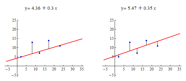
Here are the scatterplots again. For each data point, we drew a vertical line segment from the point to the summary line. The length of each vertical line segment is the amount that the predicted y-value deviates from the actual y-value for that data point. We think of this as the error in the prediction. We want to adjust the line until the overall error for all points together is as small as possible.

The most common measurement of overall error is the sum of the squares of the errors, or SSE (sum of squared errors). The line with the smallest SSE is called the least-squares regression line. We call this line the “line of best fit.”
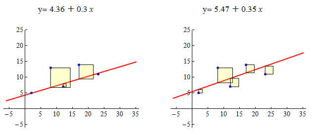
Here are the scatterplots again. As before, each vertical line represents the error in a prediction. For each data point, the squared error is equal to the area of a yellow square. The least-squares regression line is the line with the smallest SSE, which means it has the smallest total yellow area.

Using the least-squares measurement, the line on the right is the better fit. It has a smaller sum of squared errors. When we compare the sum of the areas of the yellow squares, the line on the left has an SSE of 57.8. The line on the right has a smaller SSE of 43.9.
But is the line on the right the best fit? The answer is no. The line of best fit is the line that has the smallest sum of squared errors (SSE). For this data set, the line with the smallest SSE is y = 6.72 +0.26x. The SSE is 41.79.
Now you try it with a new data set. Use the following simulation to adjust the line. See if you can find the least-squares regression line. (Try to find the line that makes the SSE as small as possible.)
Click here to open this simulation in its own window.
Try It
- Concepts in Statistics. Provided by: Open Learning Initiative. Located at: http://oli.cmu.edu. License: CC BY: Attribution
