Module 3: Examining Relationships: Quantitative Data
Scatterplots (2 of 5)
Scatterplots (2 of 5)
Learning OUTCOMES
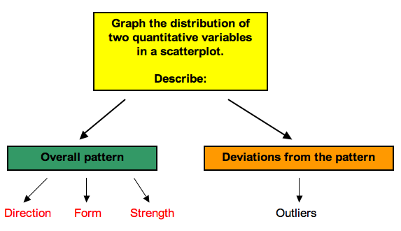
- Use a scatterplot to display the relationship between two quantitative variables. Describe the overall pattern (form, direction, and strength) and striking deviations from the pattern.
Interpreting the Scatterplot
How do we describe the relationship between two quantitative variables using a scatterplot? We describe the overall pattern and deviations from that pattern.
This is the same way we described the distribution of one quantitative variable using a dotplot or a histogram in Summarizing Data Graphically and Numerically. To describe the overall pattern of the distribution of one quantitative variable, we describe the shape, center, and spread. We also describe deviations from the pattern (outliers).
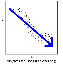
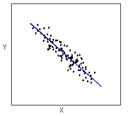
A negative (or decreasing) relationship means that an increase in one of the variables is associated with a decrease in the other.
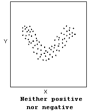
Not all relationships can be classified as either positive or negative.
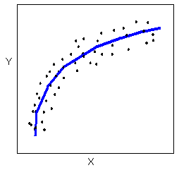
The form of the relationship is its general shape. To identify the form, describe the shape of the data in the scatterplot. In practice, forms that we commonly use have mathematical equations. We look at a few of these equations in this course. For now, we simply describe the shape of the pattern in the scatterplot. Here are a couple of forms that are quite common:
Linear form: The data points appear scattered about a line. We use a line to summarize the pattern in the data. We study the equation for a line in this module.
Curvilinear form: The data points appear scattered about a smooth curve. We use a curve to summarize the pattern in the data. We study some specific types of curvilinear forms with their equations in Modules 4 and 12.
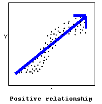
The strength of the relationship is a description of how closely the data follow the form of the relationship. Let’s look, for example, at the following two scatterplots displaying positive, linear relationships:
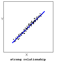
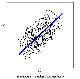
In the top scatterplot, the data points closely follow the linear pattern. This is an example of a strong linear relationship. In the bottom scatterplot, the data points also follow a linear pattern, but the points are not as close to the line. The data is more scattered about the line. This is an example of a weaker linear relationship.Labeling a relationship as strong or weak is not very precise. We develop a more precise way to measure the strength of a relationship shortly.
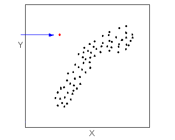
Outliers are points that deviate from the pattern of the relationship. In the scatterplot below, there is one outlier.
Try It
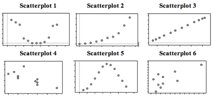
Fill in the letter of the description that matches each scatterplot.
Descriptions:
A: X = month (January = 1), Y = rainfall (inches) in Napa, CA in 2010 (Note: Napa has rain in the winter months and months with little to no rainfall in summer.)
B: X = month (January = 1), Y = average temperature in Boston MA in 2010 (Note: Boston has cold winters and hot summers.)
C: X = year (in five-year increments from 1970), Y = Medicare costs (in $) (Note: the yearly increase in Medicare costs has gotten bigger and bigger over time.)
D: X = average temperature in Boston MA (°F), Y = average temperature in Boston MA (°C) each month in 2010
E: X = chest girth (cm), Y = shoulder girth (cm) for a sample of men
F: X = engine displacement (liters), Y = city miles per gallon for a sample of cars (Note: engine displacement is roughly a measure of engine size. Large engines use more gas.)
- Concepts in Statistics. Provided by: Open Learning Initiative. Located at: http://oli.cmu.edu. License: CC BY: Attribution
Feedback for this page’s “Try It” exercise:
Scatterplot 1: The relationship between month of the year and rainfall in Napa is curvilinear. Rainfall decreases from January to June, with no rainfall for several months in summer. It begins to rain again in October and rainfall increases through the winter months.
Scatterplot 2: The relationship between year and Medicare costs is positive (increasing) and curvilinear (increases get bigger over time).
Scatterplot 3: The relationship between temperature measured in °F and °C is linear, positive, and VERY strong. It is the strongest possible relationship. This is because there is a mathematical formula relating °F and °C.
Scatterplot 4: The relationship between engine size (X) and miles per gallon (Y) is negative. As X increases (engines get bigger), Y decreases (cars get fewer miles to the gallon).
Scatterplot 5: The relationship between month of the year and temperature in Boston is curvilinear. Temperature increases from January to mid-summer, peaks, then decreases through the fall.
Scatterplot 6: The form is linear, positive, and fairly strong. If you look at men with a small chest girth (small X), they will tend to have smaller shoulder girth (small Y). Men with larger chest girth (large X) tend to have larger shoulder girth (large Y).
