Module 2: Summarizing Data Graphically and Numerically
Dotplots (2 of 2)
Dotplots (2 of 2)
Learning OUTCOMES
- Describe the distribution of quantitative data using a dot plot.
Now we will give more specific advice on how to describe the distribution of a quantitative variable.
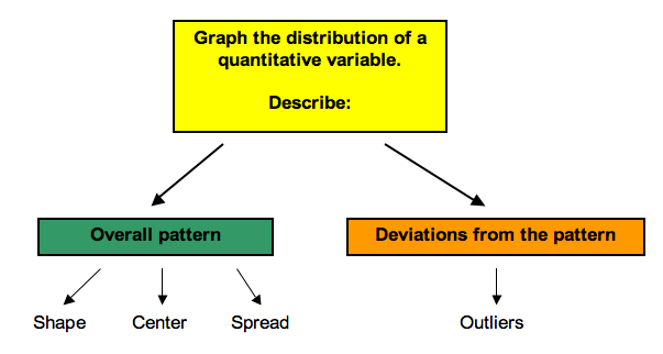
When we describe patterns in data, we use descriptions of shape, center, and spread. We also describe exceptions to the pattern. We call these exceptions outliers.

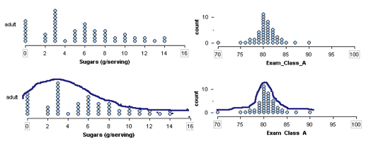
Shape: To describe the shape of a distribution, imagine sketching the outline of the data to emphasize the general trend.

Example
Some Common Descriptions of Shape Used to Categorize Distributions
Right skewed: A cluster of data on the left with a tail of data tapering off to the right. A right-skewed distribution has a lot of data at lower variable values with smaller amounts of data at higher variable values.
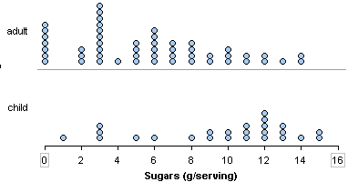
- The distribution of sugar in adult cereals is skewed to the right.

Left skewed: A cluster of data on the right with a tail of data tapering off to the left. A left skewed distribution has a lot of data at higher variable values with smaller amounts of data at lower variable values.
- The distribution of sugar in children’s cereals is skewed to the left.

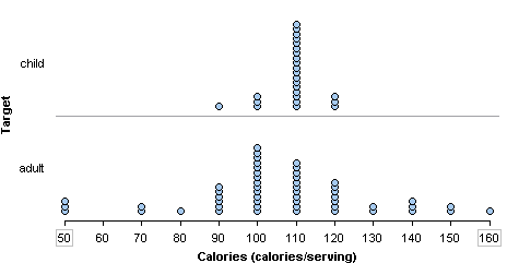
Symmetric with a central peak (also called bell-shaped): A central peak with a tail in both directions. A bell-shaped distribution has a lot of data in the center with smaller amounts of data tapering off in each direction.
- The distribution of calories in children’s cereals is symmetric with a central peak. It is bell-shaped. The distribution of calories in adult cereals is also roughly bell-shaped.

Uniform: A rectangular shape, the same amount of data for each variable value.
- Here is the last digit from 47 students’ telephone numbers. The distribution of the digits is roughly uniform.

Try It
Center and Spread
To describe the pattern in a distribution of a quantitative variable, we describe more than the shape. We also describe the center and spread. Later in this module, we develop more precise ways to identify the center of a distribution and to measure the spread. For now, we discuss these concepts informally.
When we describe a distribution of a quantitative variable, it is helpful to identify a typical value. We choose a single value of the variable to represent the entire group. This is one way to think about the center of the distribution.
We also want to describe how much the data varies among individuals in the group. Variability is another word for spread. We describe the spread in two ways:
- We look at the smallest value and the largest value to describe an overall range in the data.
range = largest value – smallest value
- We also describe a range of typical values to represent common variable values for the group.
Example
Cereals
Here we use shape, center, and spread to compare the distribution of sugar content in adult cereals and children’s cereals.
Compare the shapes:

The sugar content in adult cereals is skewed to the right. Many adult cereals have less than 8 grams of sugar in a serving. A smaller number of adult cereals contain high amounts of sugar. The sugar content for children’s cereals is skewed to the left. Many children’s cereals have more than 8 grams of sugar in a serving, with a smaller number of children’s cereals with low amounts of sugar.
Comment: There is nothing special about the number 8. We chose 8 as a convenient reference point to describe the opposite trends in these two distributions.
Compare the centers:
A typical adult cereal has 3 grams of sugar in a serving. A typical children’s cereal has 12 grams of sugar in a serving.
Comment: Here we looked at the most common value in each distribution. We develop more precise ways to describe the center of a distribution in the next section. For now, just choose a reasonable typical value to represent the group.
Compare the spreads:
Overall range: Adult cereals have 0 to 14 grams of sugar in a serving. Children’s cereals vary from 1 to 15 grams. So both types of cereal vary over a range of 14 grams.
(Note: Overall range = highest value – lowest value. For adult cereals: 14 – 0 = 14. For children’s cereals: 15 – 1 = 14)
Typical range: Typical adult cereals have between 0 and 6 grams of sugar in a serving, compared to 9 to 13 grams in typical children’s cereals.
Comment: Here we looked at clumps in the data to identify a range of typical values. We develop more precise ways to describe the spread a distribution in the last two sections of this module.
When comparing two distributions, we usually tie all of these ideas into one paragraph:
In this sample, children’s cereals have more sugar per serving than adult cereals. A typical children’s cereal has 12 grams of sugar in a serving. It is not uncommon for children’s cereals to have 9 to 13 grams of sugar per serving, but it is unusual for a children’s cereal to have less than 8 grams of sugar. A typical adult cereal has 3 grams of sugar in a serving. It is not uncommon for adult cereals to have 0 to 6 grams of sugar in a serving. Larger amounts of sugar are less common.
Here is a paragraph that uses more formal vocabulary to summarize the comparison:
In this sample, children’s cereals have more sugar per serving than adult cereals. The distribution of sugar in children’s cereals is skewed left with an overall range of 14 grams. Typical children’s cereals have 9 to 13 grams of sugar per serving with 12 grams as the most common amount. The distribution of sugar in adult cereals is skewed right with the same overall range of 14 grams. Typical adult cereals have 0 to 6 grams of sugar per serving with 3 grams as the most common amount.
Try It
Outliers: Outliers are observations that fall outside the overall pattern. We develop a more precise method for identifying outliers later in this module. For now, use your judgment to identify values that appear to be exceptions to the general trend in the data.
Example
Wrist Measurements
In the distribution of wrist measurements, there are two women with unusually large wrists. These women might be outliers. They are marked in red.
The man with the smallest wrist measurement is shown in yellow. This man is probably not an outlier.

Try It
- Concepts in Statistics. Provided by: Open Learning Initiative. Located at: http://oli.cmu.edu. License: CC BY: Attribution
