Module 3: Examining Relationships: Quantitative Data
Assessing the Fit of a Line (2 of 4)
Assessing the Fit of a Line (2 of 4)
Learning OUTCOMES
- Use residuals, standard error, and r2 to assess the fit of a linear model.
Introduction
Now we move from calculating the residual for an individual data point to creating a graph of the residuals for all the data points. We use residual plots to determine if the linear model fits the data well.
Residual Plots
The graph below shows a scatterplot and the regression line for a set of 10 points. The blue points represent our original data set, that is, our observed values. The red points, lying directly on the regression line, are the predicted values.
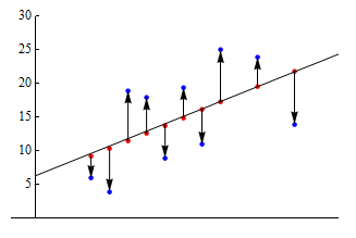
The vertical arrows from the predicted to observed values represent the residuals. The up arrows correspond to positive residuals, and the down arrows correspond to negative residuals.
Now consider the following pair of graphs. The top graph is a copy of the graph we looked at above. In the graph below, we plotted the values of the residuals on their own. (The explanatory variable is still plotted on the horizontal axis, though it is not indicated this here.) This is called a residual plot.
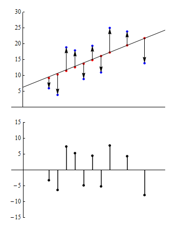
In the residual plot, each point with a value greater than zero corresponds to a data point in the original data set where the observed value is greater than the predicted value. Similarly, negative values correspond to data points where the observed value is less than the predicted value.
What are we looking for in a residual plot?
We use residual plots to determine if a linear model is appropriate. In particular, we look for any unexpected patterns in the residuals that may suggest that the data is not linear in form.
To help us identify an unexpected pattern, we start by looking at what we expect to see in a residual plot when the form is linear.
Example
No Pattern in Residual Plot
Consider the pair of graphs below. Here we have a scatterplot for a data set consisting of 400 observations. The regression line is shown in the scatterplot. The residual plot is below the scatterplot.
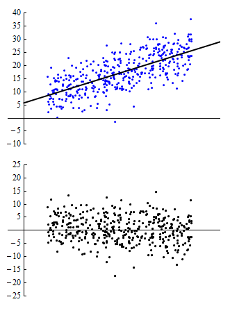
In this example, the line in the scatterplot is a good summary of the positive linear pattern in the data. Notice that the points in the residual plot seem to be randomly scattered. As we examine the residuals from left to right, they don’t appear to follow a particular path, nor does the cloud of points widen or narrow in any systematic way. We see no particular pattern. Thus, in the ideal case, when a linear model is really a good fit, we expect to see no pattern in the residual plot.
Our general principle when looking at residual plots, then, is that a residual plot with no pattern is good because it suggests that our use of a linear model is appropriate.
However, we must be flexible in applying this principle because what we see usually lies somewhere between the extremes of no pattern and a clear pattern. Let’s look at some specific examples.
Example
Patterns in Residual Plots
At first glance, the scatterplot appears to show a strong linear relationship. The correlation is r = 0.84. However, when we examine the residual plot, we see a clear U-shaped pattern. Looking back at the scatterplot, this movement of the data points above, below and then above the regression line is noticeable. The residual plot, particularly when graphed at a finer scale, helps us to focus on this deviation from linearity.
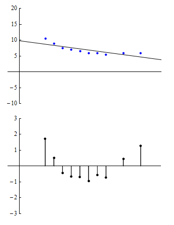
The pattern in the residual plot suggests that our linear model may not be appropriate because the model predictions will be too high for values in the middle of the range of the explanatory variable and too low for values at the two ends of that range. A model with a curvilinear form may be more appropriate.
Example
Patterns in Residual Plots 2
This scatterplot is based on datapoints that have a correlation of r = 0.75. In the residual plot, we see that residuals grow steadily larger in absolute value as we move from left to right. In other words, as we move from left to right, the observed values deviate more and more from the predicted values. Again, we have chosen a smaller vertical scale for the residual plot to help amplify the pattern to make it easier to see.
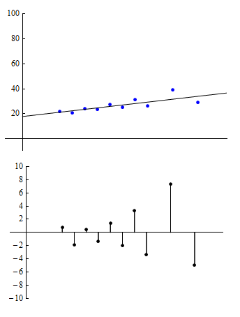
The pattern in the residual plot suggests that predictions based on the linear regression line will result in greater error as we move from left to right through the range of the explanatory variable.
Example
Highway Sign Visibility
Let’s return now to our original example and take a look at what the residual plot tell us about the appropriateness of applying a linear model to this data.
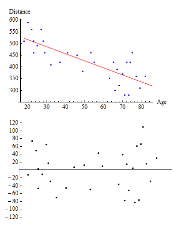
Note that the residuals are fairly randomly dispersed. However, they seem to be a bit more spread out on the left and right than they are in the middle. As we look at higher ages, there seems to be greater variation in the residuals, which suggests that we may want to be more cautious if we are trying to predict distances for older drivers. And the risks associated with extrapolation beyond the range of the data seem to be even greater here. In this case, we may still use this linear model but condition the use of it on our analysis of the residual plot.
Try It
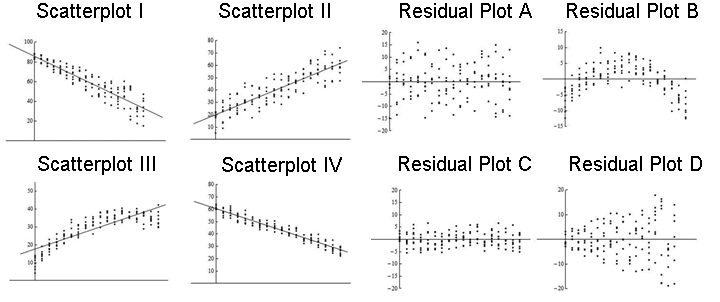
Here again are four scatterplots with regression lines shown and four corresponding residual plots.

Try It
- Concepts in Statistics. Provided by: Open Learning Initiative. Located at: http://oli.cmu.edu. License: CC BY: Attribution
Feedback on interactive questions
Question 1
Residual Plot D shows a pattern that fans out as we move left-to-right, which is consistent with Scatterplot I where points on the right side of the graph lie farther away from the line than points on the left side of the graph.
Residual Plot A is rectangular shaped, which is consistent with Scatterplot II where the distances between the points and the line remain fairly steady as we move left-to-right and have a maximum distance of about 15 units.
Residual Plot B shows a curved pattern from negative to positive and back to negative, which consistent with Scatterplot III where the points go from below the line to above the line and back to below as we move left-to-right.
Residual Plot C is rectangular shaped, which is consistent with Scatterplot IV where the distances between the points and the line remain fairly steady as we move left-to-right and have a maximum distance of about 5-6 units.
