Module 2: Summarizing Data Graphically and Numerically
Interquartile Range and Boxplots (3 of 3)
Interquartile Range and Boxplots (3 of 3)
Learning OUTCOMES
- Use a five-number summary and a boxplot to describe a distribution.
Comparing Distributions with Side-by-Side Boxplots
In the next two examples, we again use boxplots to compare two distributions. This time we focus on writing a description of the two distributions. We practiced writing descriptions in the earlier section, “Distributions for Quantitative Data,” using dotplots and histograms. Now we use boxplots. As before, we describe shape, center, spread, and outliers. But now we use the five-number summary to make our descriptions more precise.
Example
Best Actor/Actress Oscar Winners
So far we have examined the age distributions of Oscar winners for males and females separately.
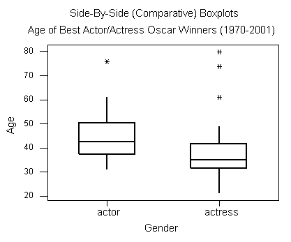
It will be interesting to compare the age distributions of actors and actresses who won best acting Oscars. To do that, we look at side-by-side boxplots of the age distributions by gender.

- Actors: Min = 31, Q1 = 37.75, M = 42.5, Q3 = 48.75, Max = 76
- Actresses: Min = 21, Q1 = 32, M = 35, Q3 = 41.5, Max = 80
Based on the graph and numerical measures, we can make the following comparison between the two distributions:
Note: A good summary compares the two distributions using shape, center, spread, and outliers. Let’s begin with observations about these characteristics of the distributions.
Shape: The shape of a distribution can be hard to determine from the boxplot, but we can compare the variability in the upper half of the data (Max − Median) to the variability in the lower half of the data (Median − Min) to get a sense of shape. For the men, the distribution appears skewed to the right because the lower half of the data has less variability than the upper half. The lower half of the data has a range of 11.5 years (42.5 − 31), compared to the upper half of the data with a range of 33.5 years (76 − 42.5). The distribution for women also appears right-skewed. The lower half of the data has a range of 14 years (35 − 21), compared to a range of 45 years for the upper half of the data (80 − 35). In both cases, the shape suggests that the Oscar is awarded to younger actors and actresses.
Center: Actresses tend to win the Oscar at a younger age than do actors. The median age for females (35) is lower than for the males (42.5). Note also that the third quartile of the females’ distribution (41.5) is lower than the median age for males. It tells us that only 25% of the actresses were 41.5 years old or older when they won the Oscar, compared to 50% of the males who were 42.5 years old or older.
Spread: Not only do actresses win at a younger age, but the Oscar is awarded more consistently to younger actresses, as we can see by comparing the interquartile ranges. There is less variability in the middle half of the actresses’ ages (IQR = 9.5) than in the actors’ ages (IQR = 11). On the other hand, the actresses have more variability in their overall ages (range = 59) compared to the actors (range = 45).
Outliers: We see that we have outliers in both distributions. There is only one high outlier in the actors’ distribution (76, Henry Fonda, On Golden Pond), compared with three high outliers in the actresses’ distribution.
Now let’s pull these observations together into a paragraph. A good paragraph compares the two distributions and uses observations about the distributions to support a central thesis.
In general, actresses win the Best Actress Oscar at a younger age than do actors. The median age for actresses is 35, compared to 42.5 for actors. Not only do actresses win at a younger age, the Oscar is awarded more consistently to younger actresses, as seen when we compare the interquartile ranges. There is less variability in the middle half of the actresses’ ages (IQR = 9.5) than in the actors’ ages (IQR = 11). Both distributions have older winners that are outliers. These older winners are unusual and skew the distribution of ages to the right.
Example
Temperature of Pittsburgh vs. San Francisco
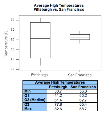
To compare the average high temperatures of Pittsburgh to those of San Francisco, we look at the following side-by-side boxplots and supplement the graph with the descriptive statistics of each of the two distributions.

When looking at the graph, the similarities and differences between the two distributions are striking. Both distributions have roughly the same center (medians are 61.4 for Pittsburgh and 62.7 for San Francisco). However, the temperatures in Pittsburgh have a much larger variability than the temperatures in San Francisco (Range: 49 vs. 12; IQR: 36.5 vs. 5).
The practical interpretation of the results we obtained is that the weather in San Francisco is much more consistent than the weather in Pittsburgh, which varies a lot during the year. Also, because the temperatures in San Francisco vary so little during the year, knowing that the median temperature is around 63 is actually very informative. On the other hand, knowing that the median temperature in Pittsburgh is around 61 is practically useless, since temperatures vary so much during the year and can get much warmer or much colder than in San Francisco.
Note that this example provides more intuition about variability by interpreting small variability as consistency and large variability as lack of consistency. Also, through this example, we learned that the center of the distribution is more meaningful as a typical value for the distribution when there is little variability (or, as statisticians say, little “noise”) around it. When there is large variability, the center loses its practical meaning as a typical value.
Let’s Summarize
- The range measures the variability of a distribution by looking at the interval covered by all the data. The IQR measures the variability of a distribution by giving us the interval covered by the middle 50% of the data.
- The five-number summary of a distribution consists of the minimum, quartile 1, median, quartile 3, and maximum.
- The IQR is the measure of spread we should use when using the median to measure center.
- When using the median and IQR to measure center and spread, a data point is considered an outlier if it satisfies one of the following conditions.
- More than 1.5 IQRs greater than Q3 (i.e., the value is greater than Q3 + 1.5 * IQR).
- More than 1.5 IQRs less than Q1 (i.e., the value is less than Q1 – 1.5 * IQR).
- The boxplot is a graphical representation of a data set. It displays the five-number summary and highlights any points that are considered outliers (using the 1.5 * IQR rule described in the previous bullet).
- Side-by-side boxplots are commonly used to compare two data sets.
- Concepts in Statistics. Provided by: Open Learning Initiative. Located at: http://oli.cmu.edu. License: CC BY: Attribution
